Shimagumi
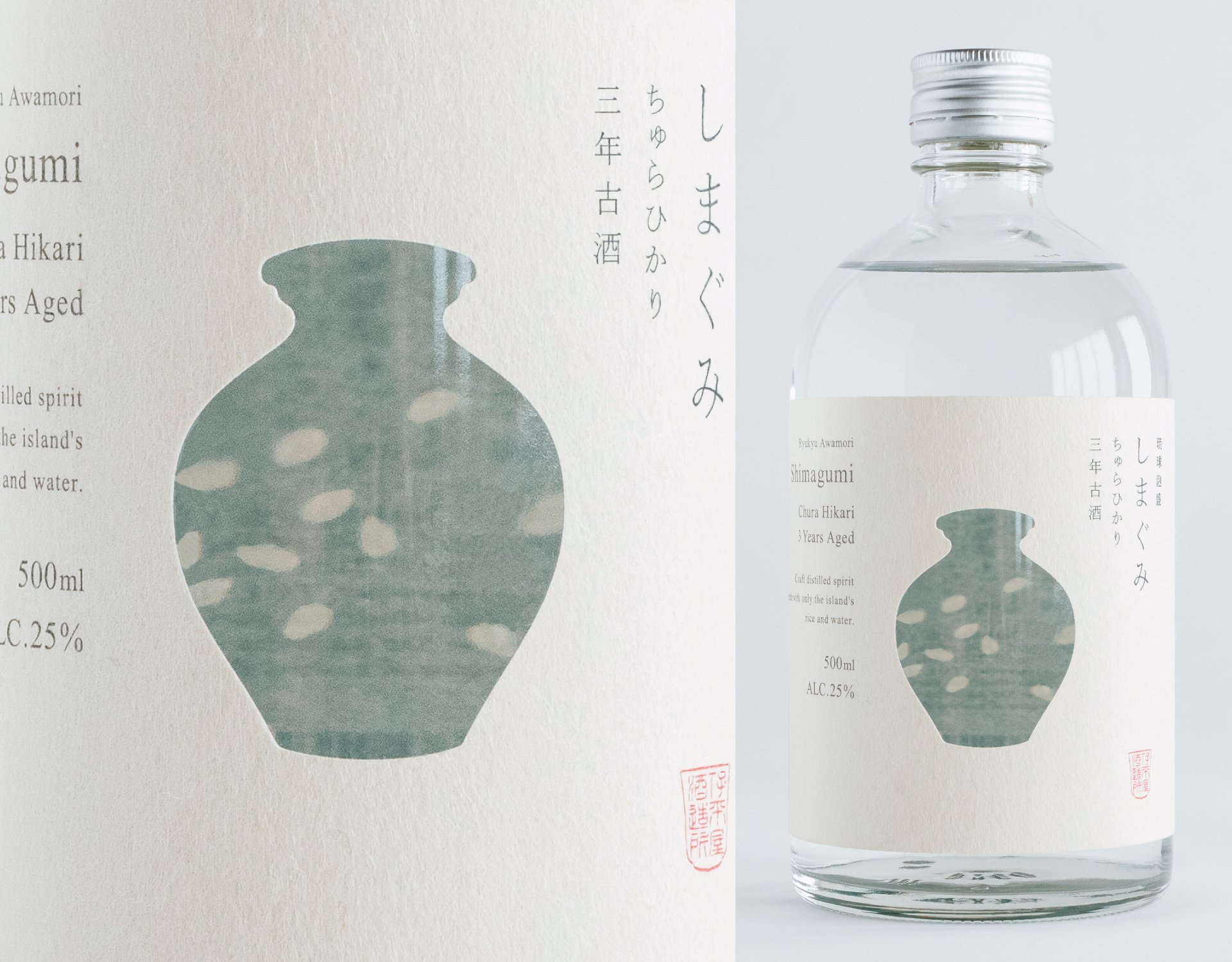
Where Jar and Rice Overlap, Awamori Takes Shape
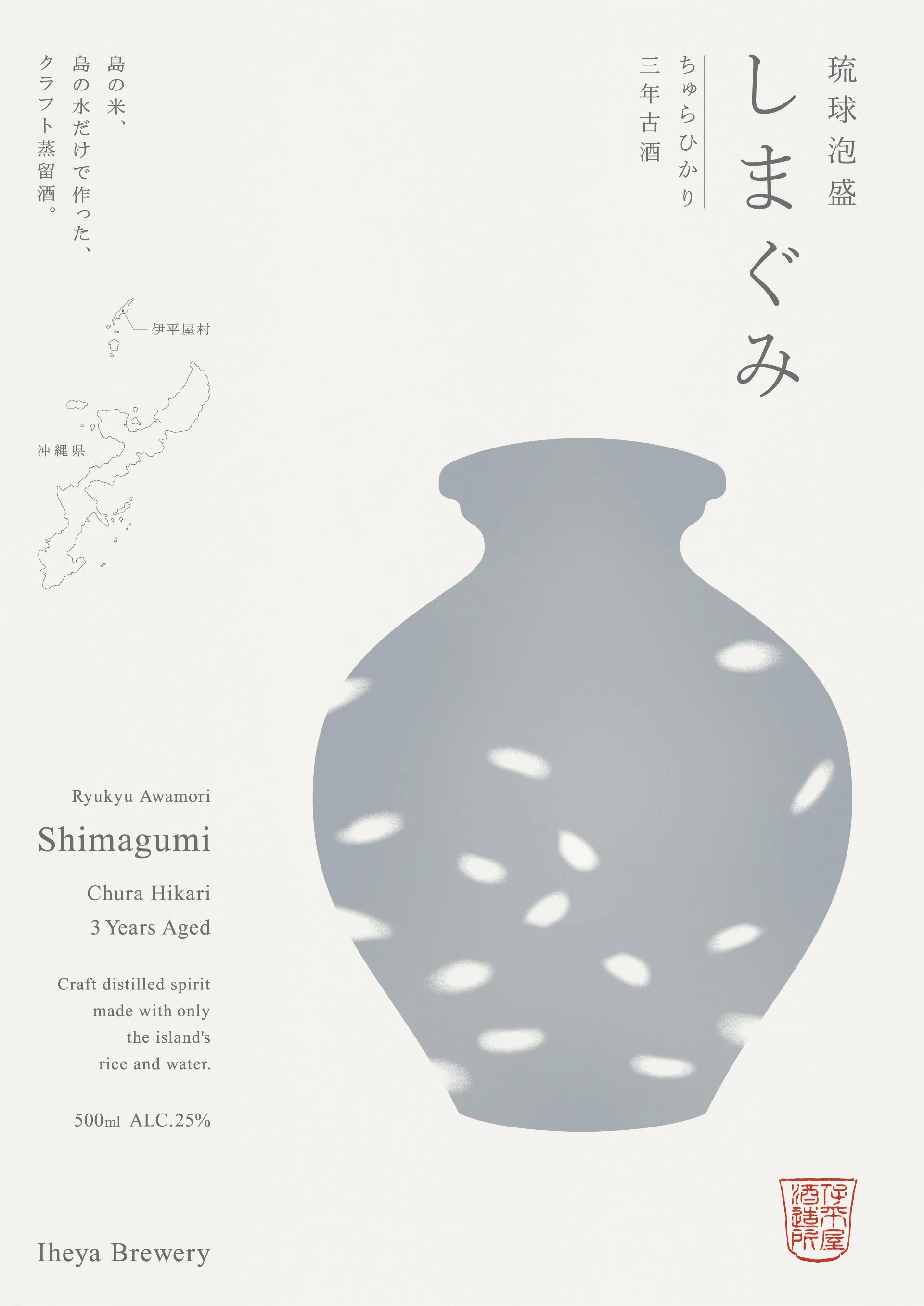
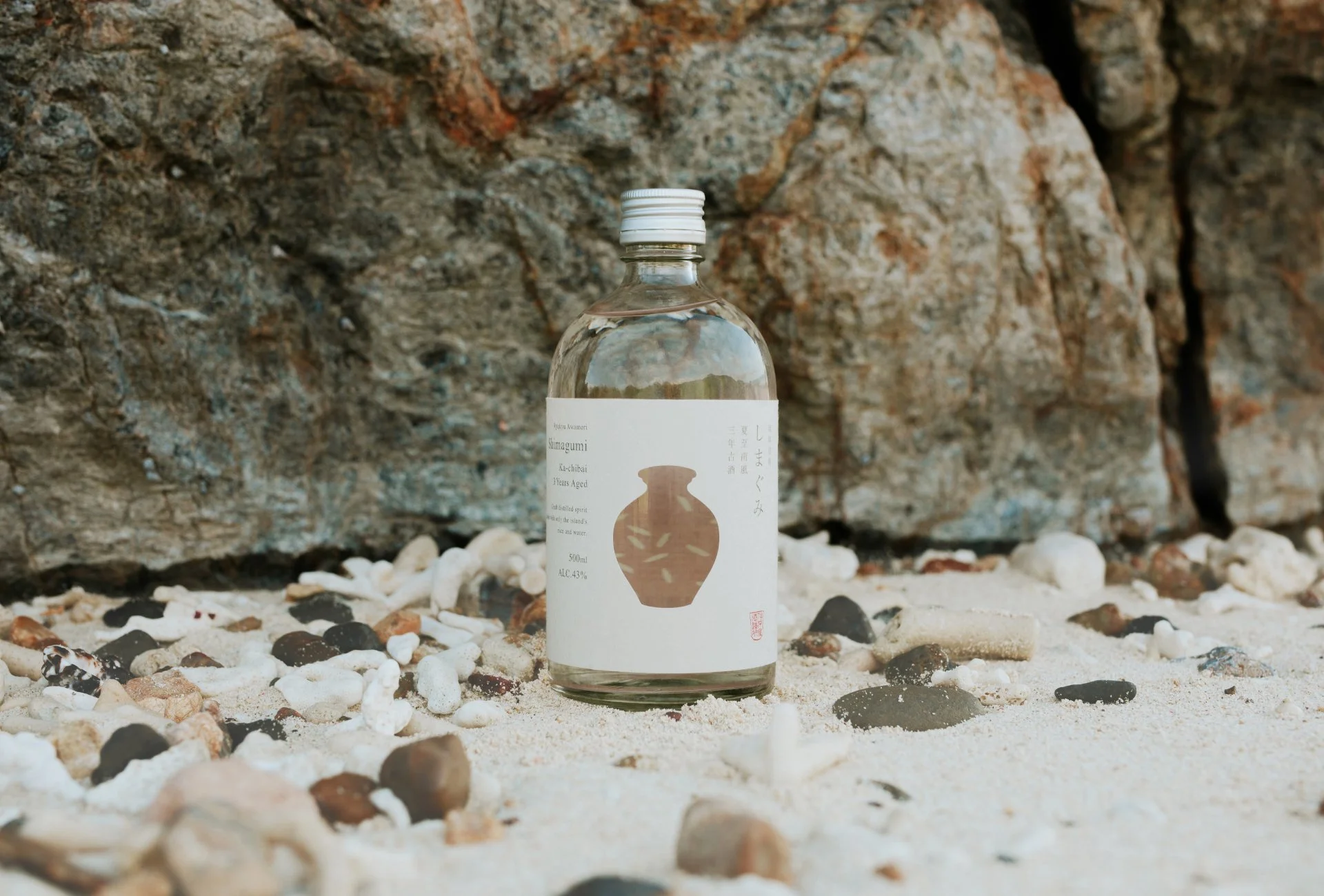
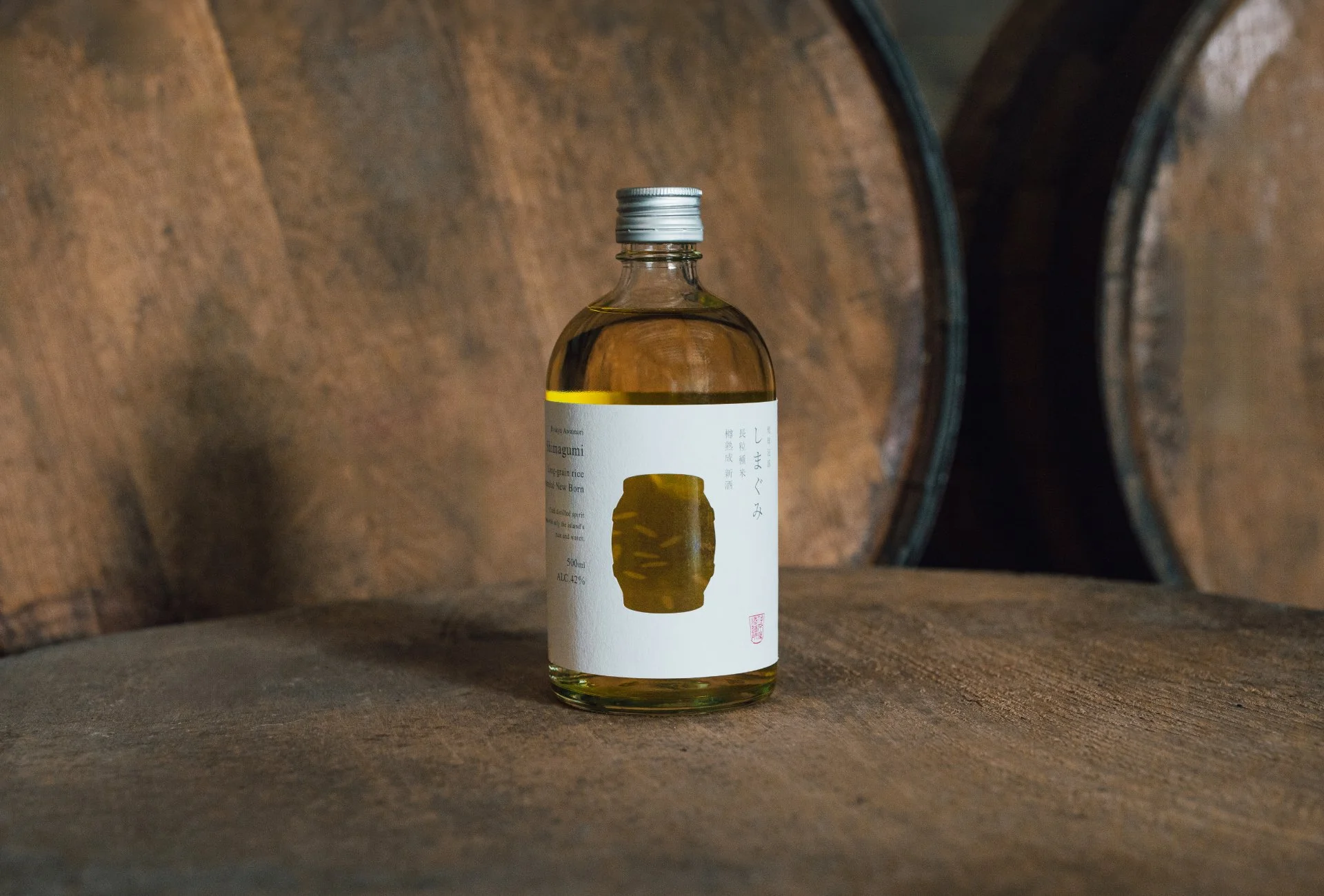
Branding for “Shimagumi,” a craft awamori distilled on Iheya Island, northwest of Okinawa’s main island. The name derives from the Okinawan word “gumi,” meaning rice, and literally translates to “island rice.”
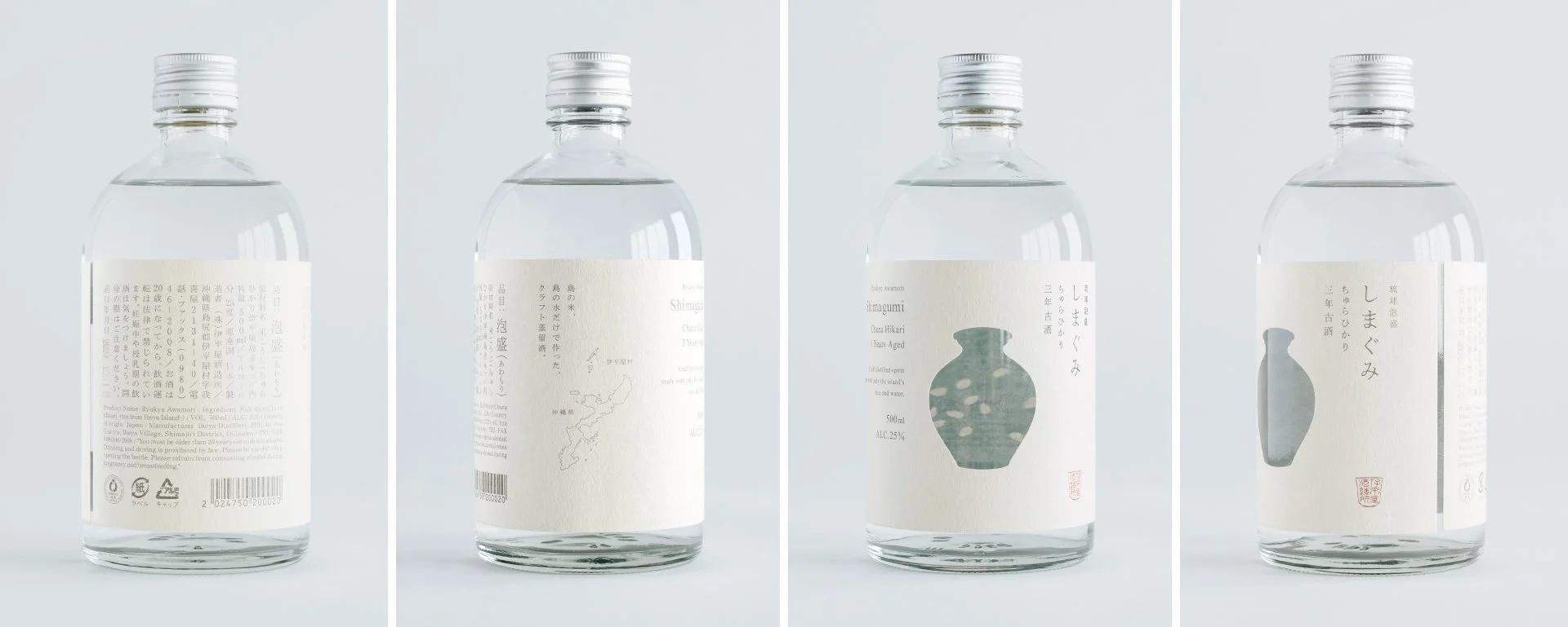
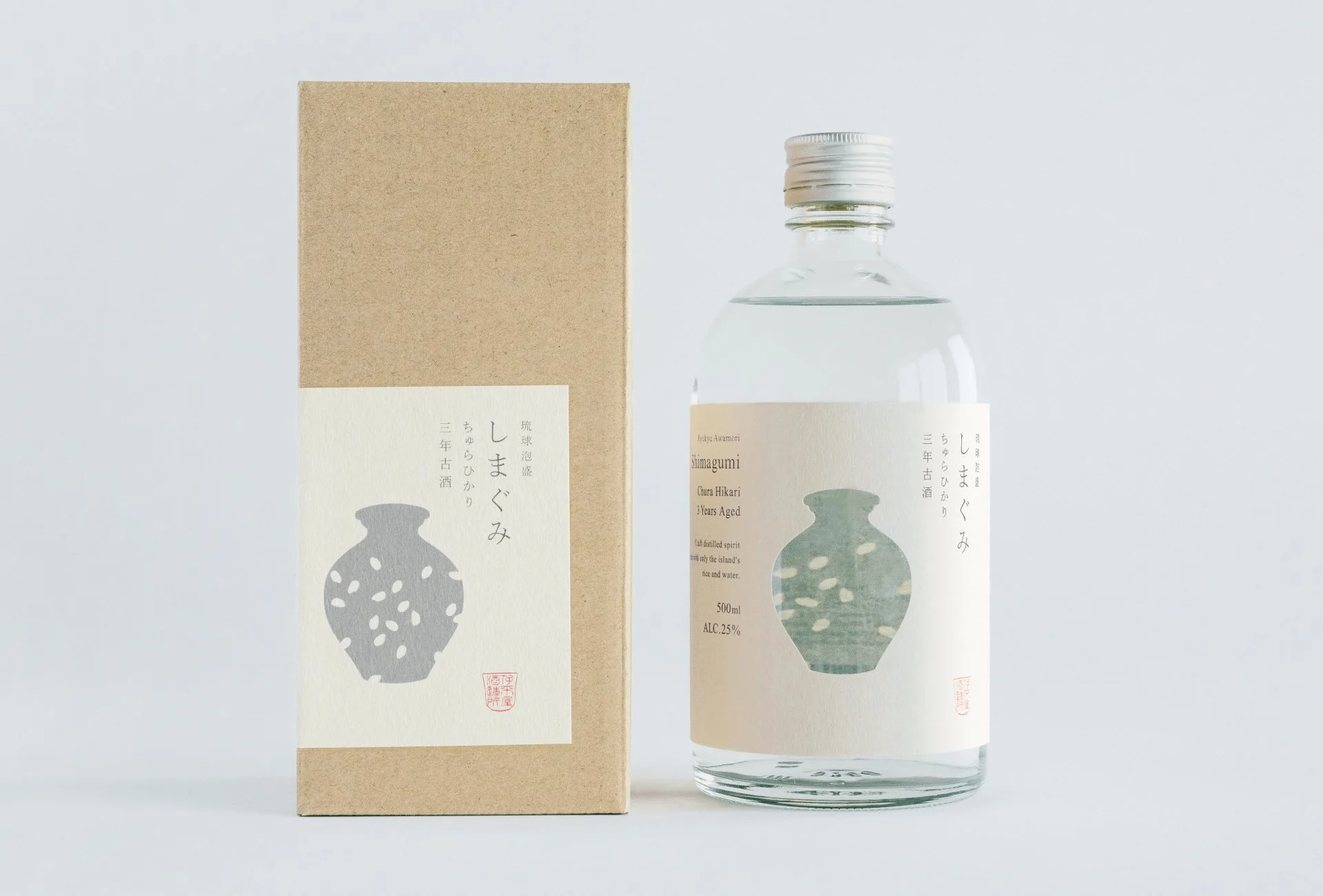
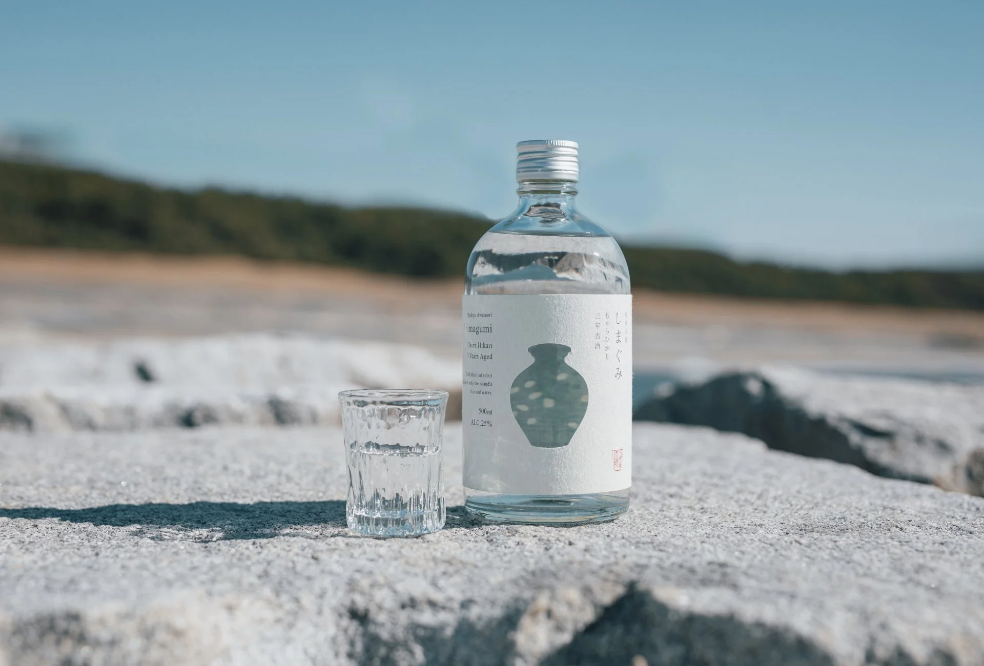
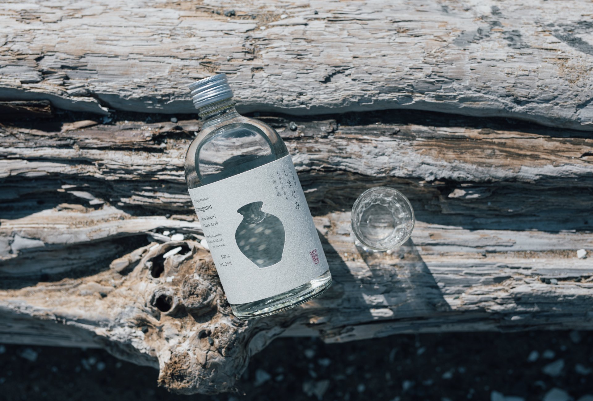
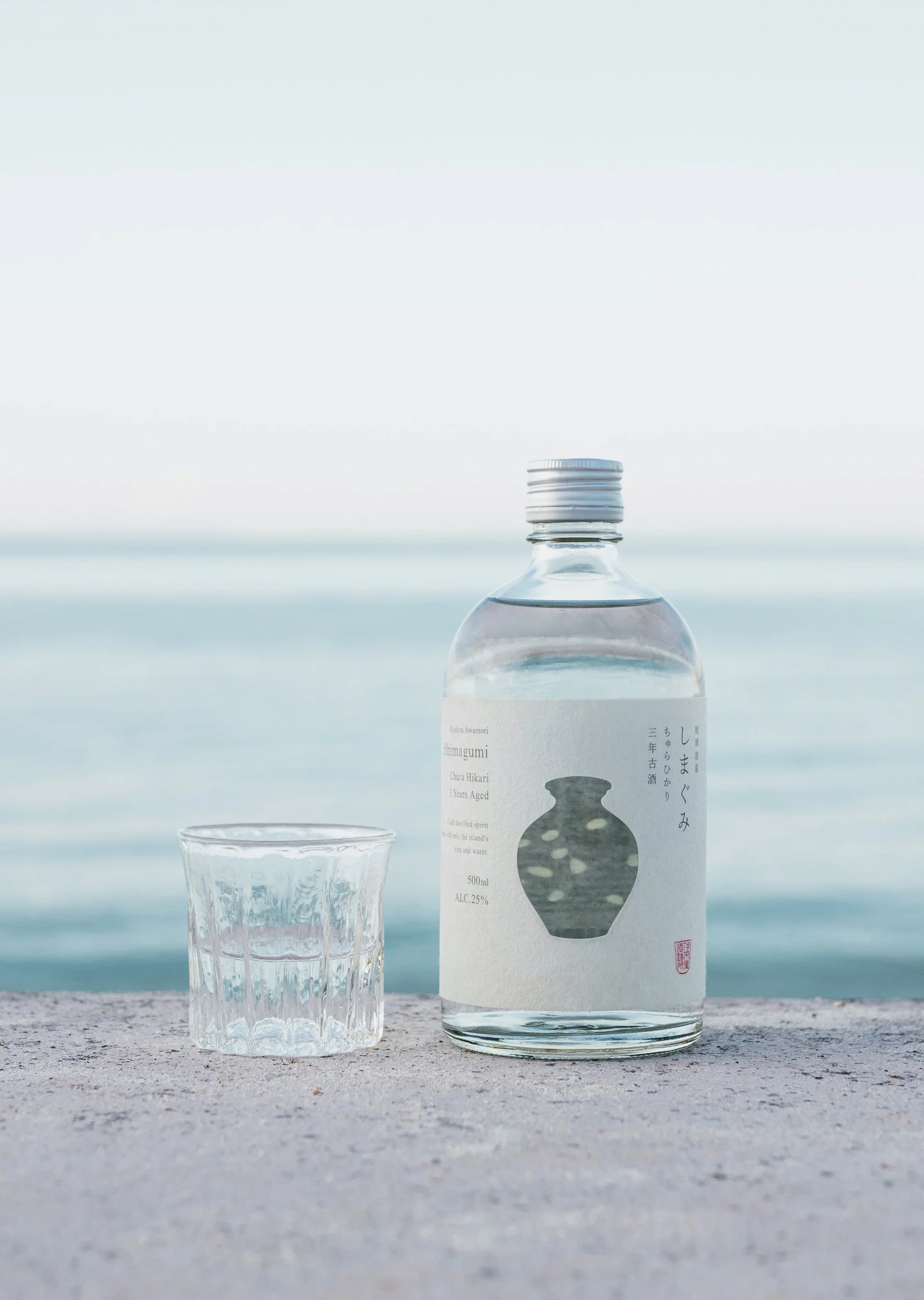
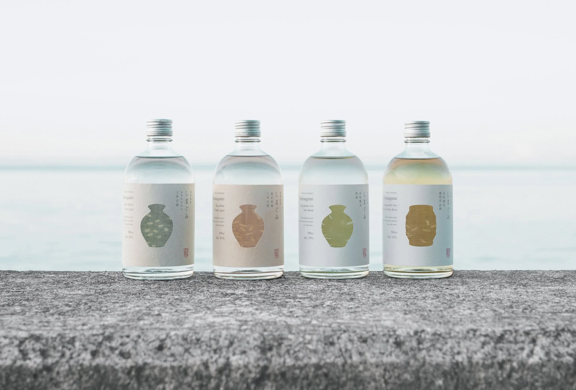
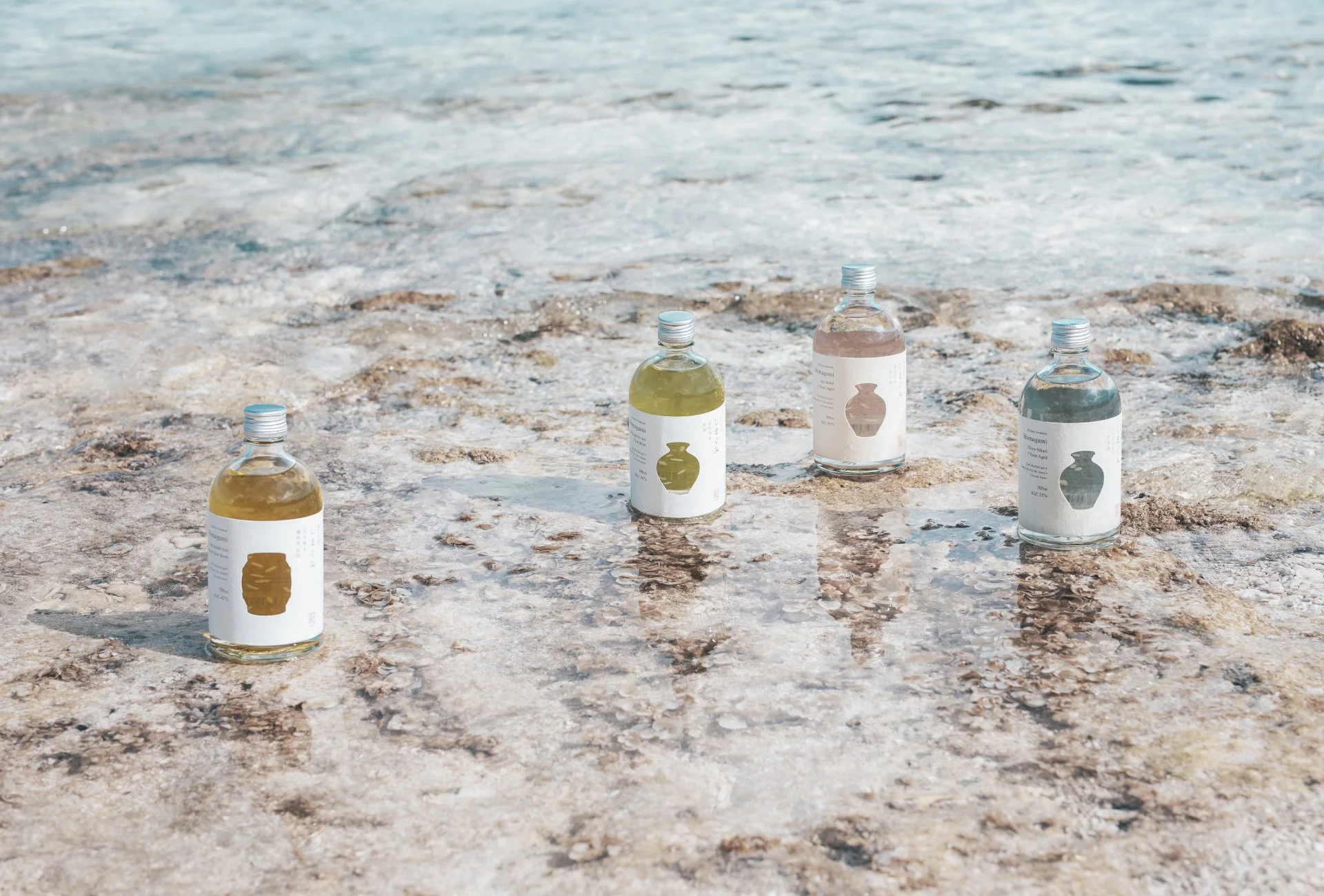
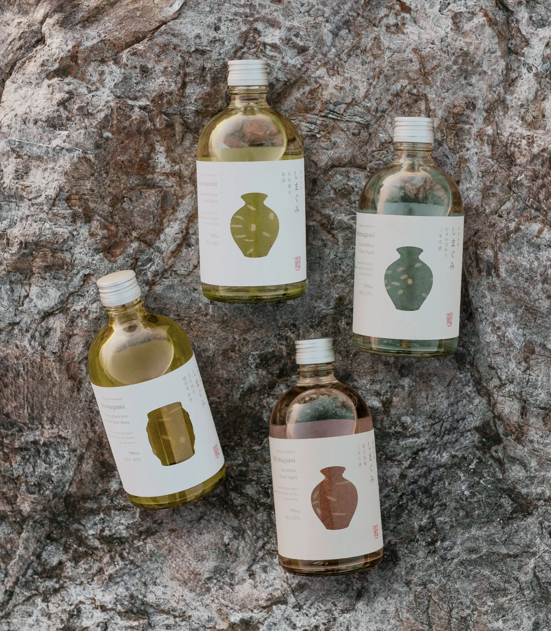
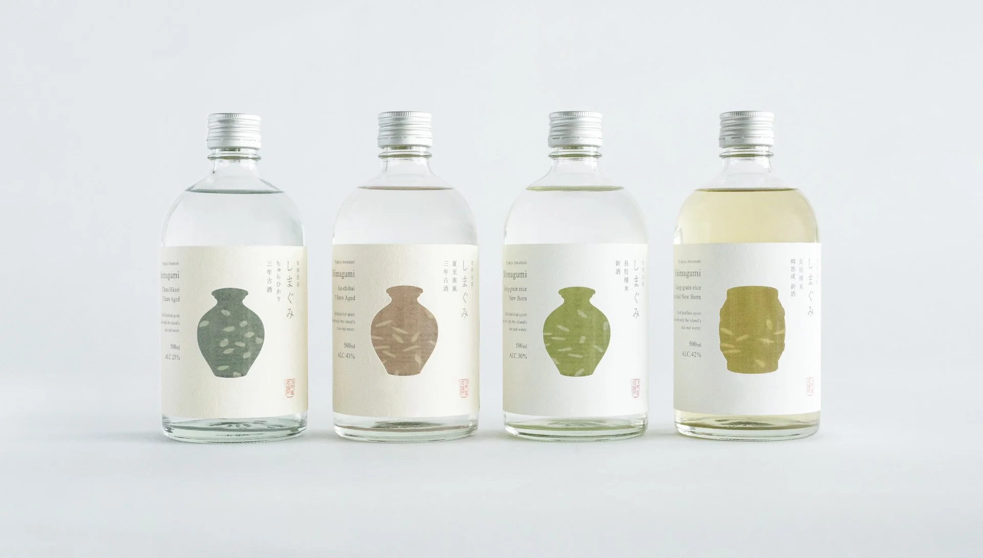
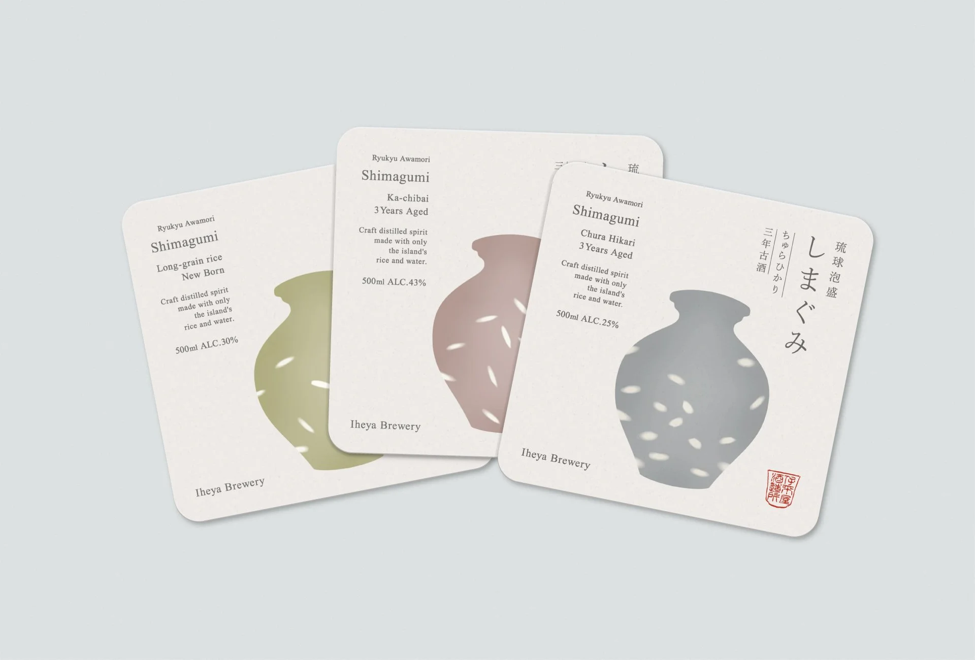
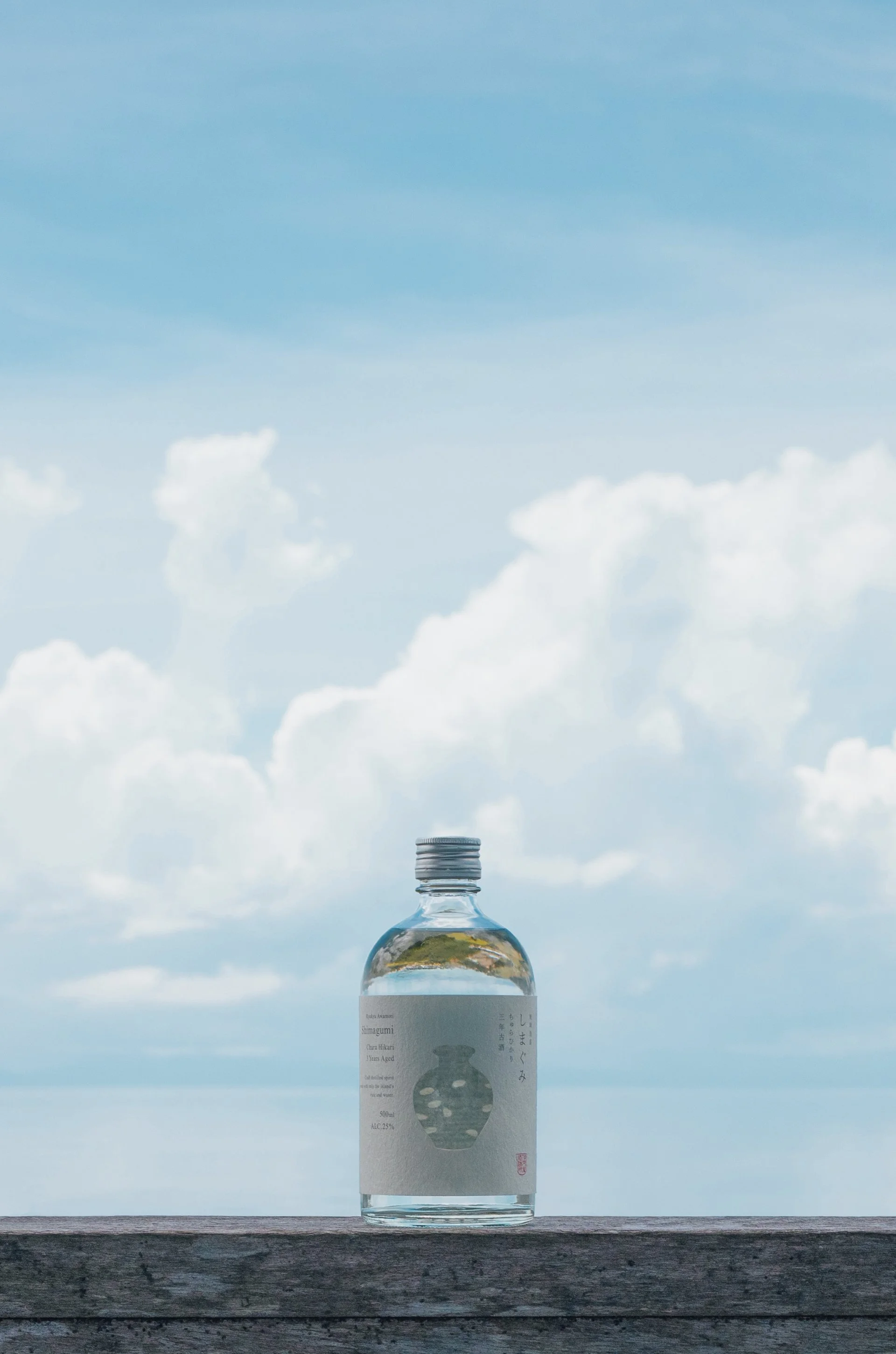
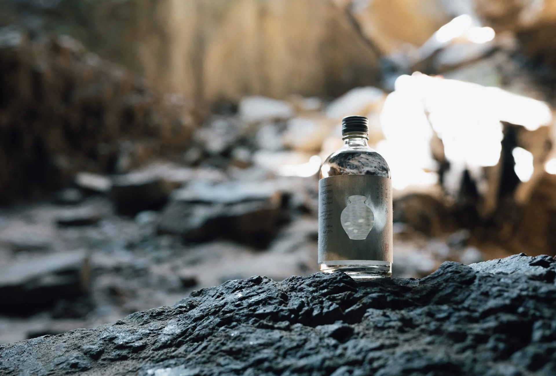
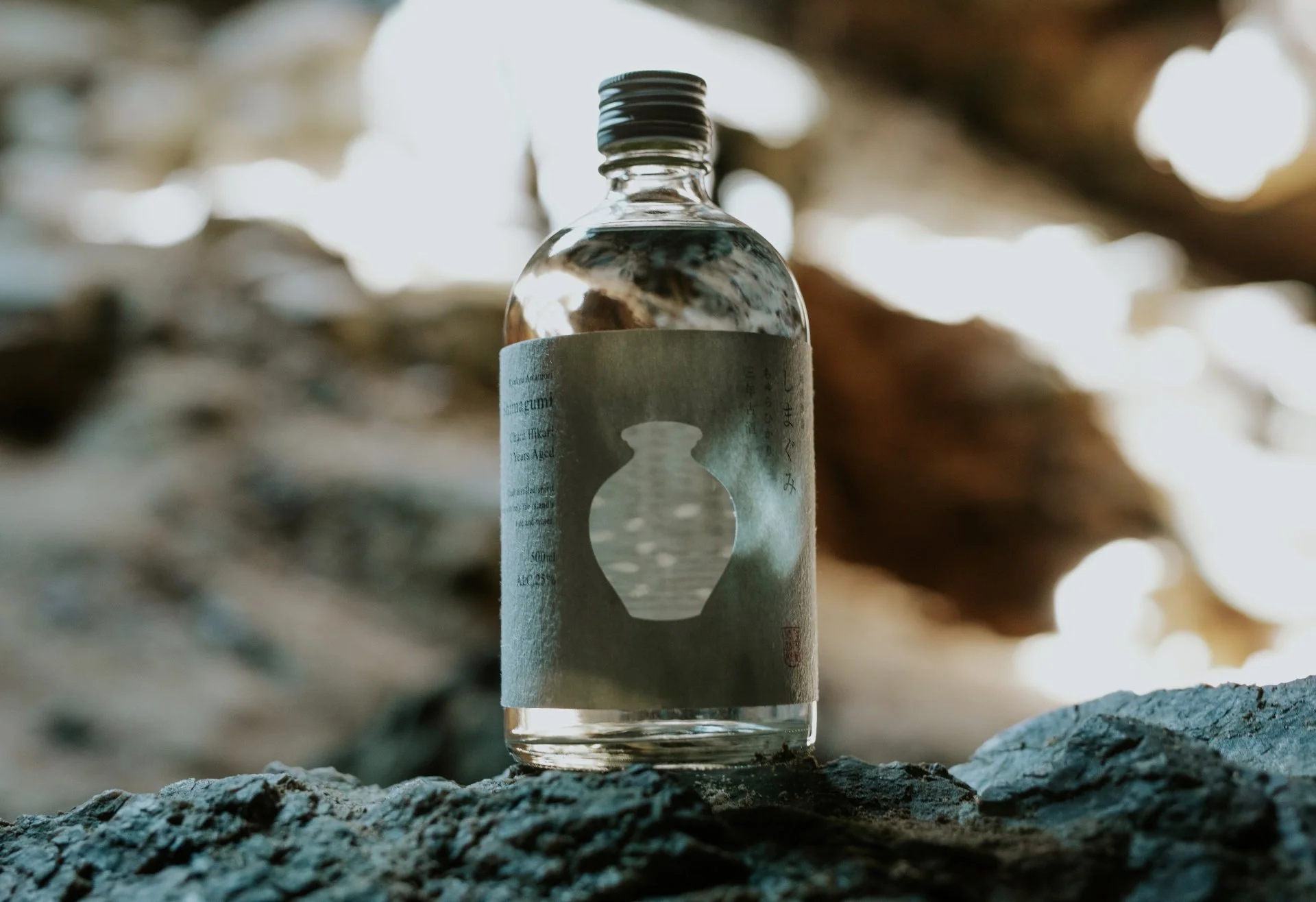
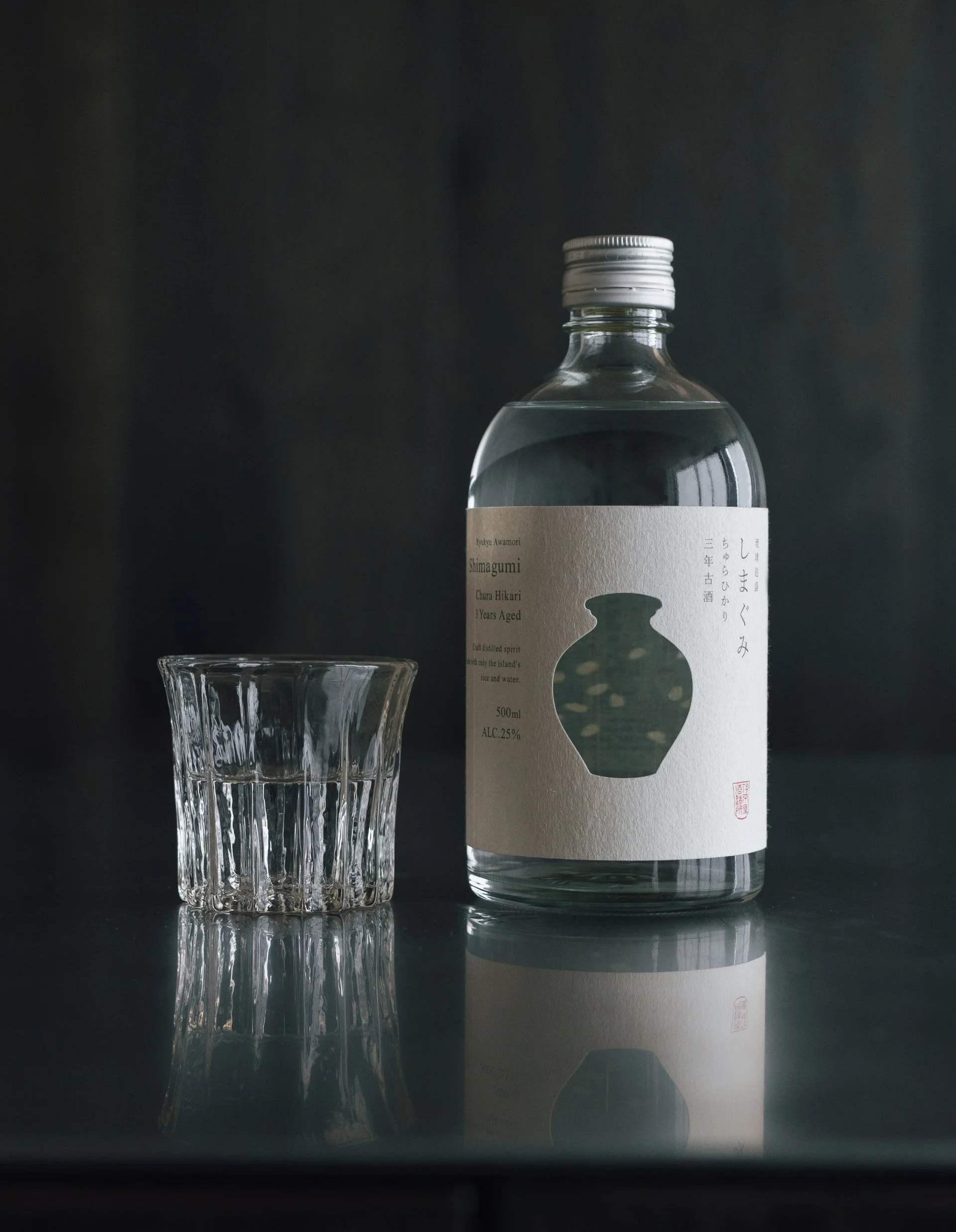
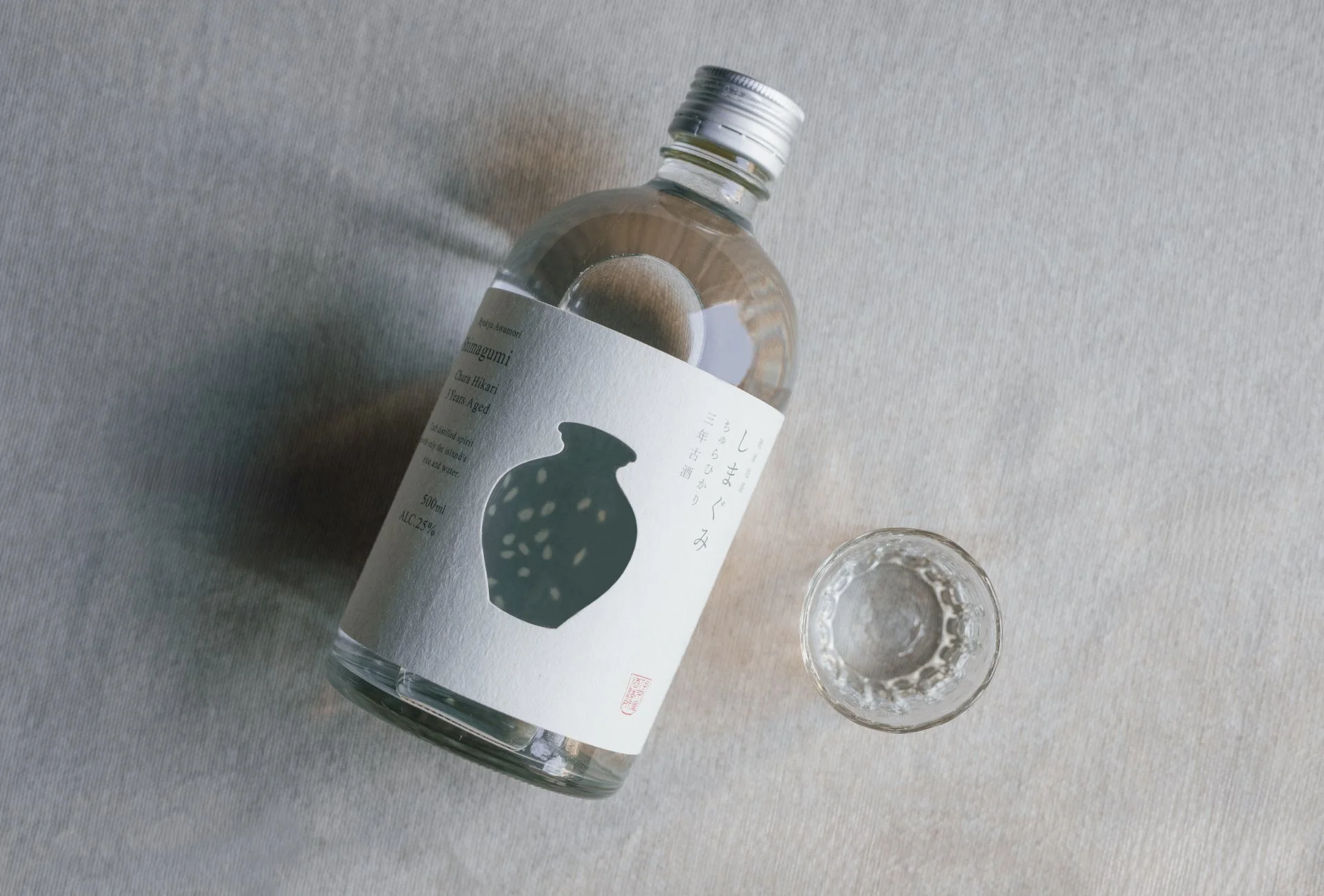
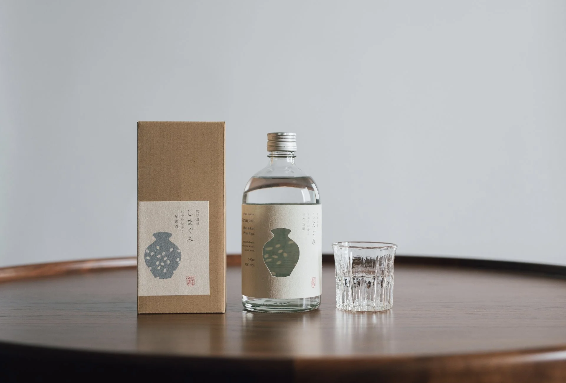
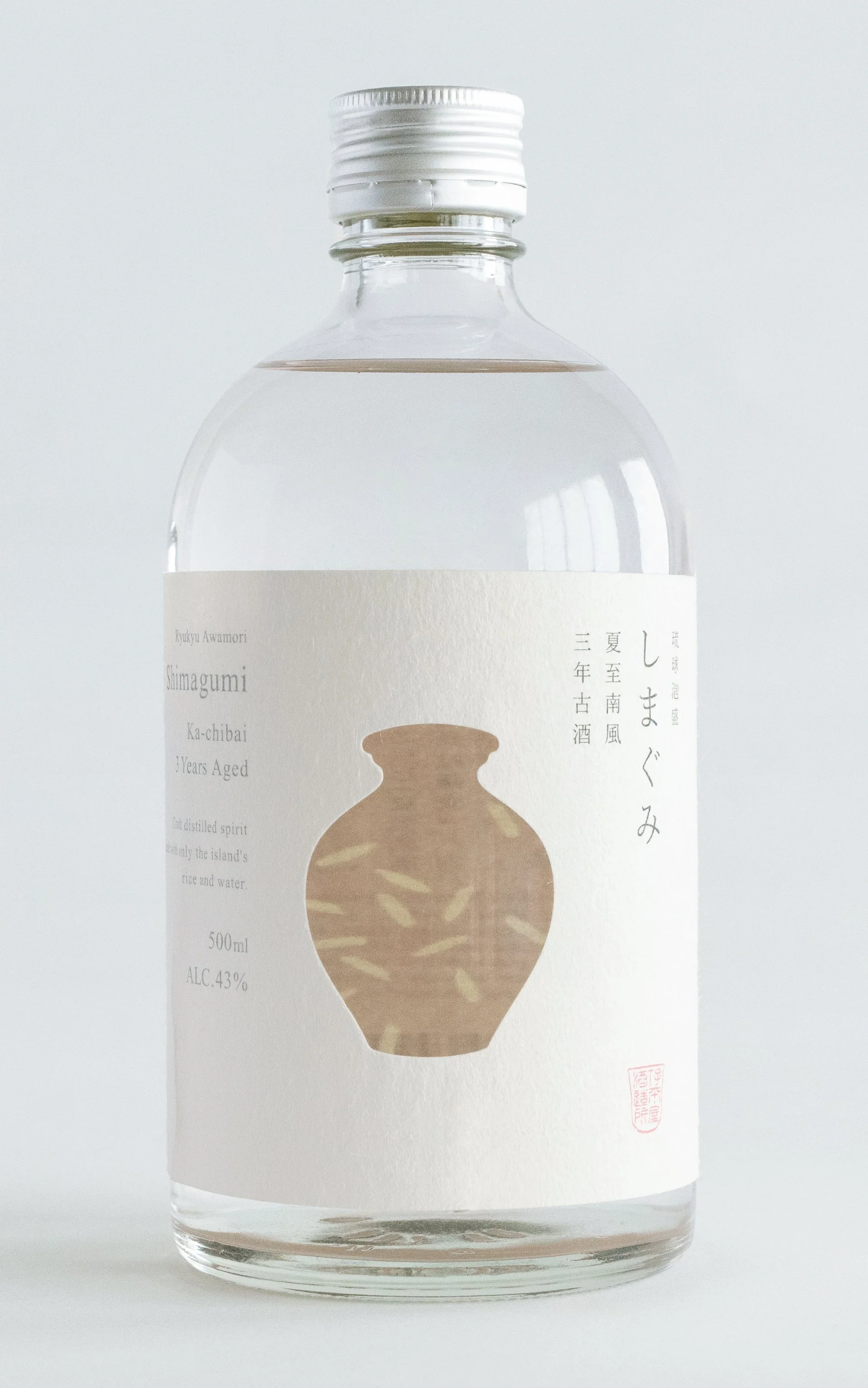
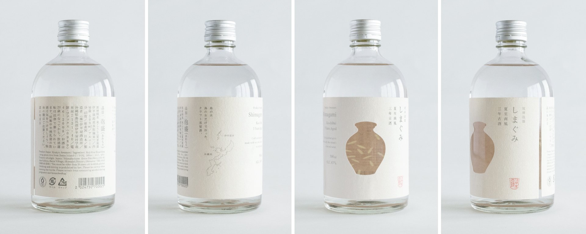
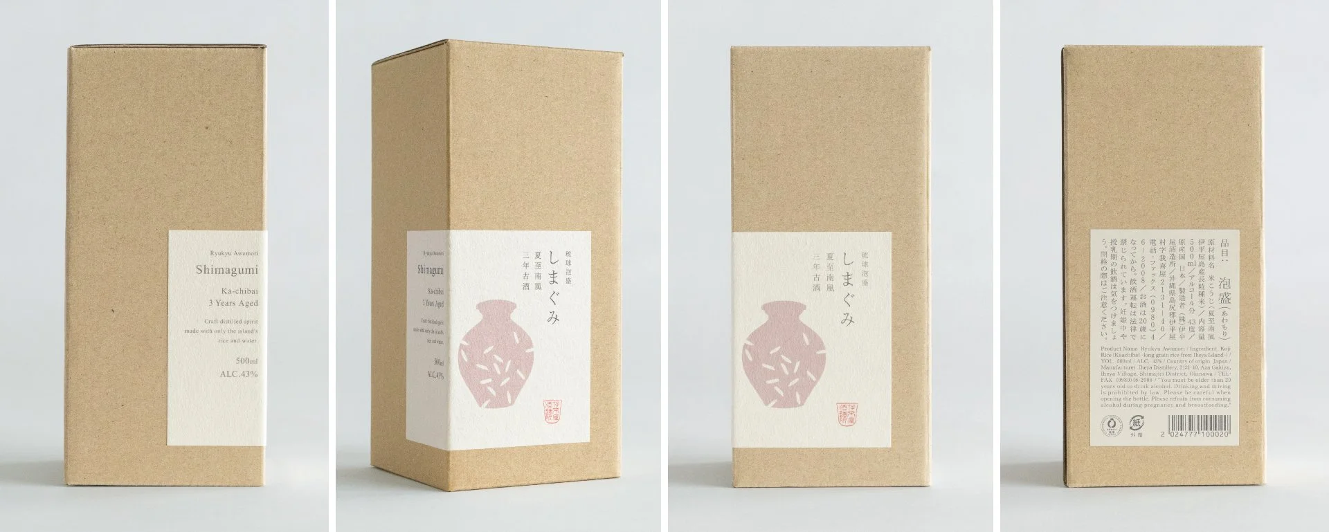
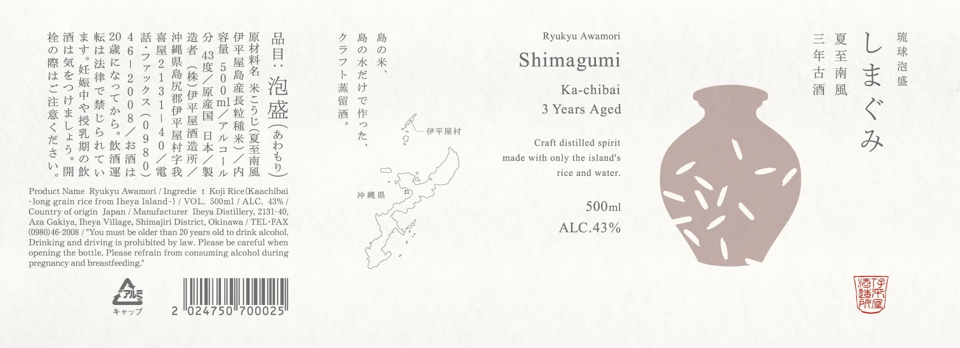
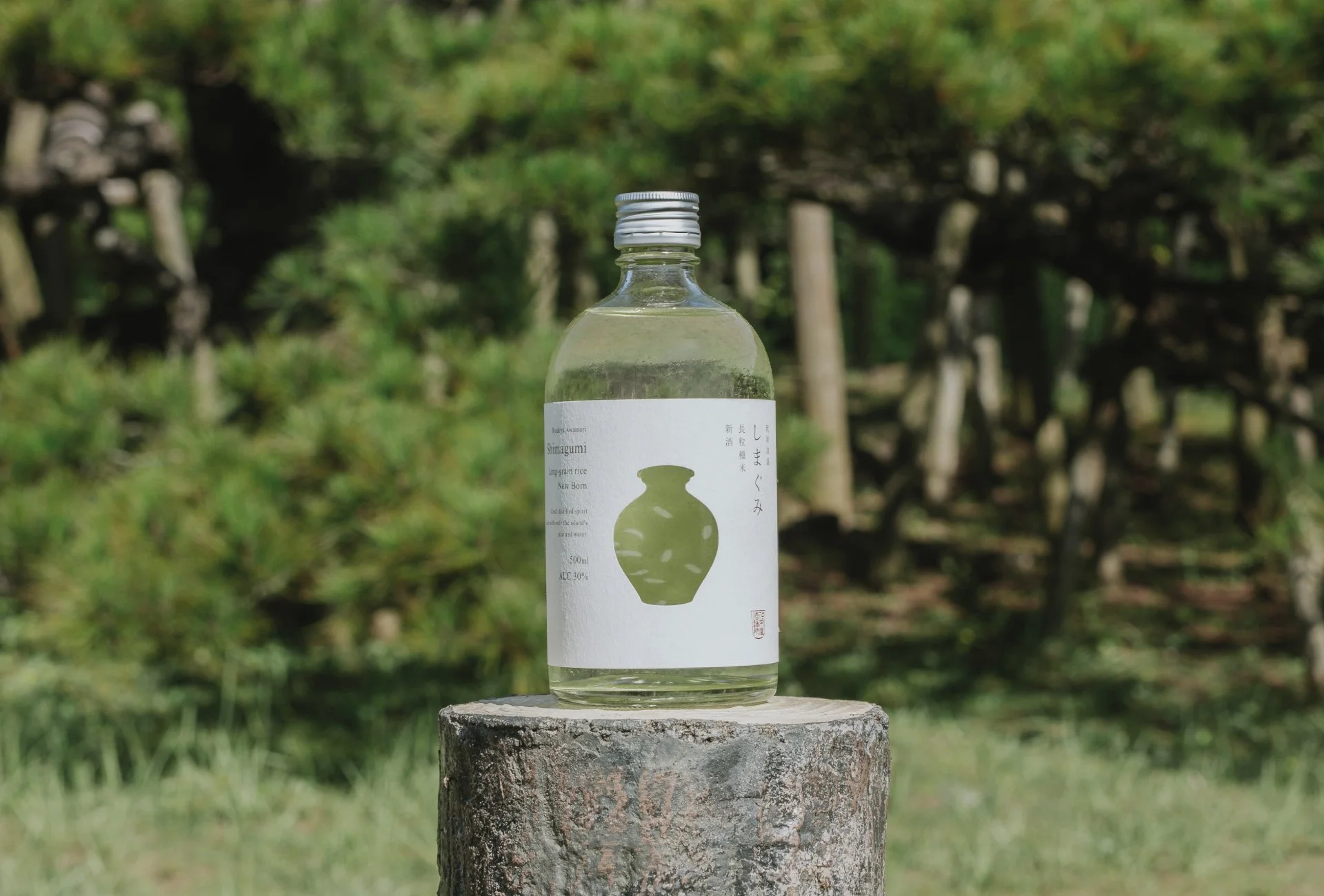
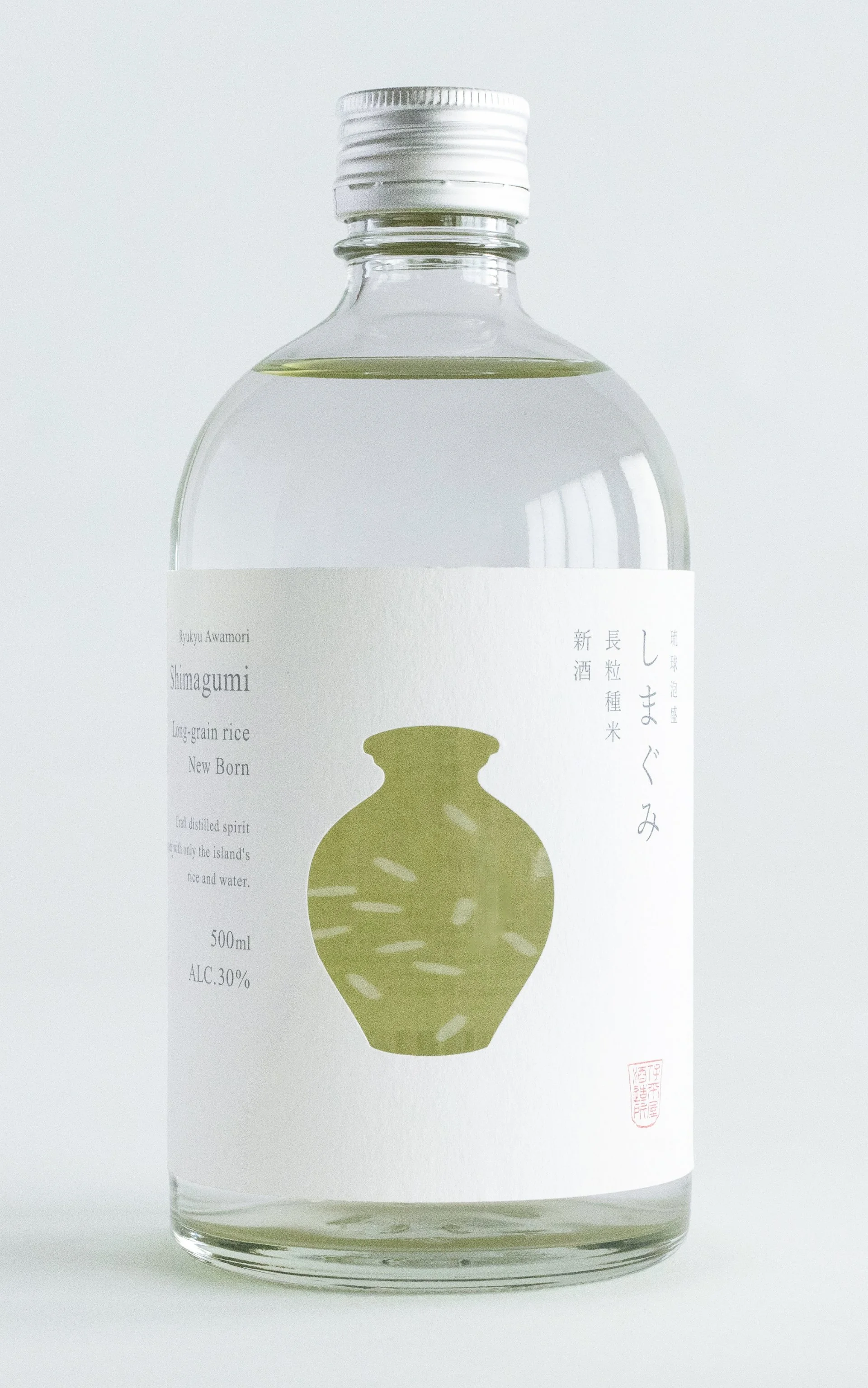
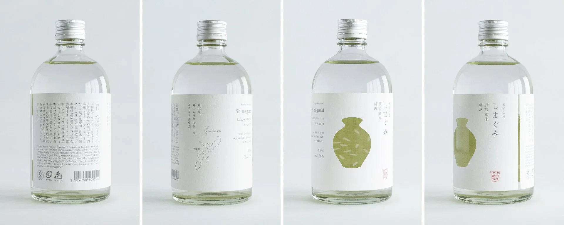
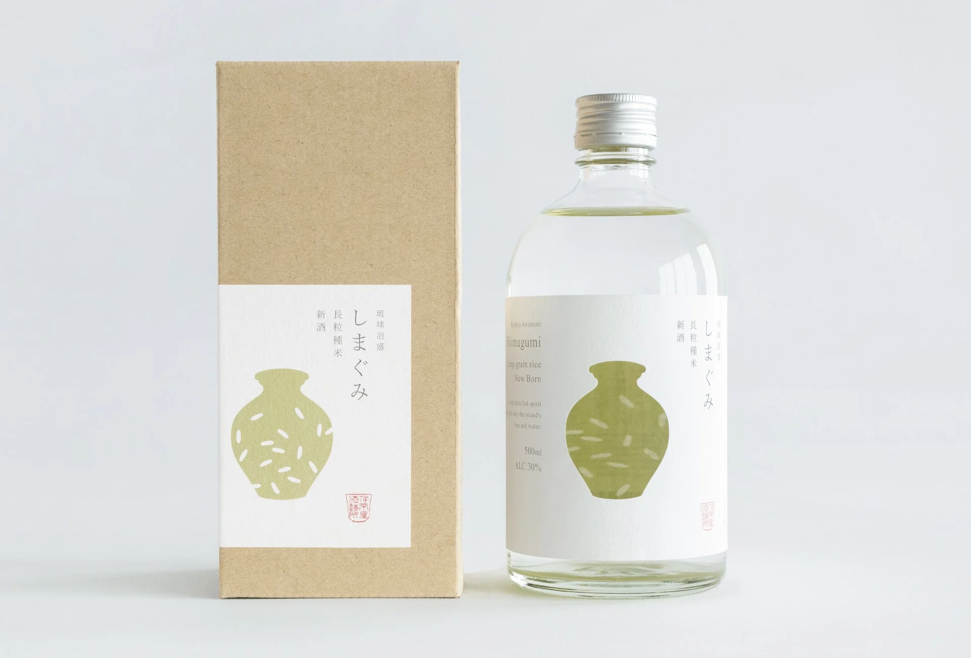
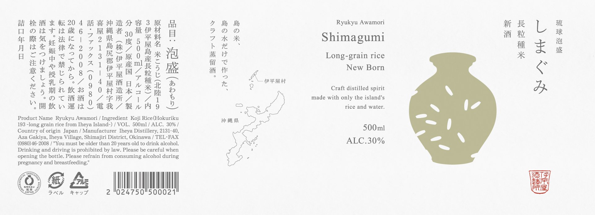
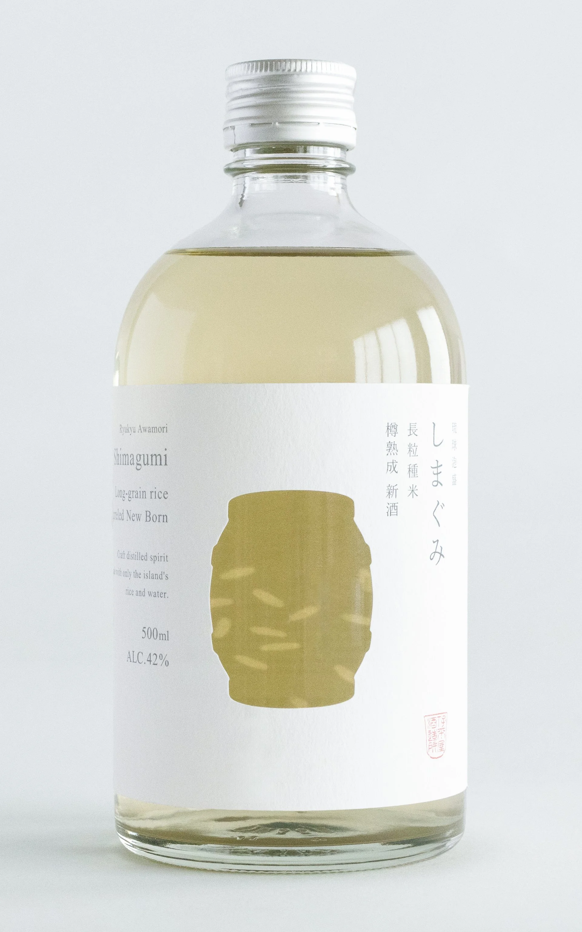
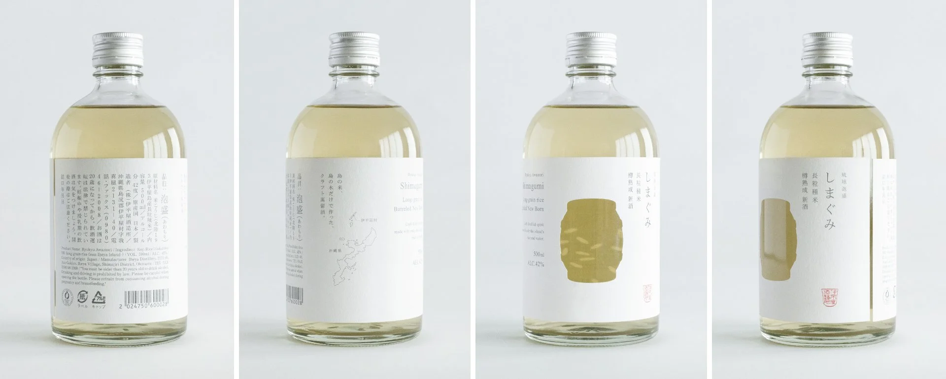
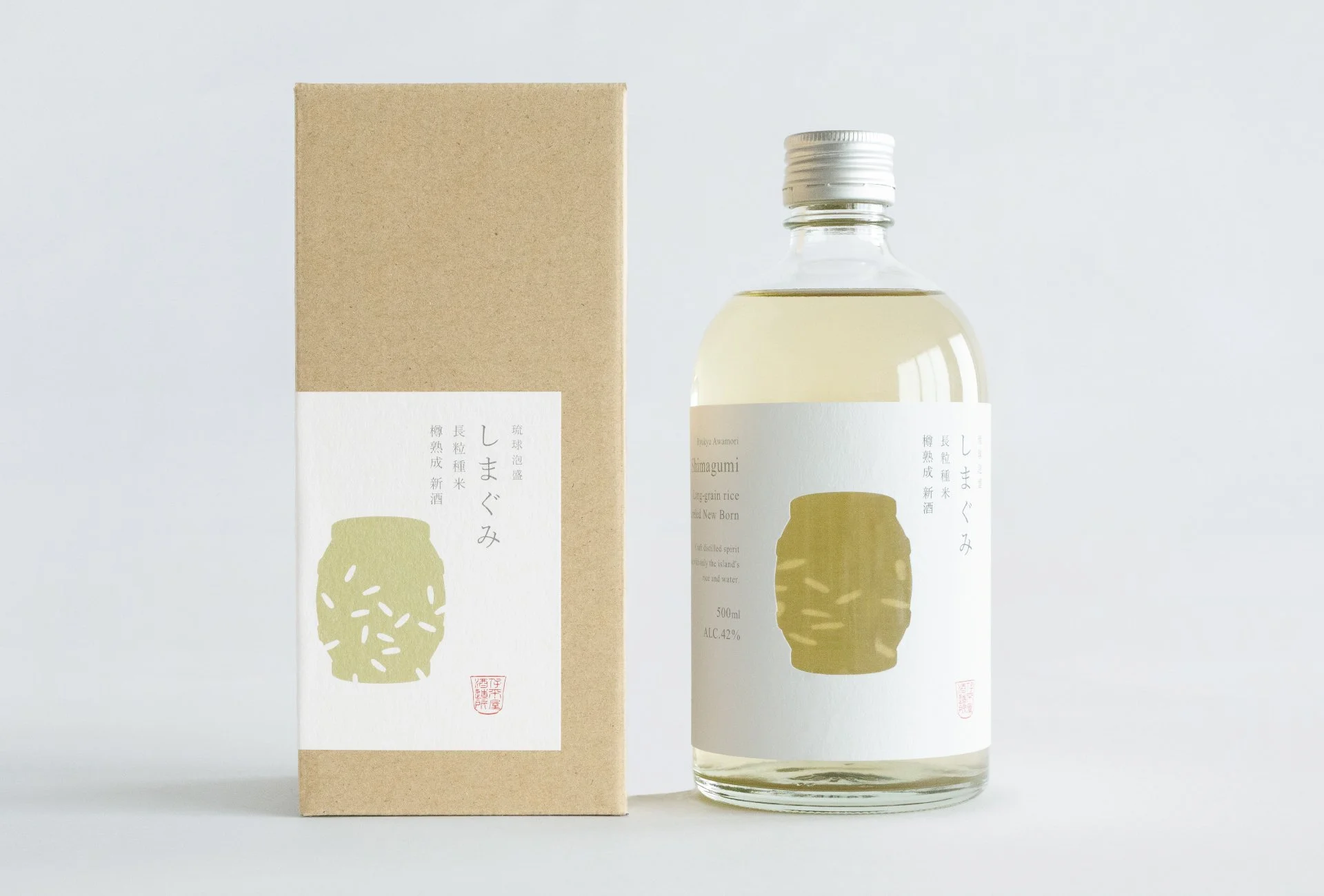
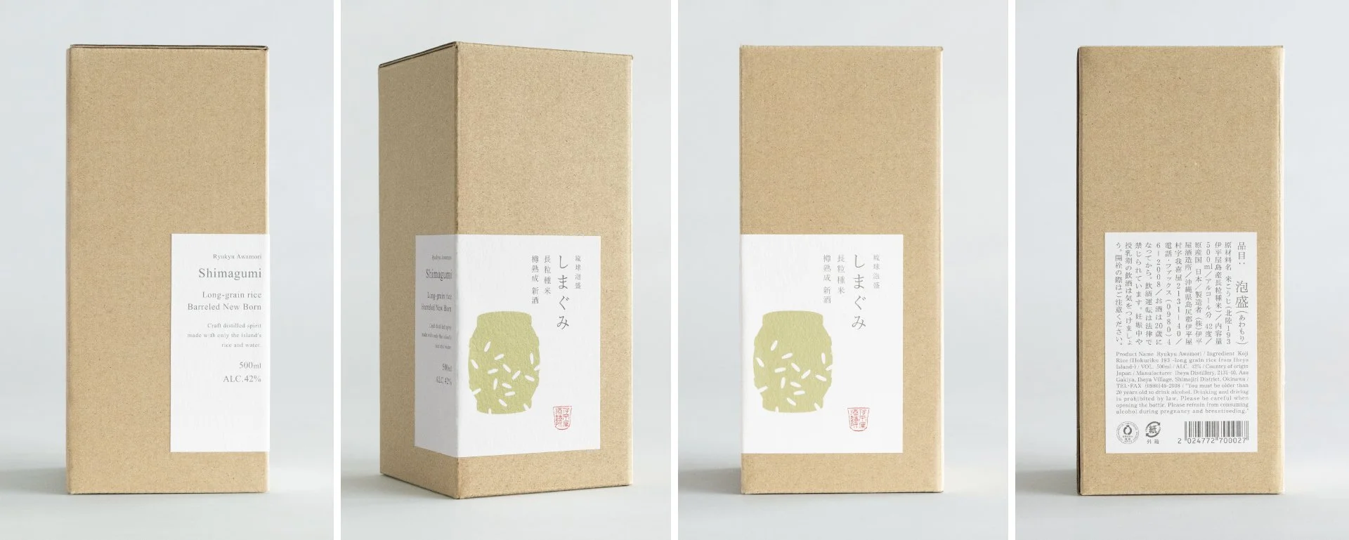
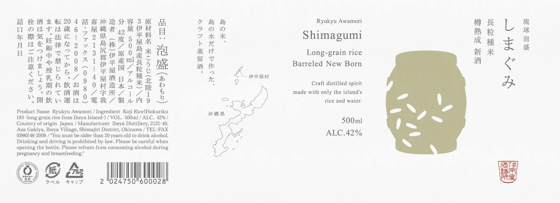
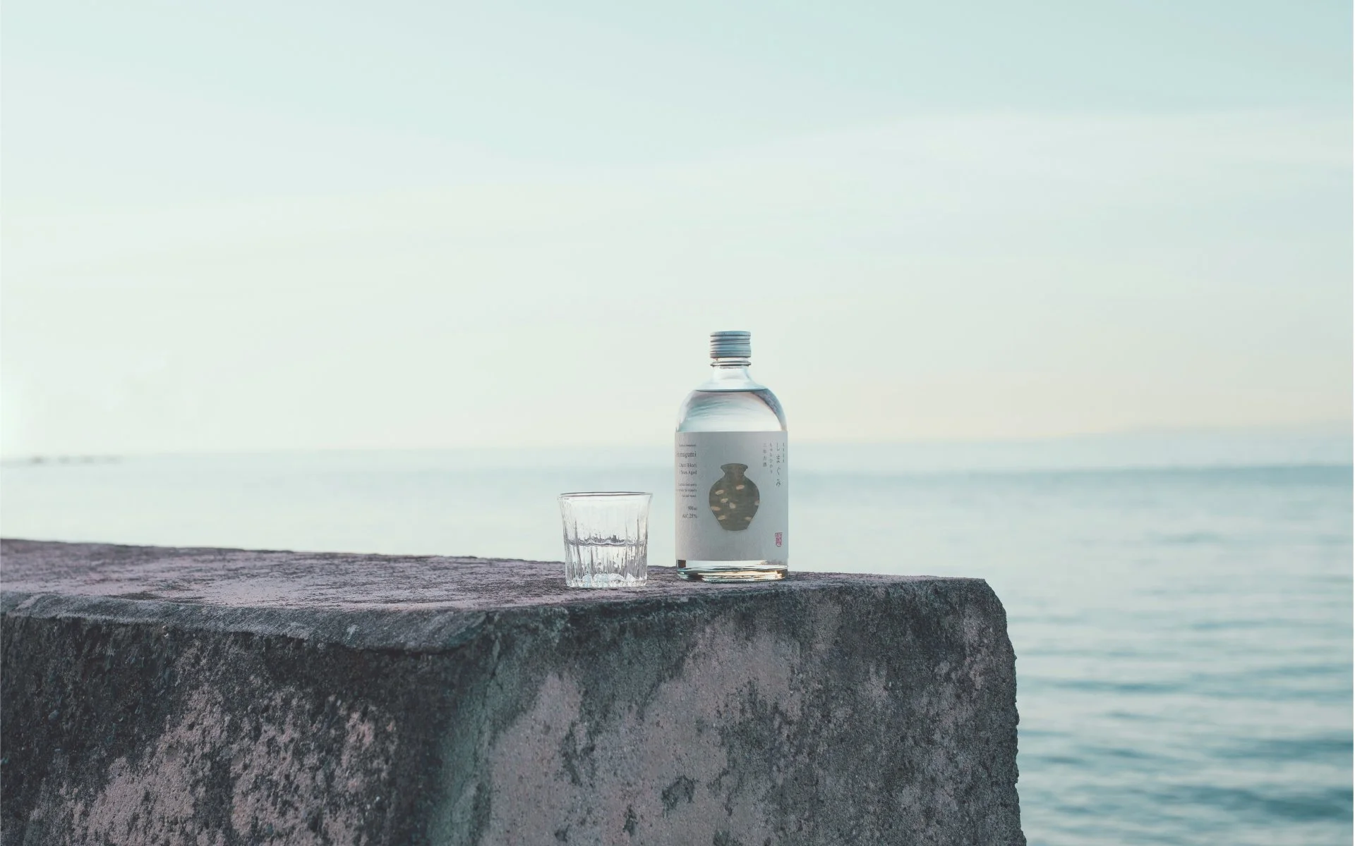
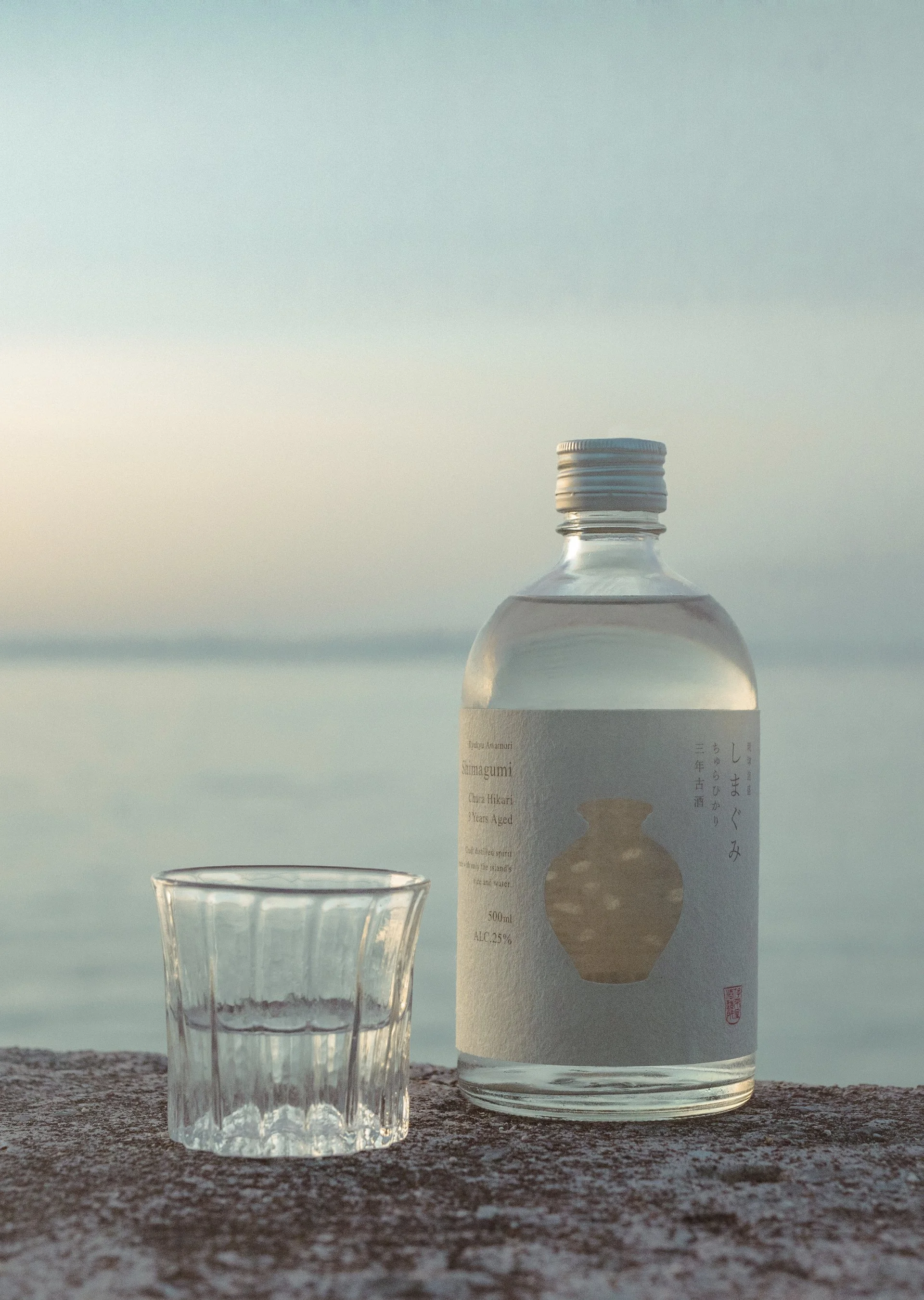
The project rethinks awamori packaging as a perceptual interface. A 360-degree wraparound label is die-cut in the shape of a traditional kame jar, transforming the silhouette into a viewing device. Looking through the cutout reveals magnified rice silhouettes generated by the optical interaction of glass and liquid, making the spirit’s defining ingredient directly perceptible.
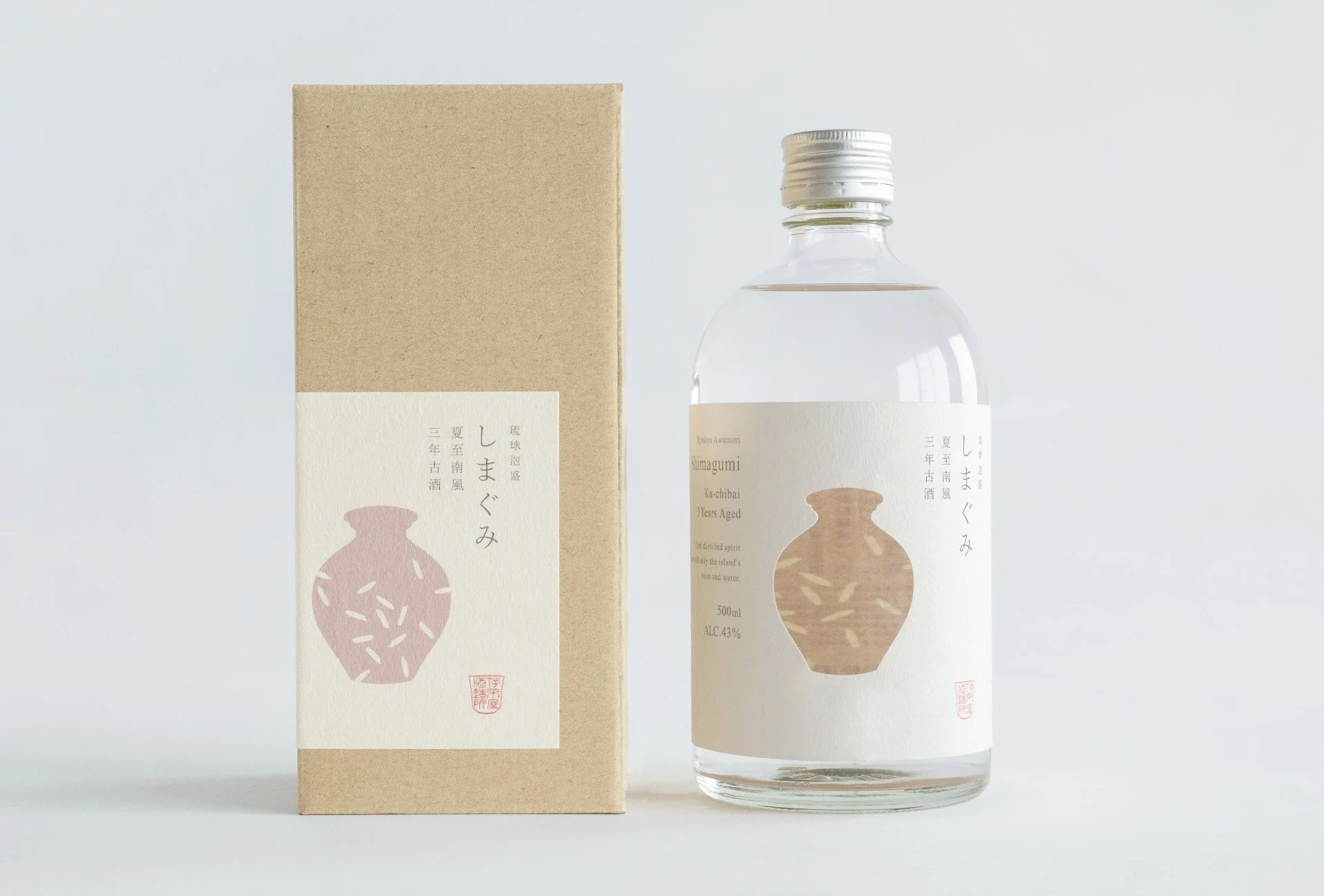
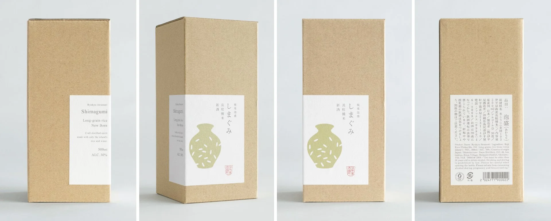
Typography, whitespace, and hierarchy were deliberately restrained to reduce visual noise, while a modular visual system differentiates variants through subtle shifts in color, rice silhouette, paper tone, and tactility. Rather than relying on nostalgic or rustic symbolism, the design creates a quiet yet immediate presence, reshaping how awamori is recognized within contemporary retail and gifting contexts.
米と甕が重なり、泡盛の輪郭が浮かび上がる
沖縄本島北西に位置する伊平屋島の伊平屋酒造が手がけるクラフト泡盛「しまぐみ」のブランディング。「しまぐみ」は、沖縄の言葉で「米」を意味する「ぐみ」に由来し、文字通り「島の米」を意味します。
本プロジェクトでは、泡盛のパッケージを単なる装飾ではなく、知覚のインターフェースとして再設計しました。甕の輪郭をかたどった切り抜きを備えた360度巻きラベルは、覗き窓として機能し、ガラスと液体の光学作用によって拡大された米のシルエットを浮かび上がらせます。印象的なアイキャッチであると同時に、泡盛が米から生まれる蒸留酒であることを直感的に伝える仕組みです。
タイポグラフィ、余白、情報階層は意図的に抑制し、色、米のシルエット、紙質、手触りの違いによってシリーズを展開しました。郷愁的な沖縄表現に依存せず、静かでありながら即時性のある存在感を構築することで、現代の店頭やギフト文脈における泡盛の見え方を更新しています。
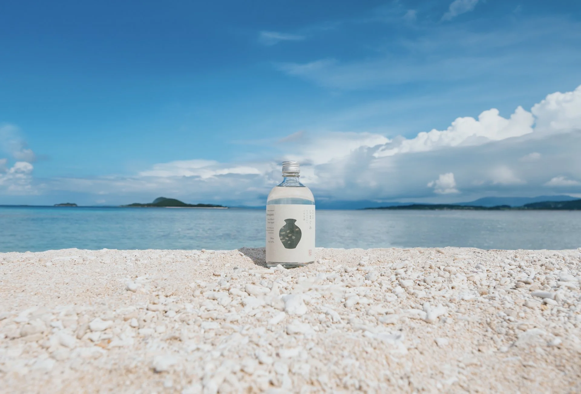
Bottle
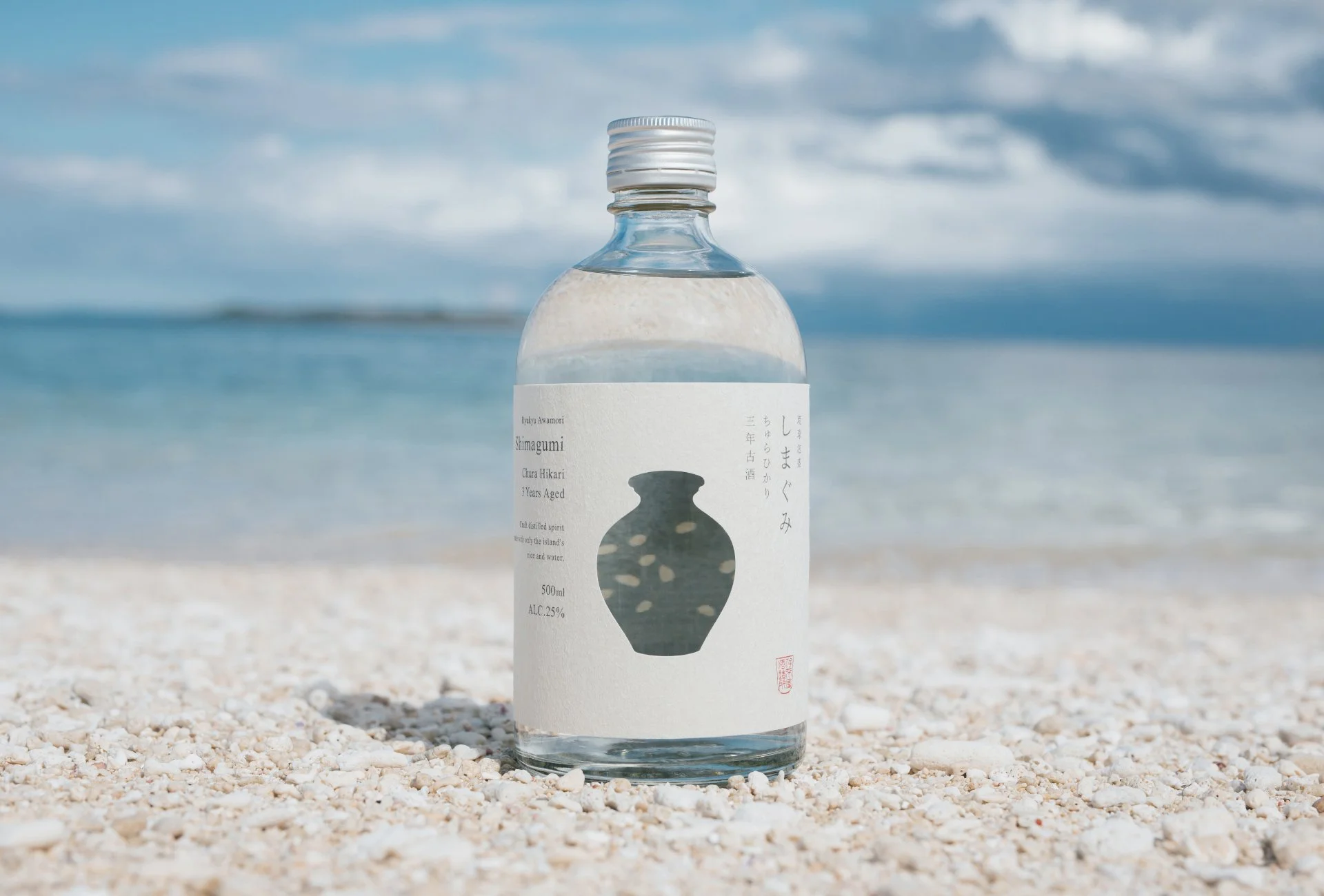
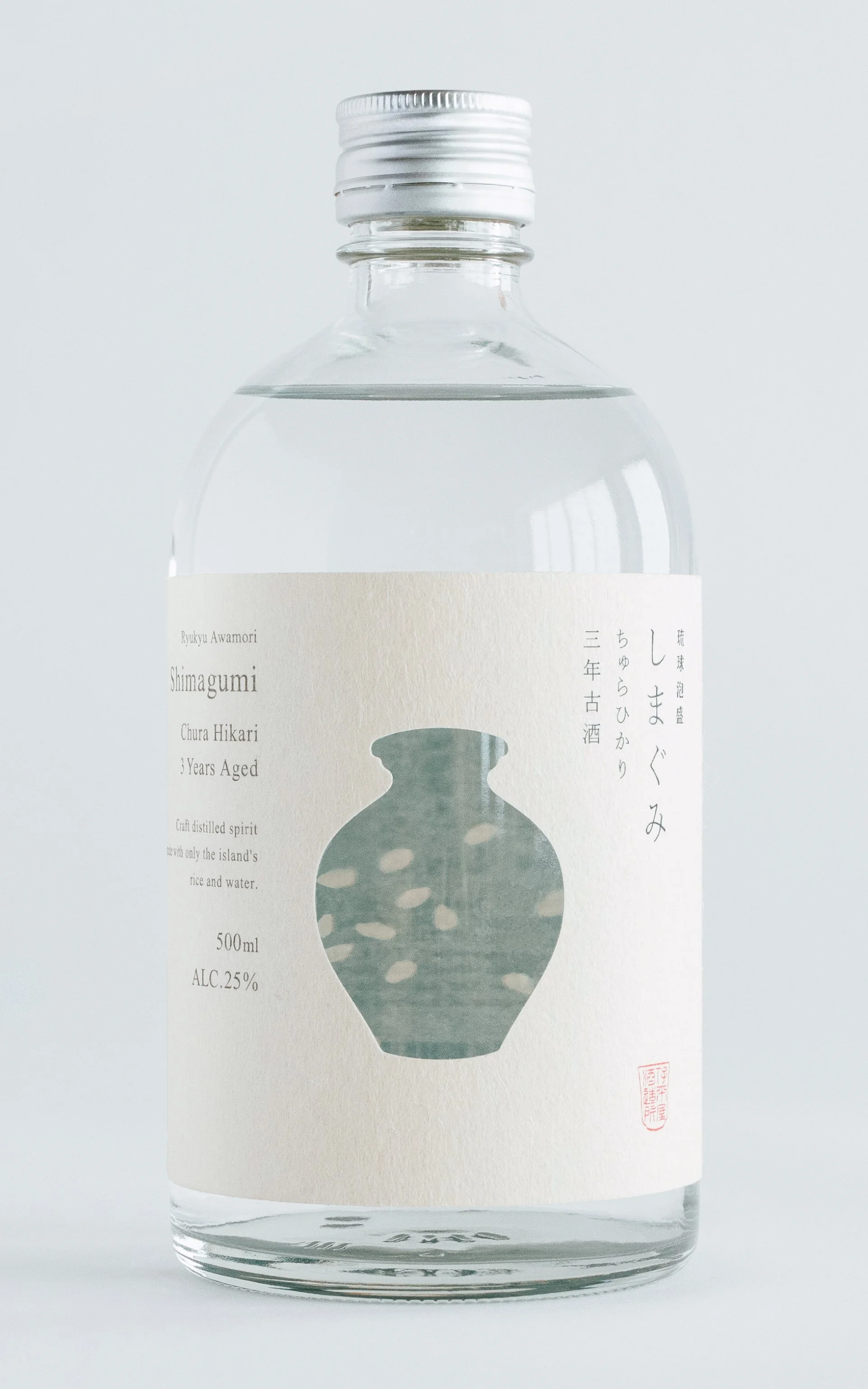
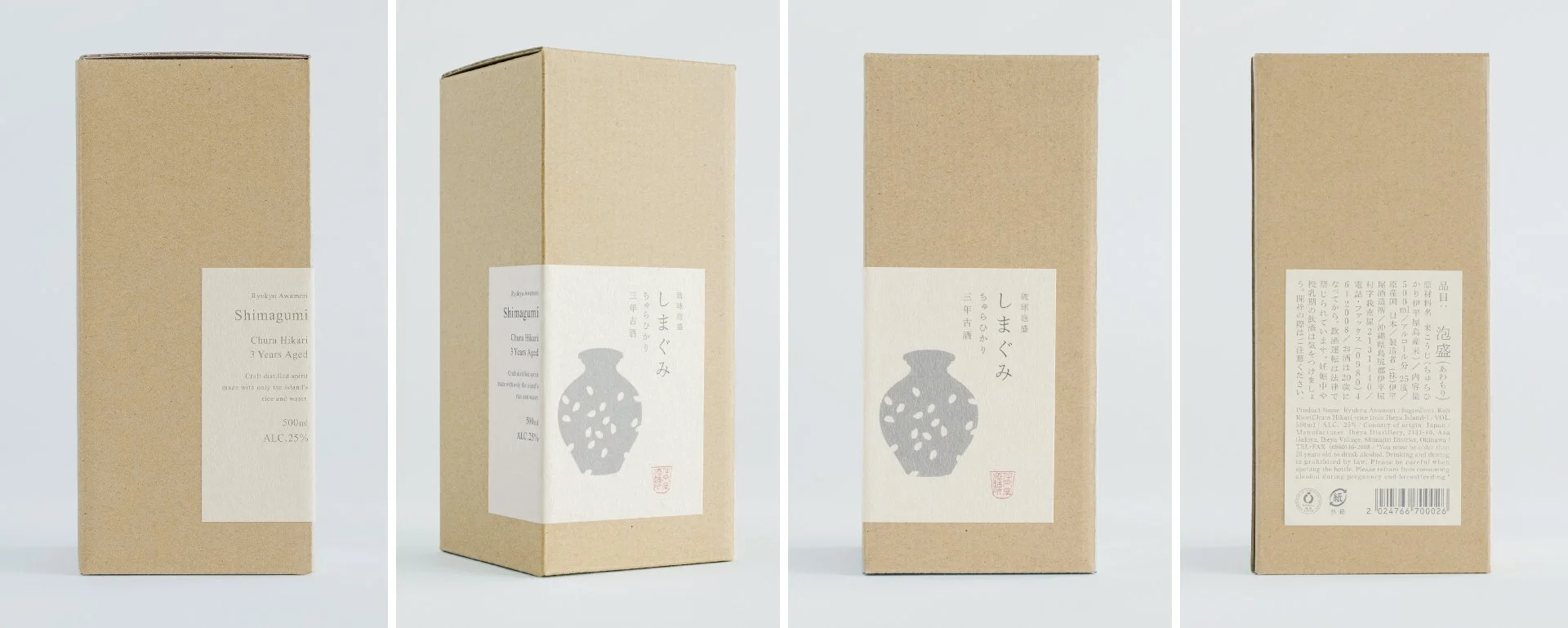
Box
Bottle&Box
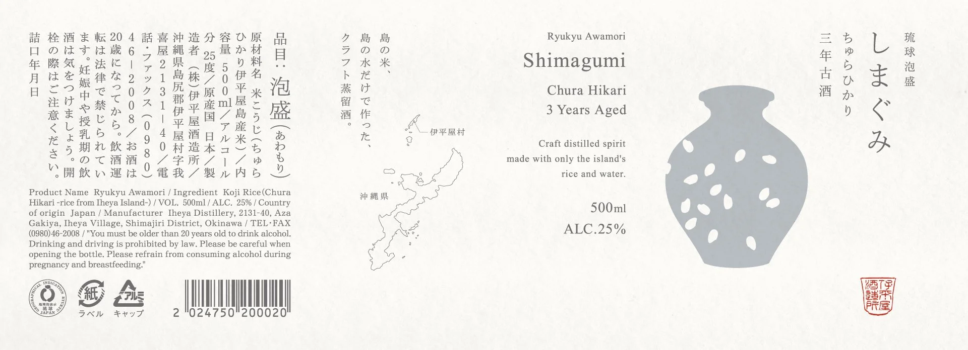
Bottle Label
Poster

Client:
Koshimeijo Co., Ltd. / Imadeya Co., Ltd.
Credits:
Creative Director: Yoshinaka Ono (ORBIT)
Art Director: Yoshinaka Ono (ORBIT)
Designer: Ryota Sugahara (SORA)
Planning Director: Yuichiro Kojima (IMADEYA)
Photographer: Kosuke Arai (IMADEYA)