Smart Exchange
Logo
Immediate Recognition, Public Confidence
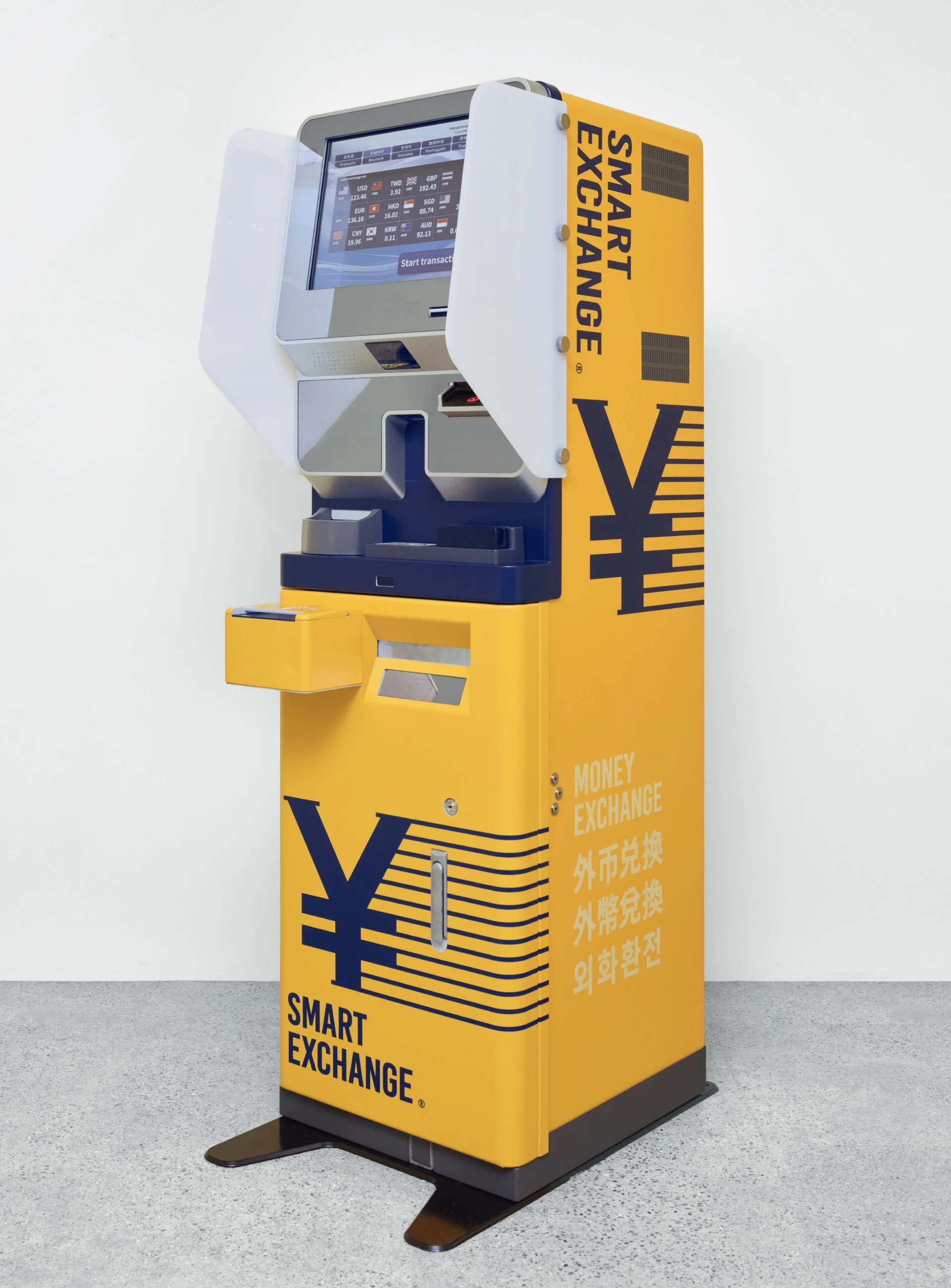
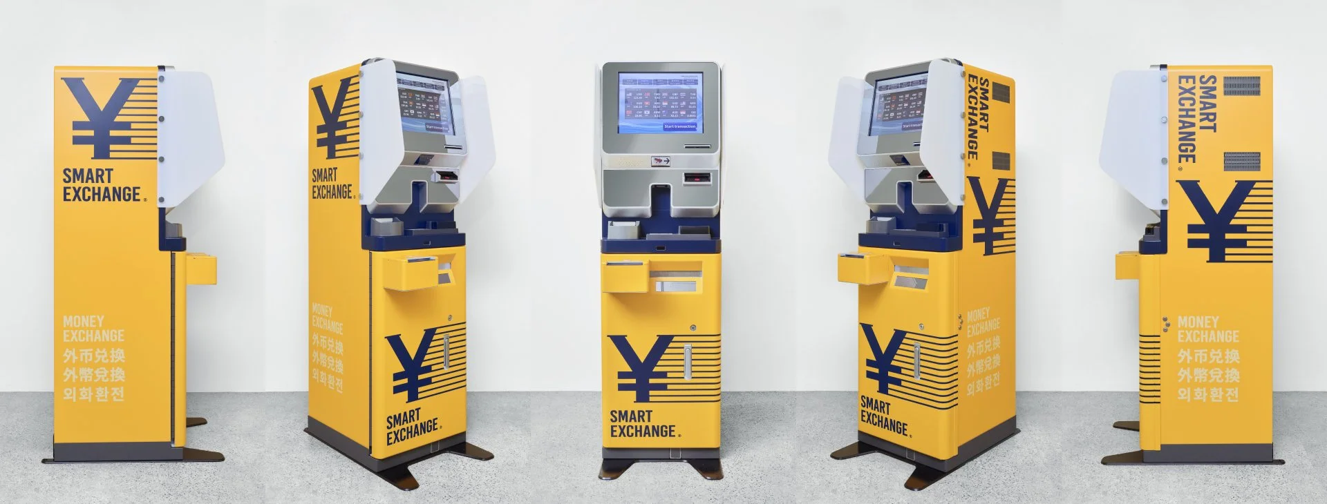
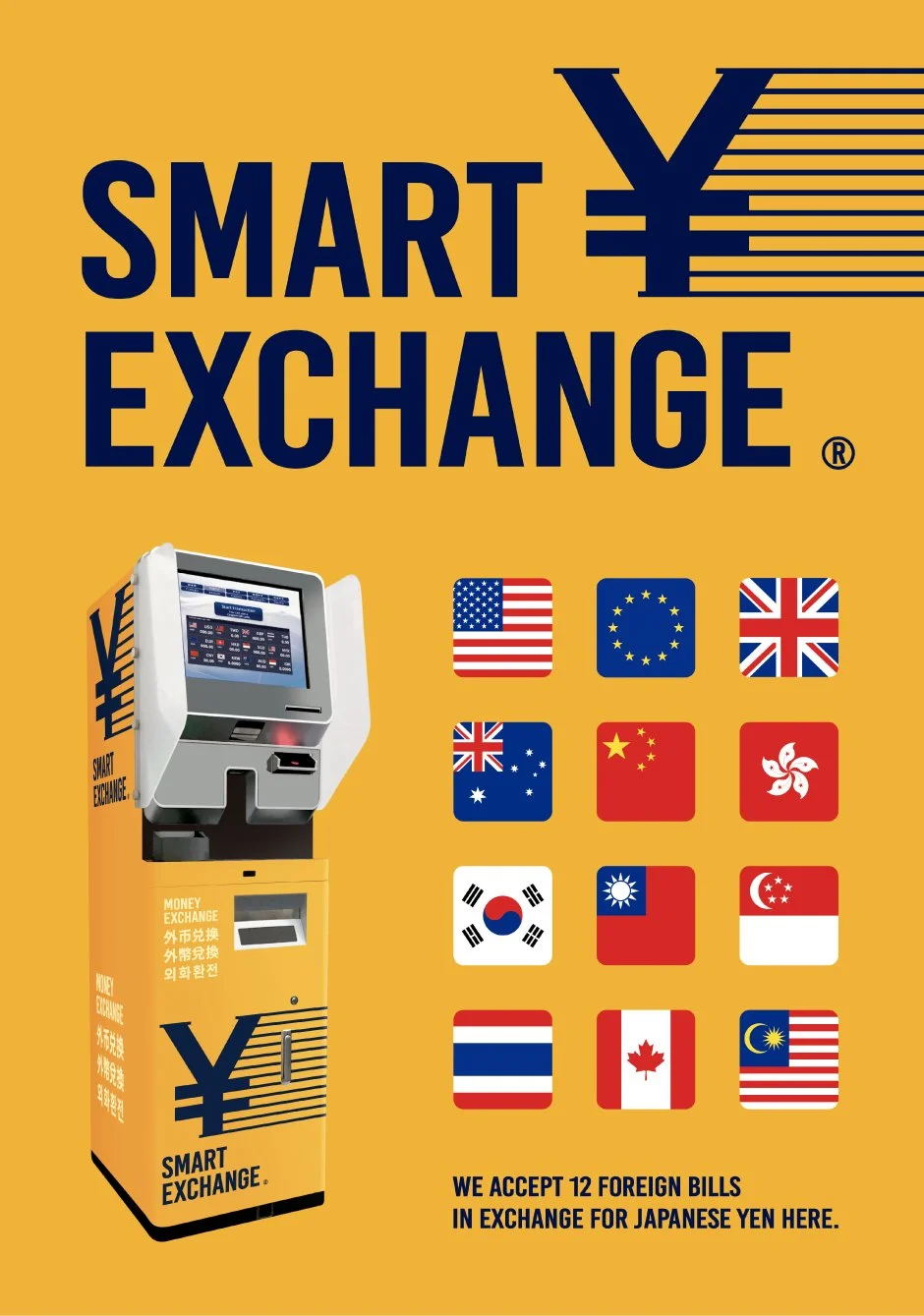
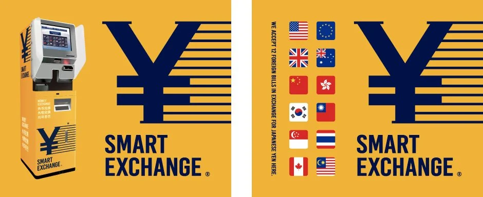
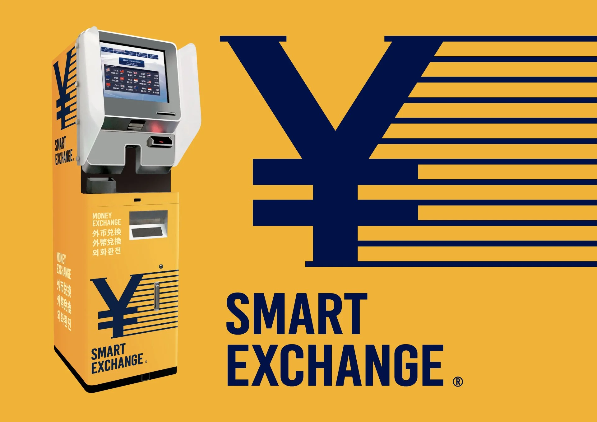
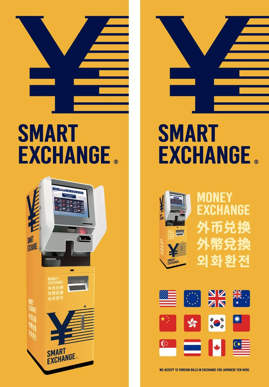
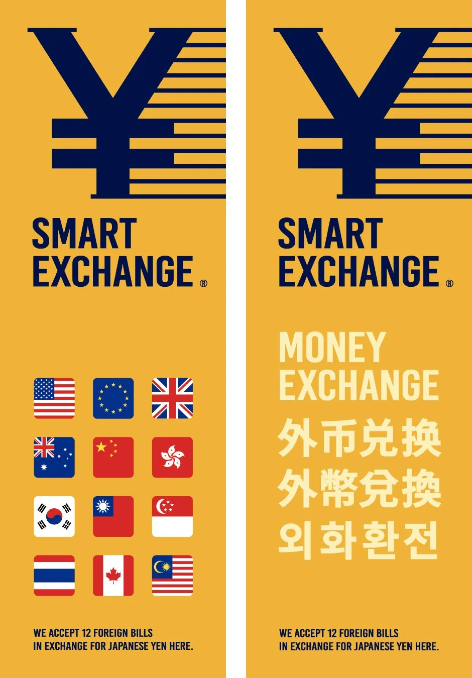
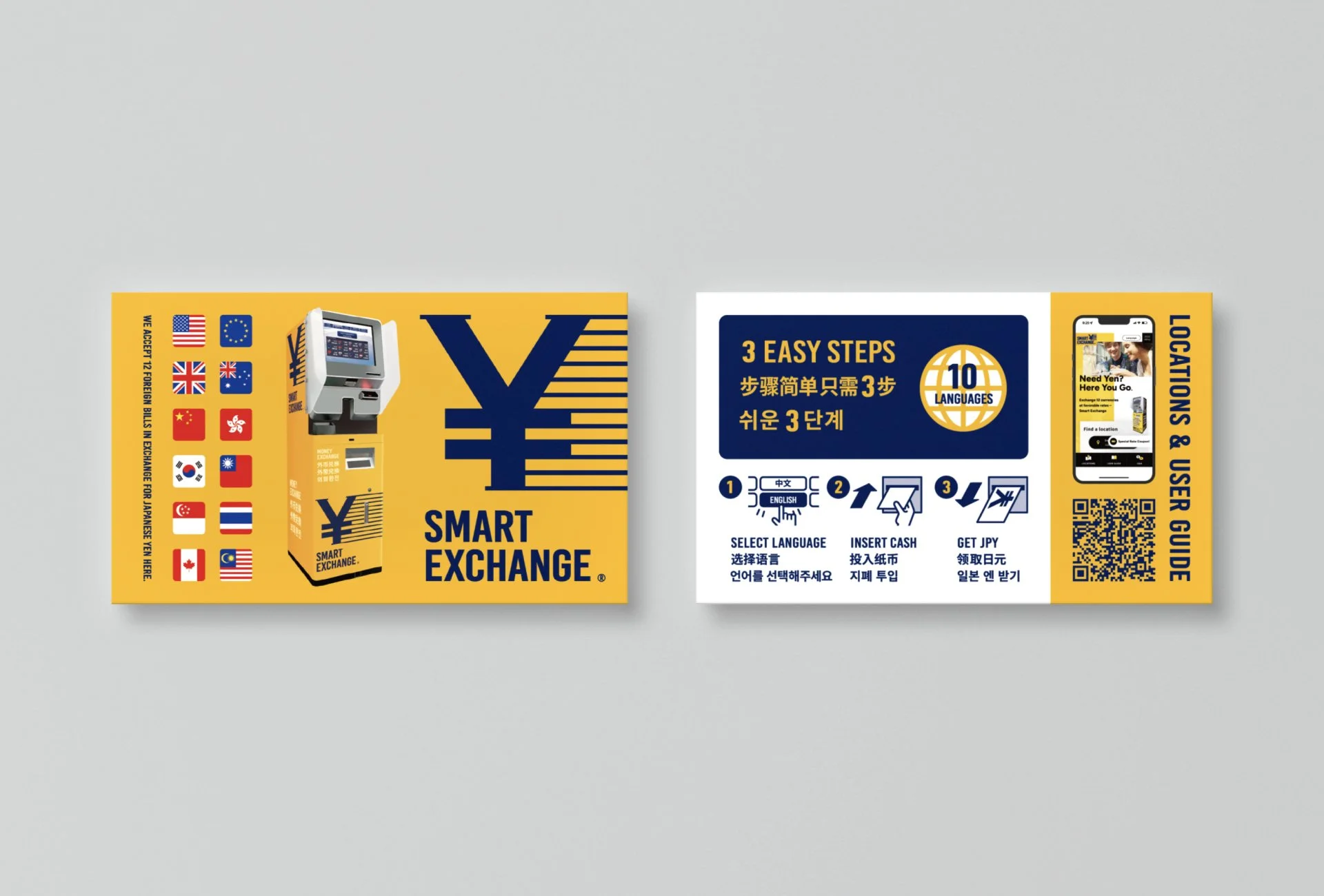
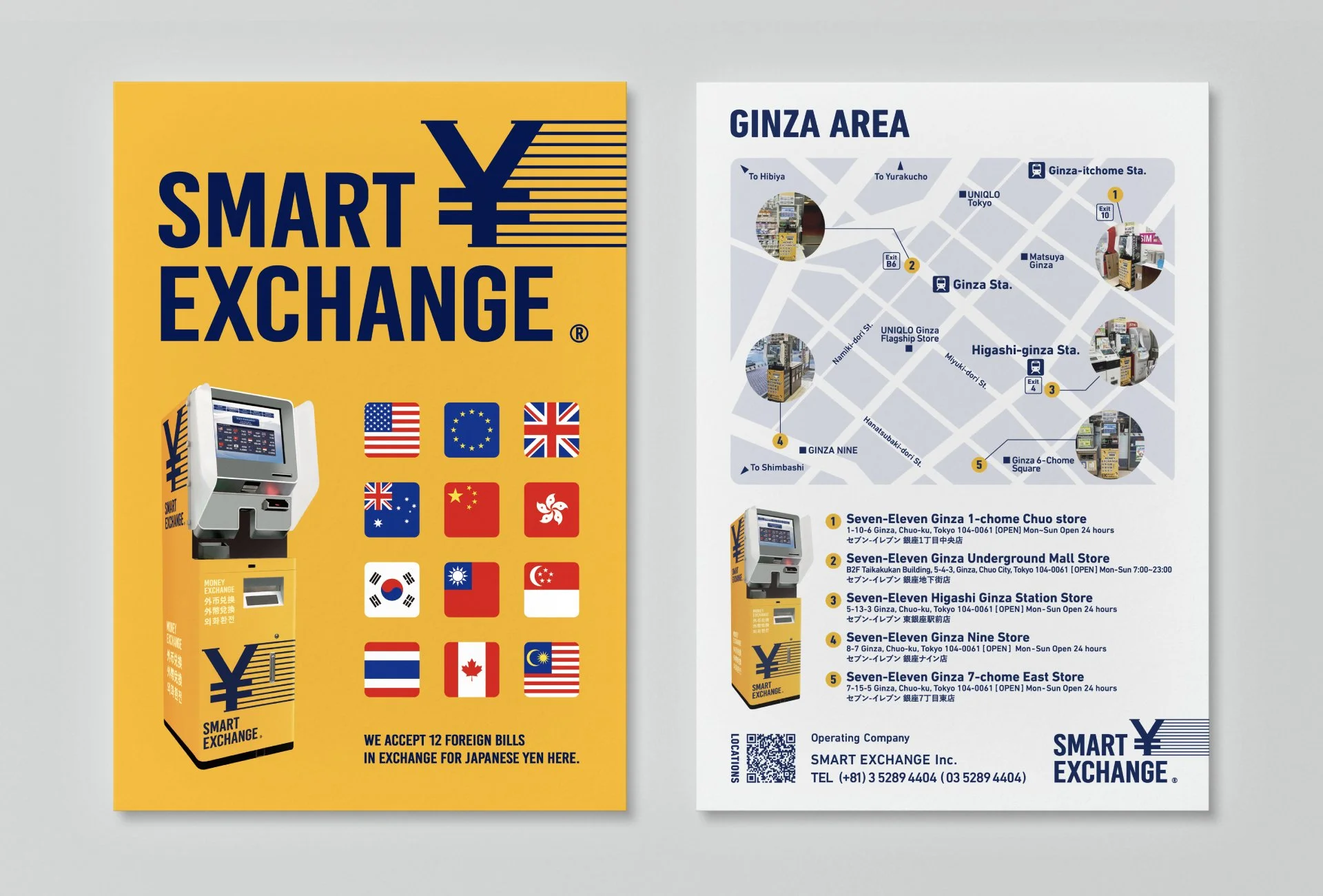
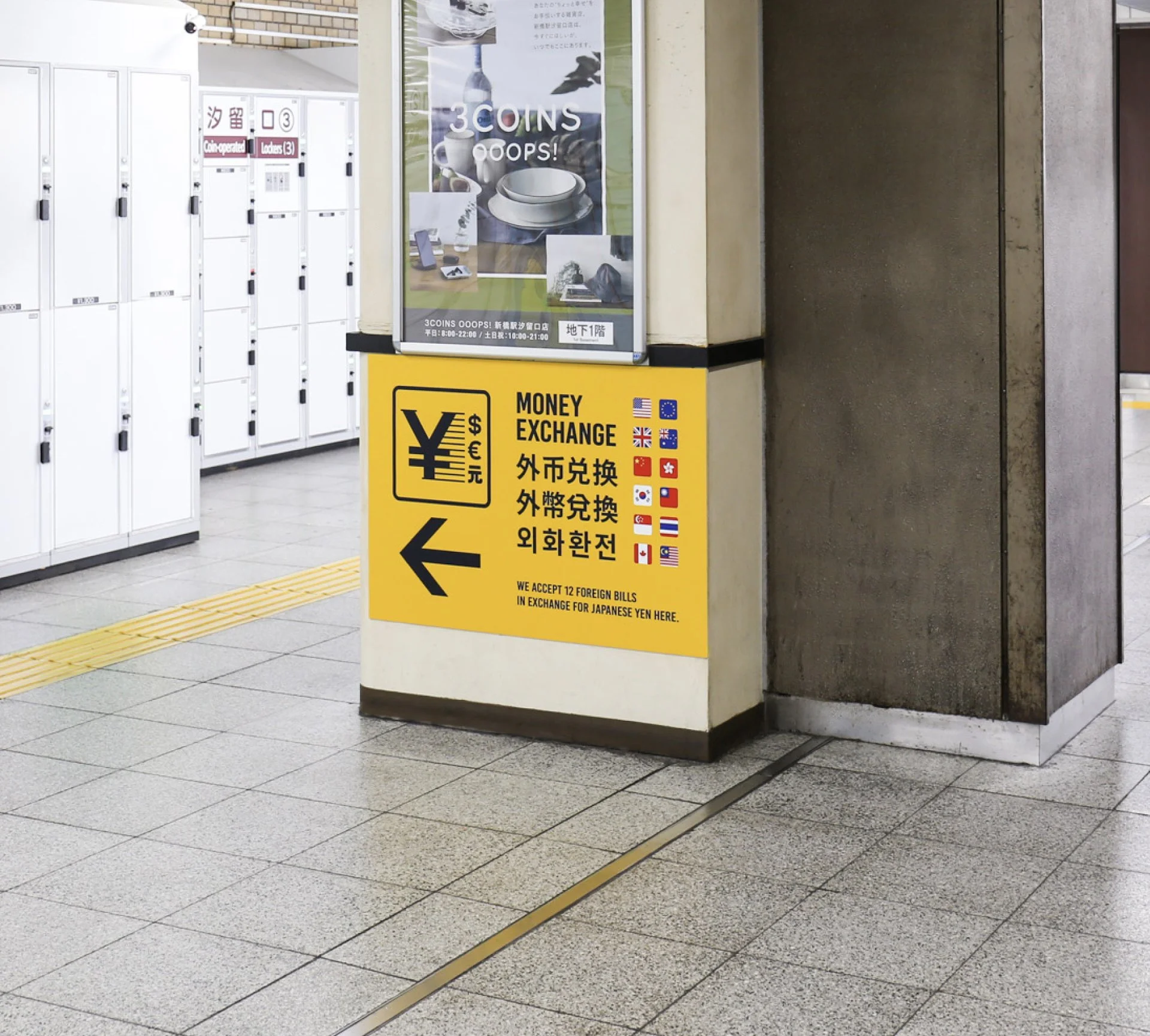
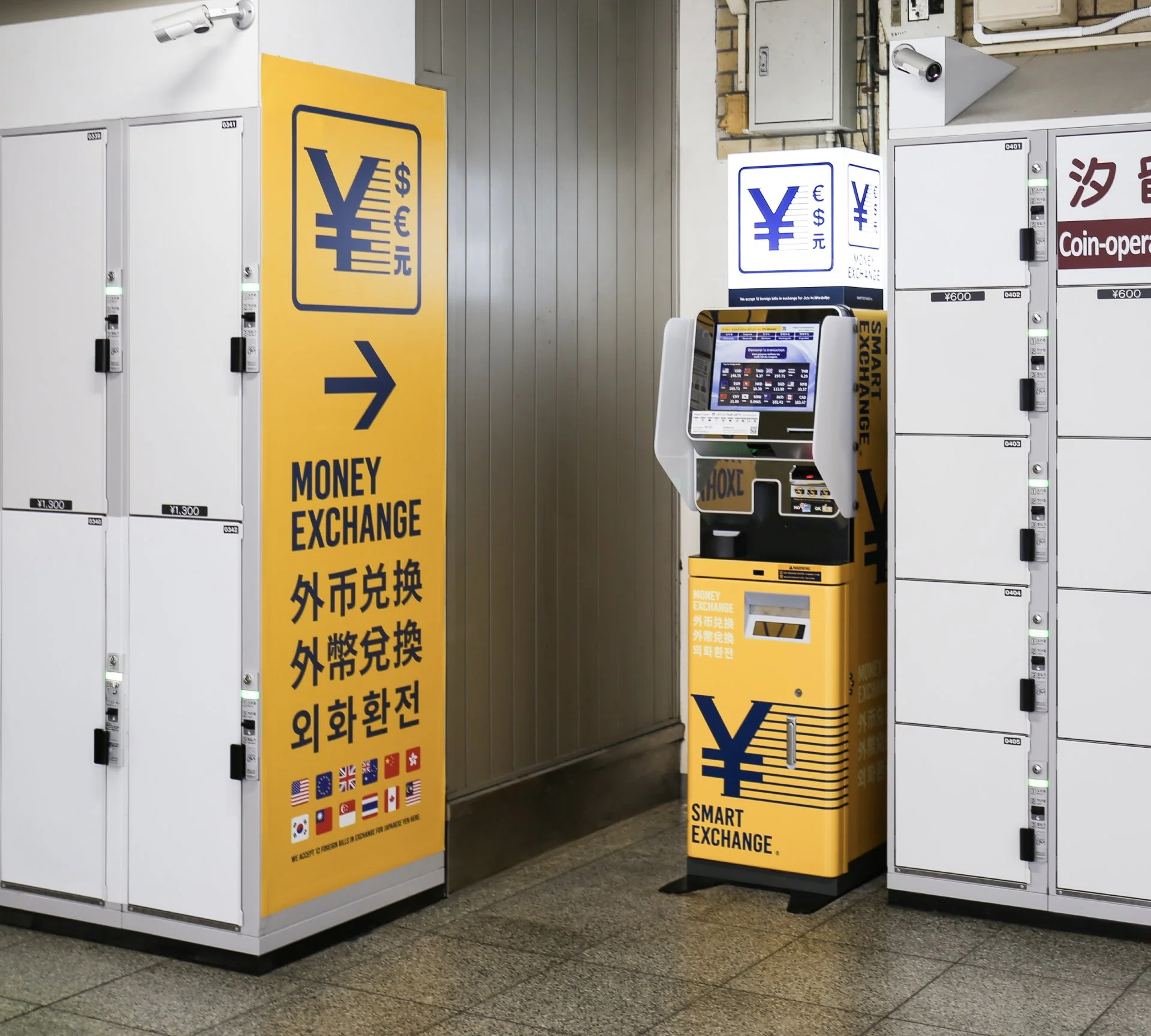
With inbound tourism on the rise, over 650 “SMART EXCHANGE” currency exchange machines have been installed nationwide. Placed along major travel pathways—stations, airports, hotels, and commercial facilities—they address the common need for “I need Japanese yen right now” by supporting 10 languages and 12 currencies.
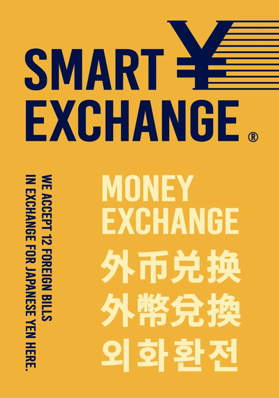
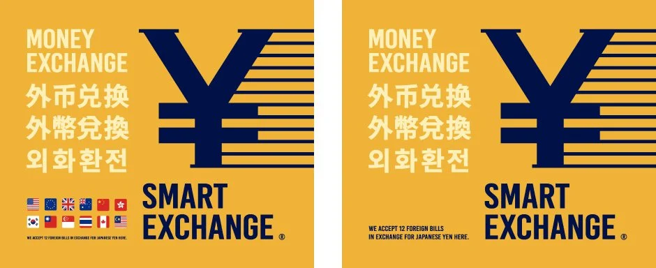
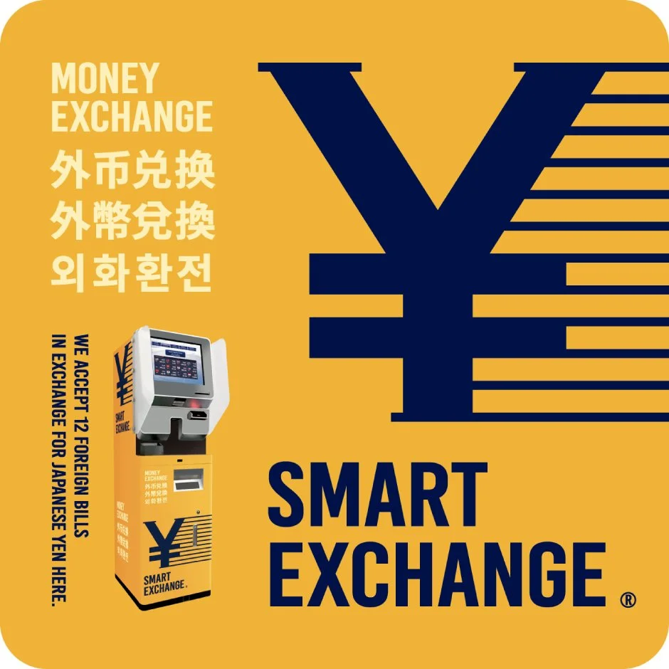
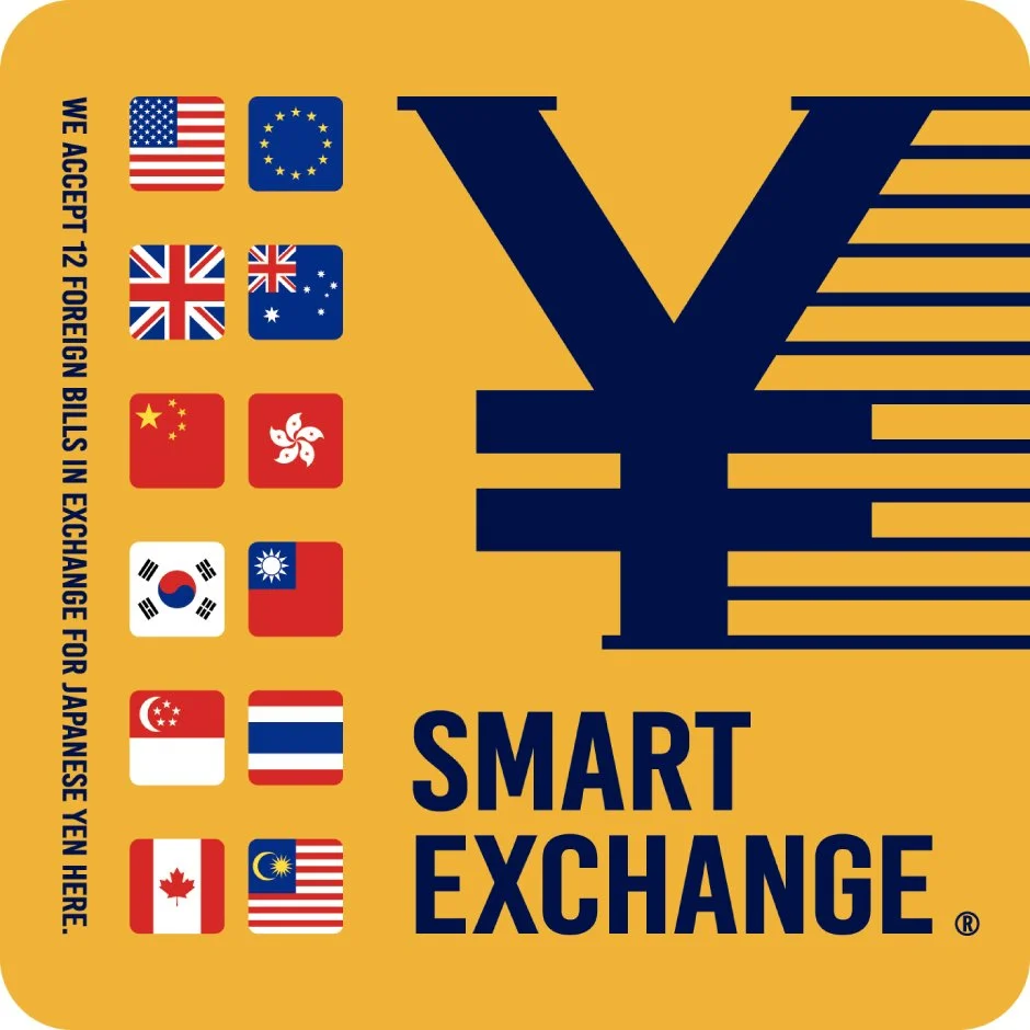
The core of the design is a swiftly sliding “¥” symbol that directly conveys immediate access to Japanese yen. A highly legible sans-serif logotype, shaped in a tall and sharp silhouette, reinforces the sense of speed and aligns with the name “SMART.”
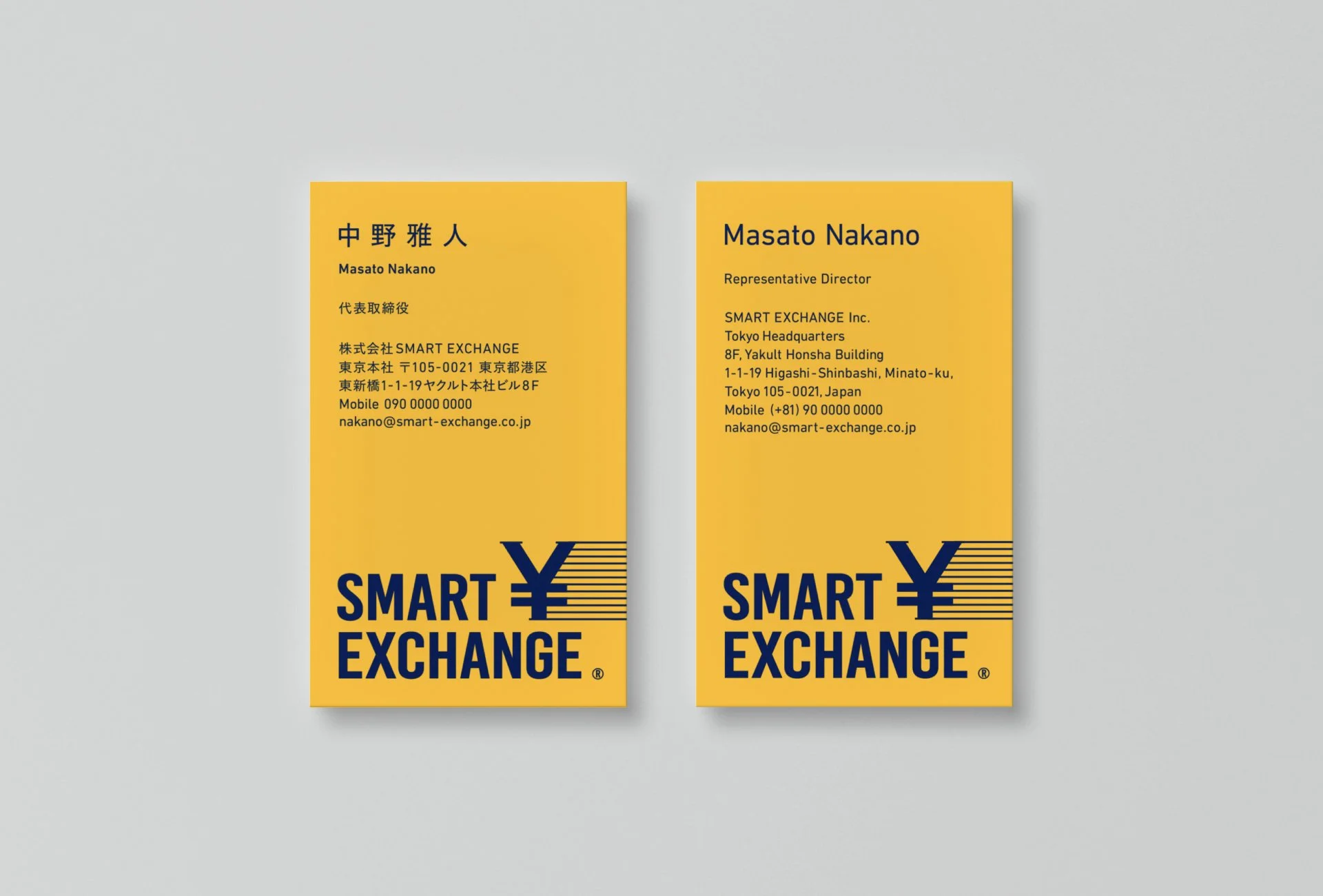
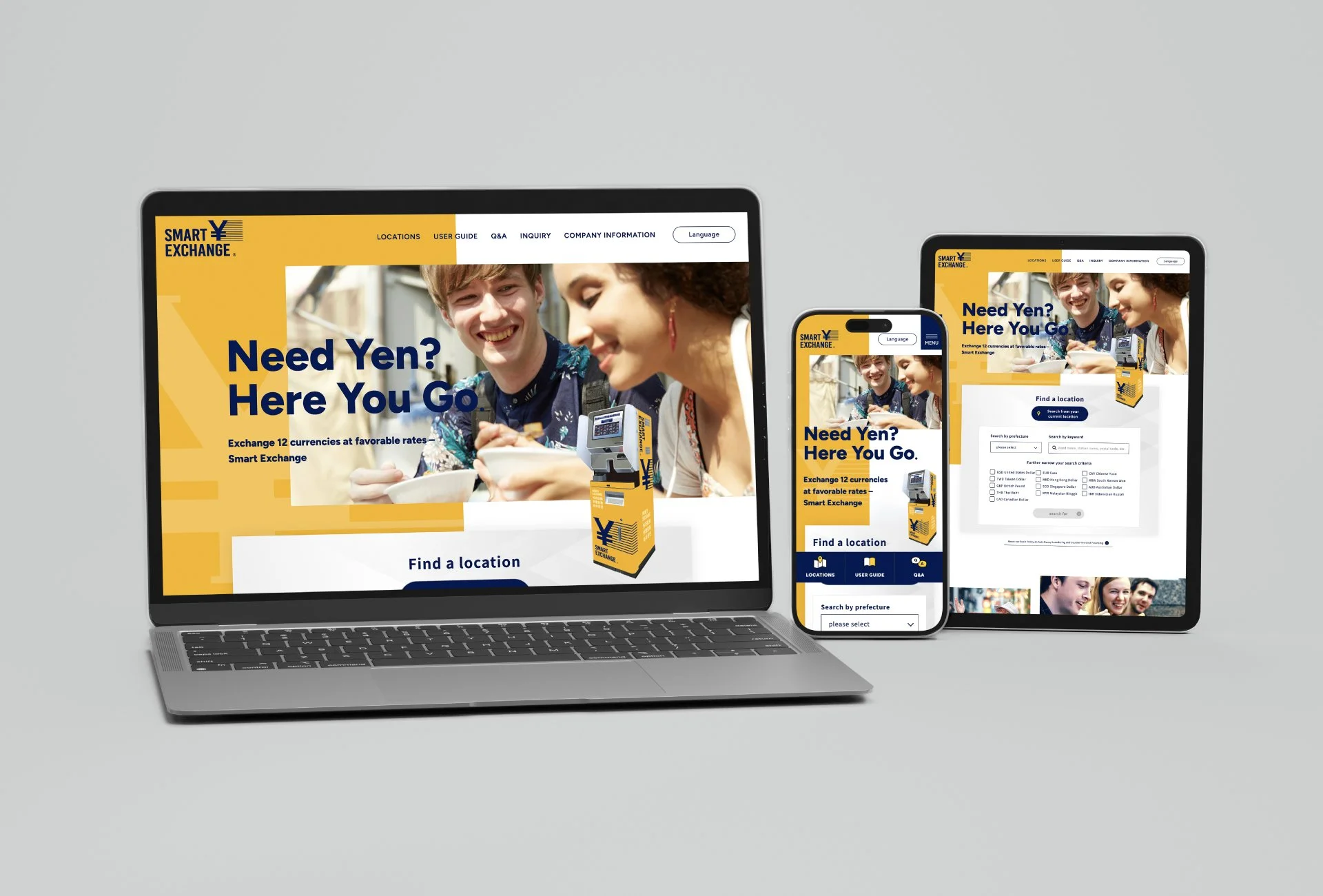
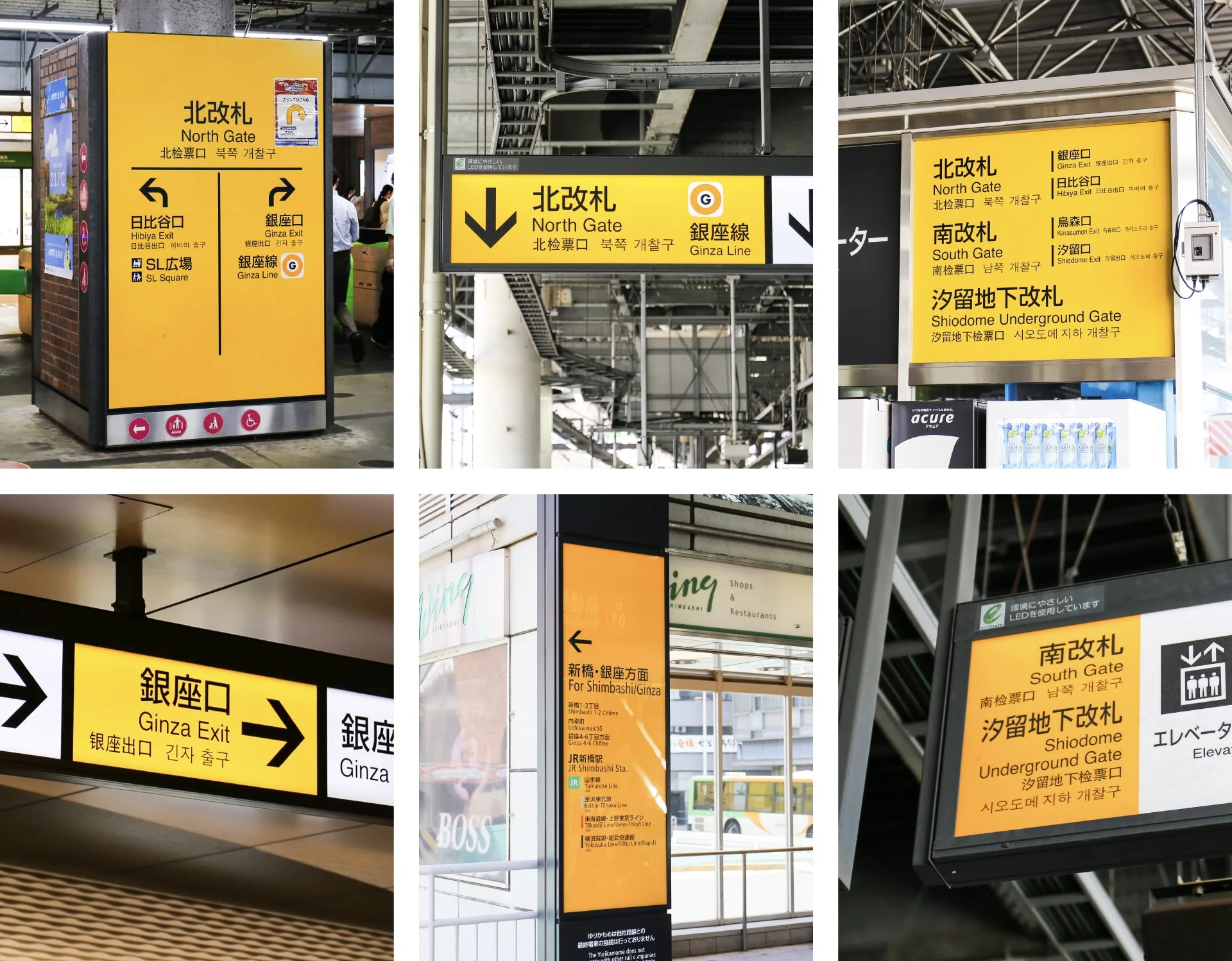
A warm, slightly reddish yellow was chosen as the brand color, referencing signage commonly found in airports and train stations. Applied boldly to the machine and surrounding visuals, it enhances visibility, offers reassurance for travelers, and underscores the service’s public utility.
すぐに見つかる、公共の安心
インバウンド需要の高まりに伴い、全国650か所以上に設置されている外貨両替機「SMART EXCHANGE」。駅、空港、ホテル、商業施設などの主要な観光導線に配置され、10か国語と12通貨に対応することで、旅先での「すぐに日本円が必要」というニーズに応えるインフラとして機能しています。
デザインの核としたのは、日本円を象徴する「¥」がスピーディーにスライドするシンボルです。訪日客が求める「日本円へすぐアクセスできる」という価値を直感的に伝えます。縦長でシャープなシルエットの可読性の高いサンセリフロゴタイプによって、スピード感と「SMART」という名称を呼応させました。
ブランドカラーには、空港や駅の案内サインを想起させる、わずかに赤みを帯びた温かいイエローを採用。マシン本体や周辺ビジュアルへ大胆に展開することで、旅先でも迷わず見つけられる視認性と安心感を生み出し、サービスが持つ公共性を強調しました。
Statement
Business Card
Web
Client:
Smart Exchange Inc.
Credits:
Creative Director: Yoshinaka Ono (GENDA)
Art Director: Yoshinaka Ono (GENDA)
Graphic Designer: Naoki Yamaguchi (GENDA)