GAME SPOT PALO
Logo
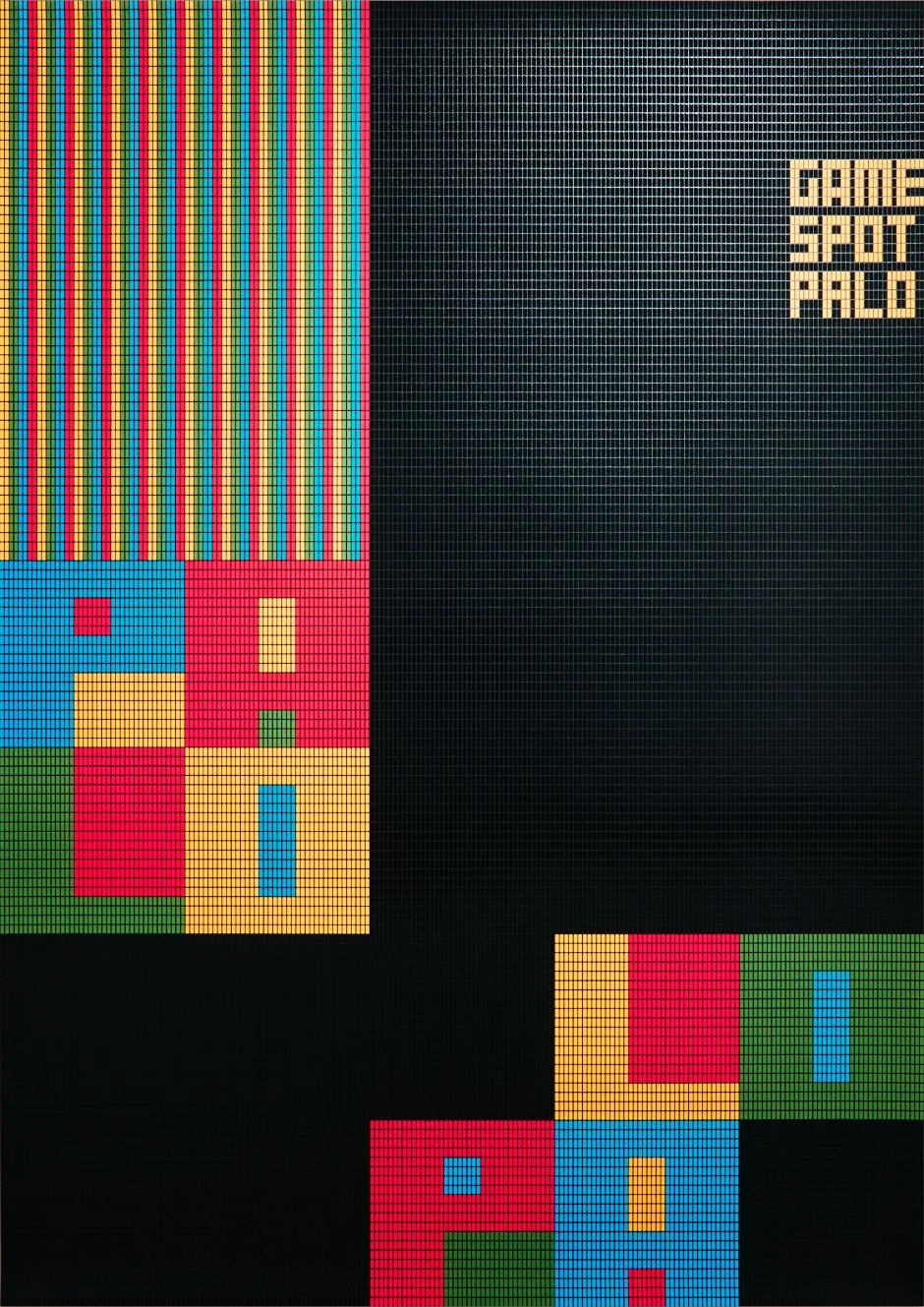
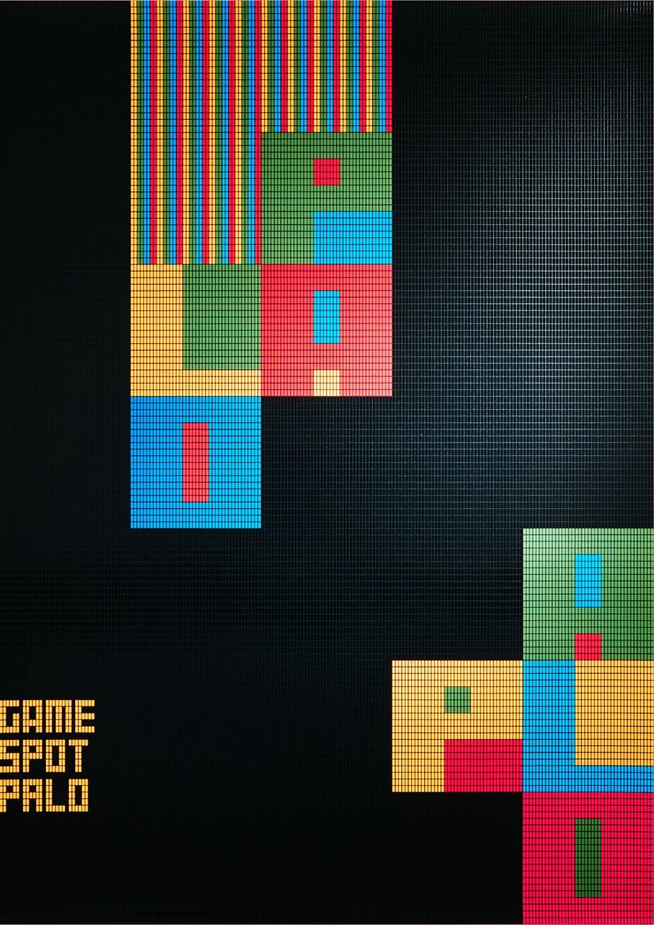


Poster

Shop Card

Post Card


Space
GAME SPOT PALO
A Logo System Built for Play
Rebranding of “PALO,” an amusement facility renewed as Daiei became part of the Aeon Group. The name “PALO,” meaning “stick” in Spanish, was retained for its familiarity and recognition.
The logo was developed as a four-color module, combining the motif of a “stick” with imagery drawn from falling block games and pixels—the smallest units of video graphics. Capable of transforming into vertical, horizontal, or block-like forms, the system embodied both flexibility and playfulness.
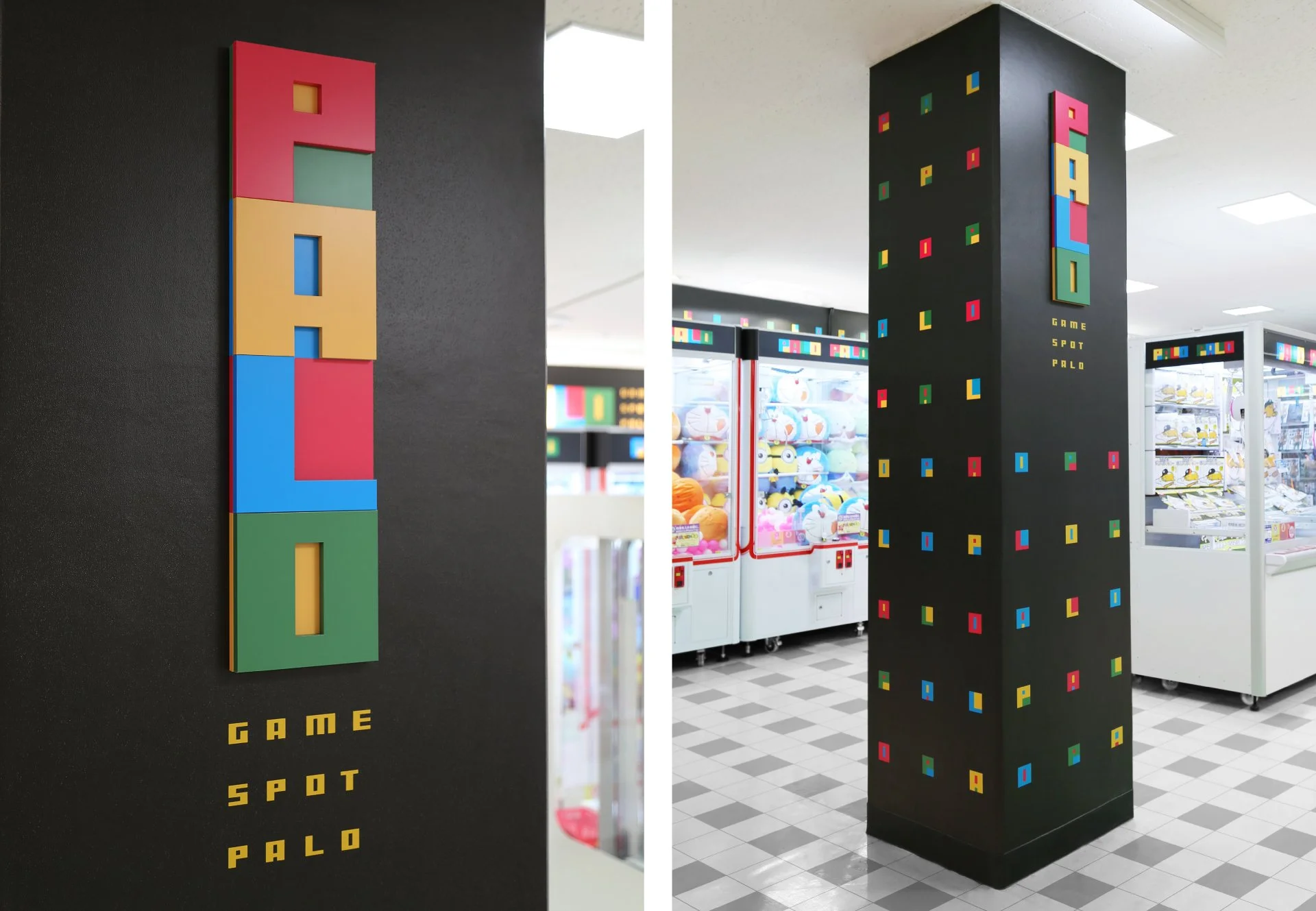
The modules extended across typography, shop cards, posters, signage, and wallpapers. With graphics suggesting motion and vibrant brand colors, the identity created a playful and consistent experience throughout the space.
遊びへ広がるロゴシステム
アミューズメント施設「PALO」のリブランディング。ダイエーがイオングループとなったことを契機に、長年続いた旧デザインを刷新しました。ブランド名「PALO」はスペイン語で「棒」を意味し、親しまれてきた名称は継続して使用されています。
「棒」をモチーフに、落下パズルやブロックゲームのイメージと、ビデオゲームの最小単位であるピクセルを重ね合わせ、4色のモジュールロゴを開発。縦長・横長・塊など多様な形状へ自在に変形できる構造とし、柔軟性と遊び心を備えています。
モジュールはタイポグラフィ、ショップカード、ポスター、店舗サイン、壁紙など幅広く展開。動きを感じさせるグラフィックと華やかなブランドカラーによって、ブランド全体に一貫性と新鮮さを与え、ゲームセンターを訪れる体験をより楽しいものへと高めました。
Client
AEON FANTASY Co., Ltd.
Creative Team
Creative Director : Yoshinaka Ono (Dentsu)
Art Director : Yoshinaka Ono (Dentsu)
Designer : Yoshinaka Ono (Dentsu)
Copy Writer : Yoichi Ugaeri (Dentsu)
Planner : Yuichiro Kojima (Dentsu)
Project Manager : Mihoko Nishii (Dentsu)
Account Executive : Naoki Yamaguchi (Dentsu)
Designer : Midori Nozawa (TAKI CORPORATION)
Designer : Yuici Iwata (TAKI CORPORATION)
Printing Director : Emiko Kawashima (SEIBIDO)