inglewood
Logo

Office Sign

Business Card

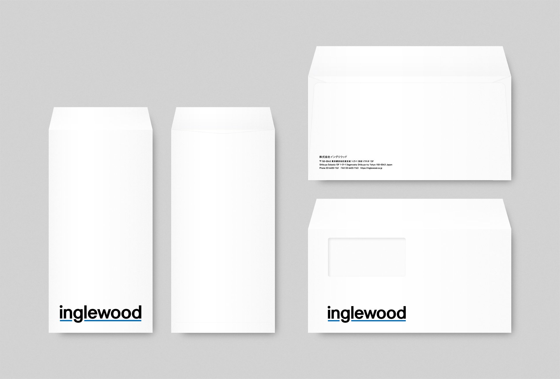
Envelope


Pamphlet


Motion Graphic

Corpolate SIte

Company Infomation (PPT)
inglewood
Staying the Strongest Force in Selling Products
Branding for “inglewood,” a DX solutions company. Since its founding in 2005, the firm has pursued the mission of “staying the strongest force in selling,” evolving from a sneaker e-commerce business into consulting and D2C ventures. Leveraging retail-focused expertise and executional strength, inglewood supports the growth of companies and brands alike.
To unify its expanding business scope into a single, powerful image, the brand’s visual language was restructured. A color palette of blue, black, and silver established a sharp and sophisticated impression, embodying speed, innovation, and trust in equal measure.
An animation illustrated the flow from planning to design, advertising, sales, and delivery—using diverse products like shampoo, T-shirts, and bento meals as examples. This highlighted the synergy across business domains while consistently reinforcing the company’s core commitment: the power to sell.
商品を売る最強の集団であり続ける
DXソリューションカンパニー「inglewood」のブランディング。2005年の創業以来「商品を売る最強の集団であり続ける」というミッションを掲げ、スニーカーECを起点にECコンサルティングやD2Cブランド事業へと展開。リテールに特化したノウハウと実行力を武器に、企業やブランドの成長を支援しています。
広がり続ける事業領域を一つの強いイメージに束ねるため、ブランド全体の視覚言語を再構築。青・黒・シルバーを基調としたカラーリングはシャープで洗練された印象を与え、スピード感・先進性・信頼感を同時に体現するデザイントーンを築きました。
さらにシャンプーやTシャツ、お弁当といった多様な商品を題材に、企画からデザイン、広告、販売、発送までの流れを描くアニメーションを制作。幅広い領域とシナジーを示すとともに、どの分野においても「売る力」を核に据える姿勢を一貫して伝えています。
Client
inglewood
Creative Team
Creative Director : Yoshinaka Ono (inglewood)
Art Director : Yoshinaka Ono (inglewood)
Designer : Katsunori Nishino (inglewood)
Designer : Yusuke Takahashi (inglewood)
Designer : Momoka Atsumi (inglewood)
Animator : Yosuke Ishimoto (inglewood)