VR BASE TOKYO
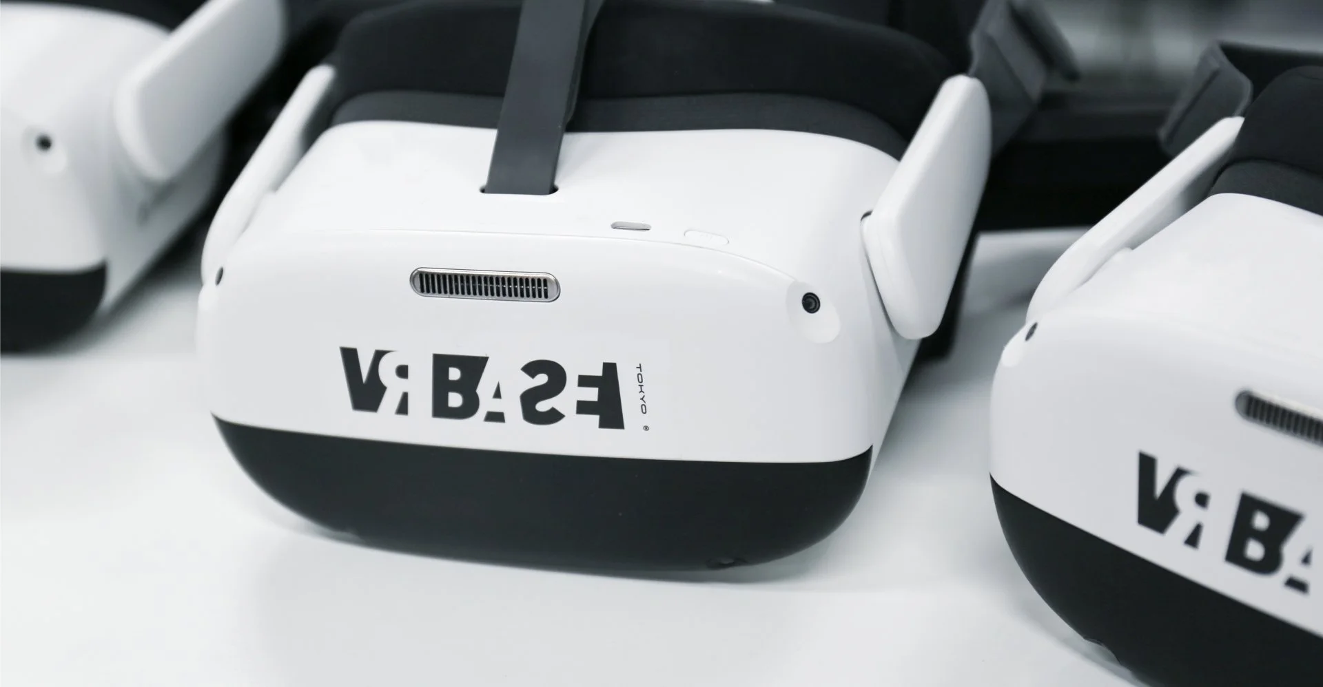
Logo
Logo Pattern
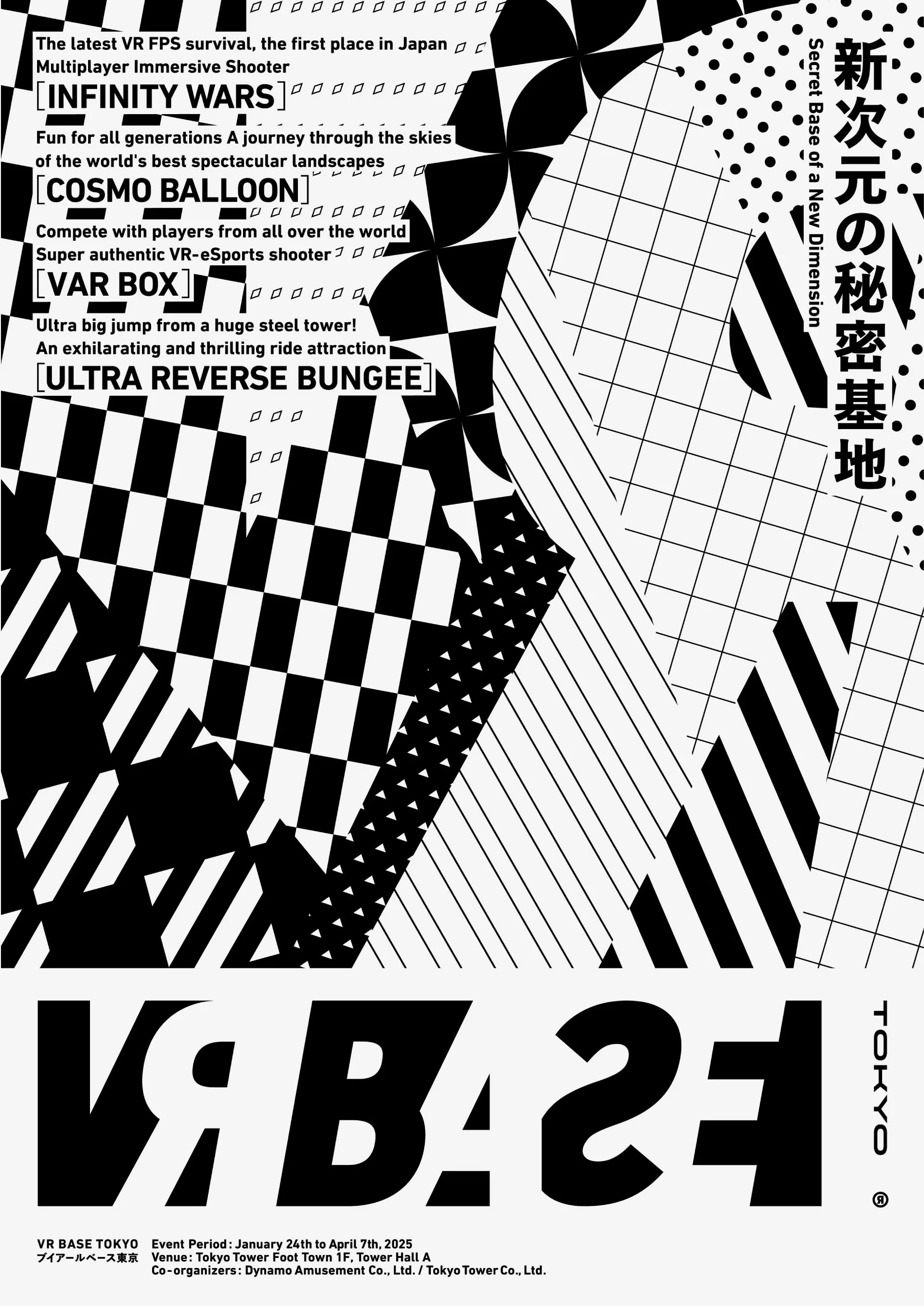

Poster

SNS Banner

Leaflet
VR BASE TOKYO
A Secret Base Beyond Reality
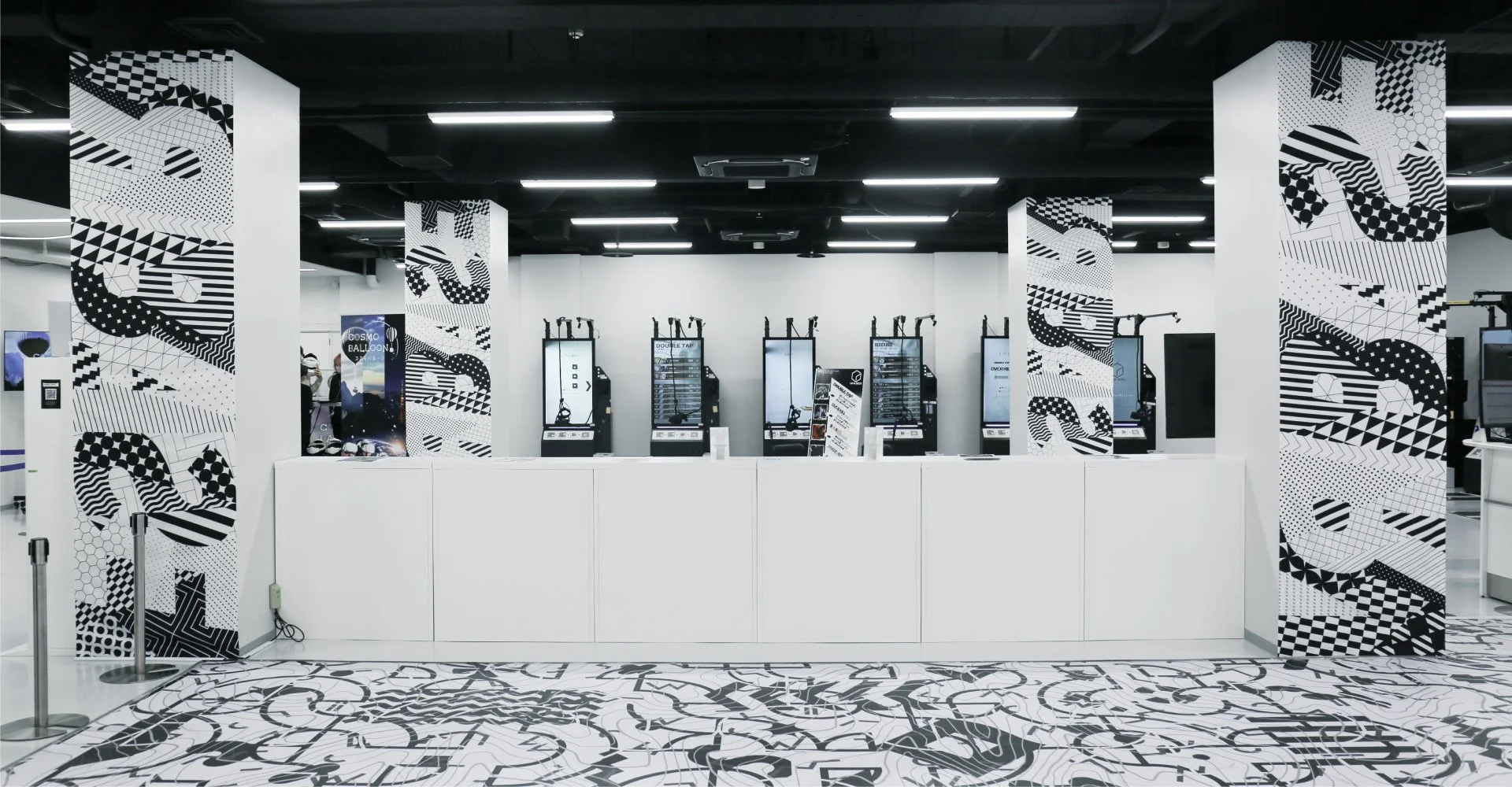
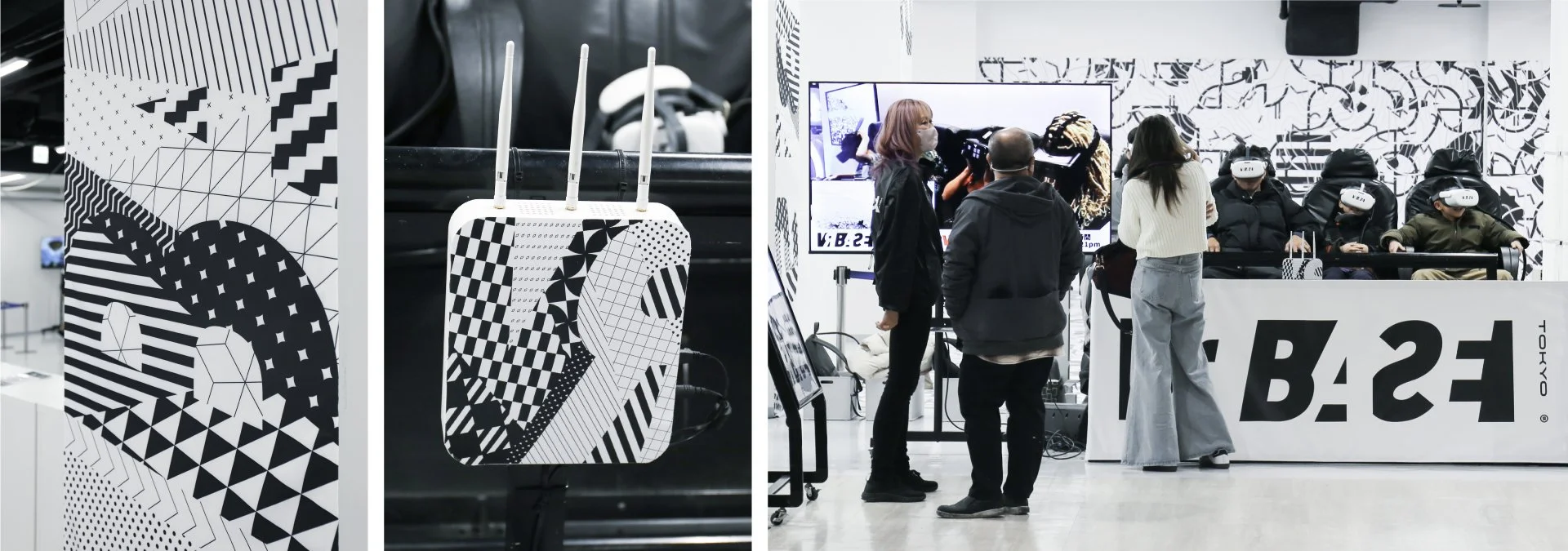
Branding for “VR BASE TOKYO,” an experiential entertainment facility located on the first floor of Tokyo Tower. Designed as an “infinitely expanding secret base” that welcomes everyone, the space offers diverse VR activities, enabling visitors to move freely between the everyday and the extraordinary.
The logotype incorporates dualities such as “positive and negative” and “front and back,” conveying a seamless link between reality and the virtual world. Subtle shifts and deliberate distortions were embedded into the typography, creating a fresh sense of discovery within familiar forms.
From the logo emerged black-and-white graphic patterns that evoke the sensation of drifting between reality and illusion. Applied to posters, brochures, and the facility itself, these layered motifs were designed to let visitors physically sense the ambiguity and shifting boundaries hidden behind visual perception.
現実を越える、秘密基地
体験型エンターテインメント施設「VR BASE TOKYO」のブランディング。東京タワー1Fに誕生したこの空間は、誰もが気軽に立ち寄れる“無限に広がる秘密基地”的な拠点として設計されました。多彩なVRアクティビティを備え、日常と非日常を自在に行き来できる体験を提供します。
ロゴタイプには「正と反」「ネガとポジ」「表と裏」といった二面性を取り入れ、現実と仮想がシームレスにつながる感覚を表現。ベーシックなタイポグラフィにあえて微細なズレや違和感を潜ませ、既視感の中に新鮮な驚きを生み出しました。
ロゴを起点に展開された黒と白のグラフィックパターンは、動きながら現実と幻想のあいだを漂うような視覚体験をもたらします。ポスターやリーフレット、施設空間に展開されたこれらの複層的なモチーフは、視覚の裏側に潜む“曖昧さ”や“切り替わる境界”を身体で感じさせる設計です。
Client
Dynamo Amusement, Inc.
Creative Team
Creative Director : Yoshinaka Ono (GENDA)
Art Director : Yoshinaka Ono (GENDA)
Designer : Naoki Yamaguchi (J.C.SPARK)
Copywriter : Issei Ishikura