Skindex

Skindex
Your Guide Your Guide to Beauty, Where Skin Meets Index
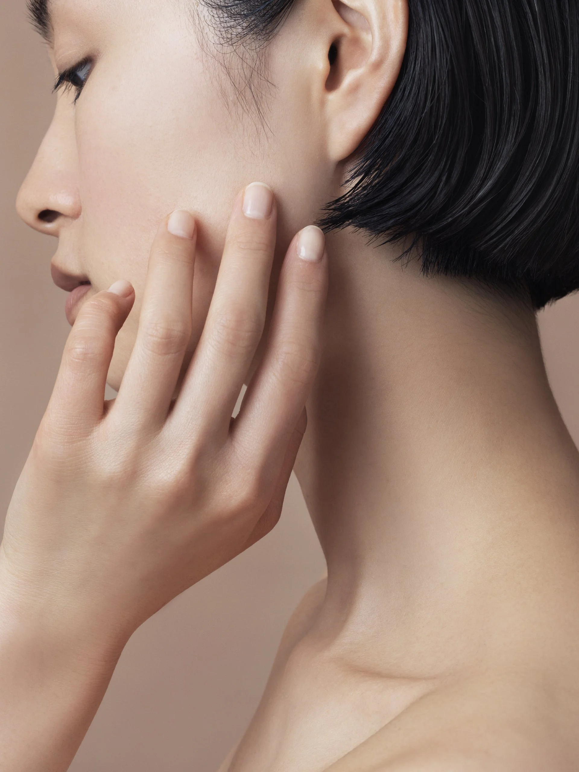
Branding for “Skindex,” a skincare series built on the mission of selecting and delivering ingredients of true value from among countless options. Developed in parallel with the products, the brand was designed as a trustworthy source that guides users through the benefits of advanced skincare.
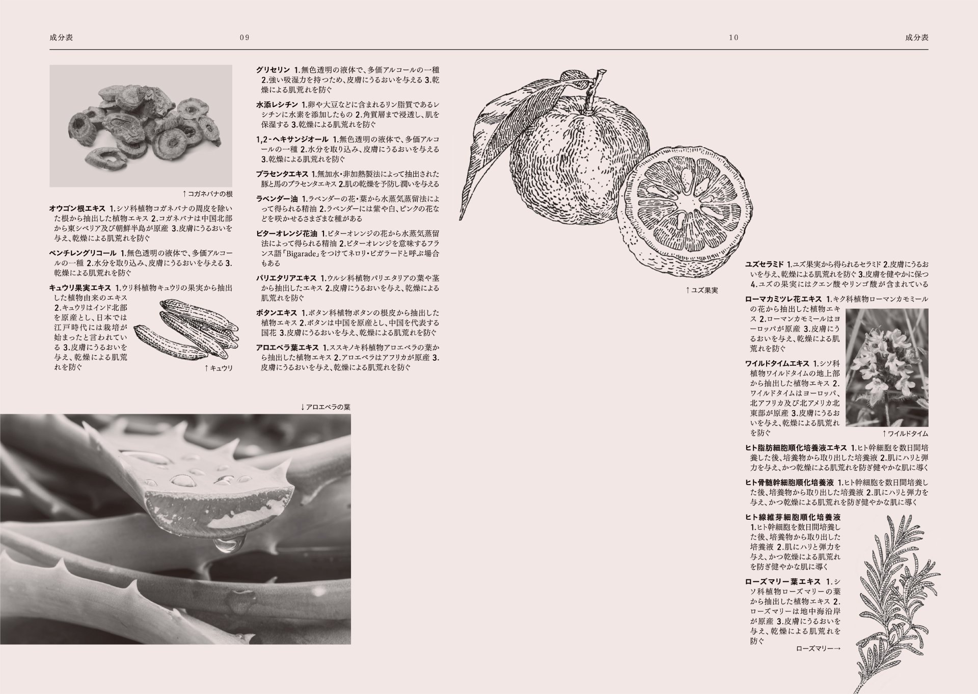
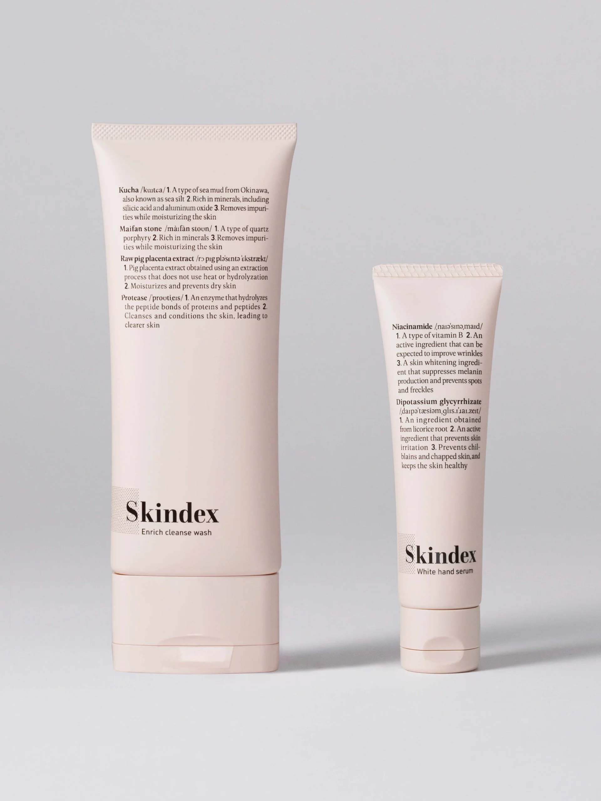
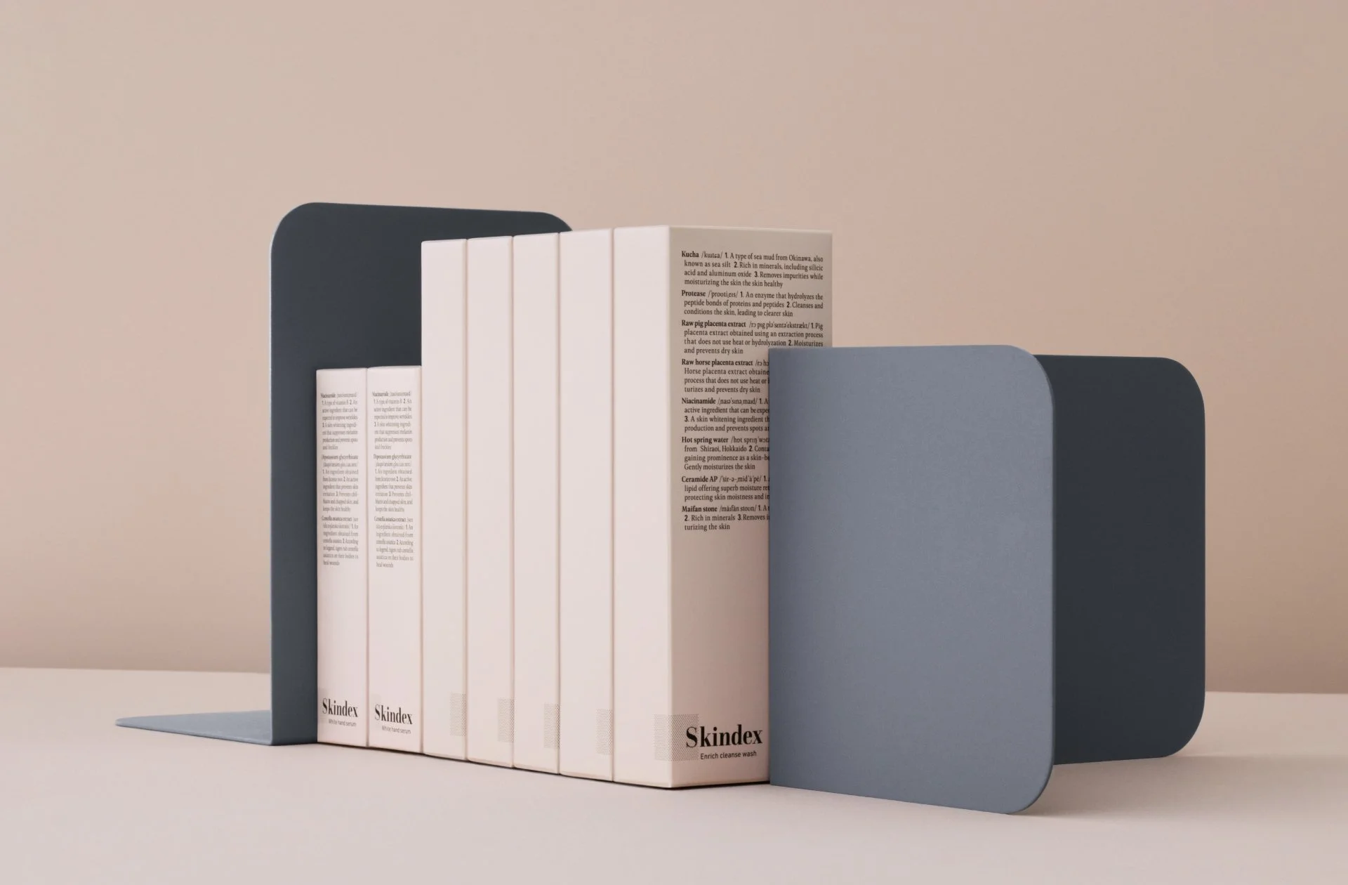
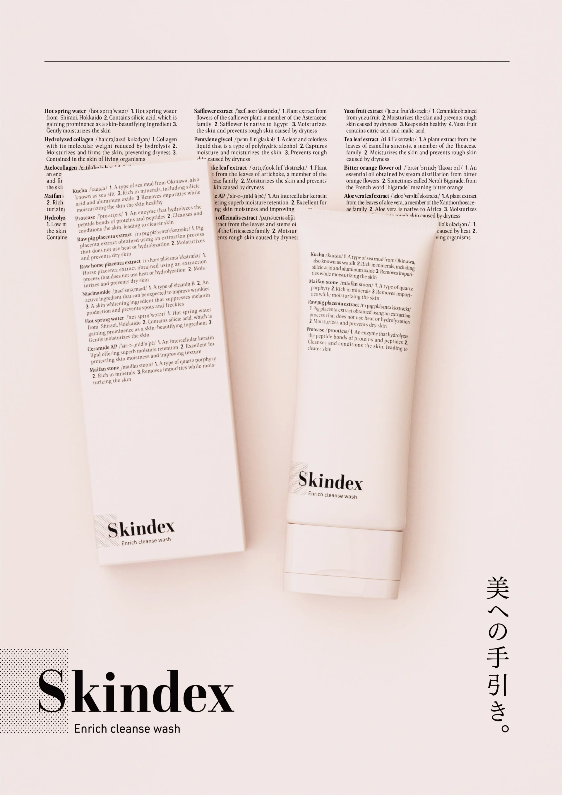
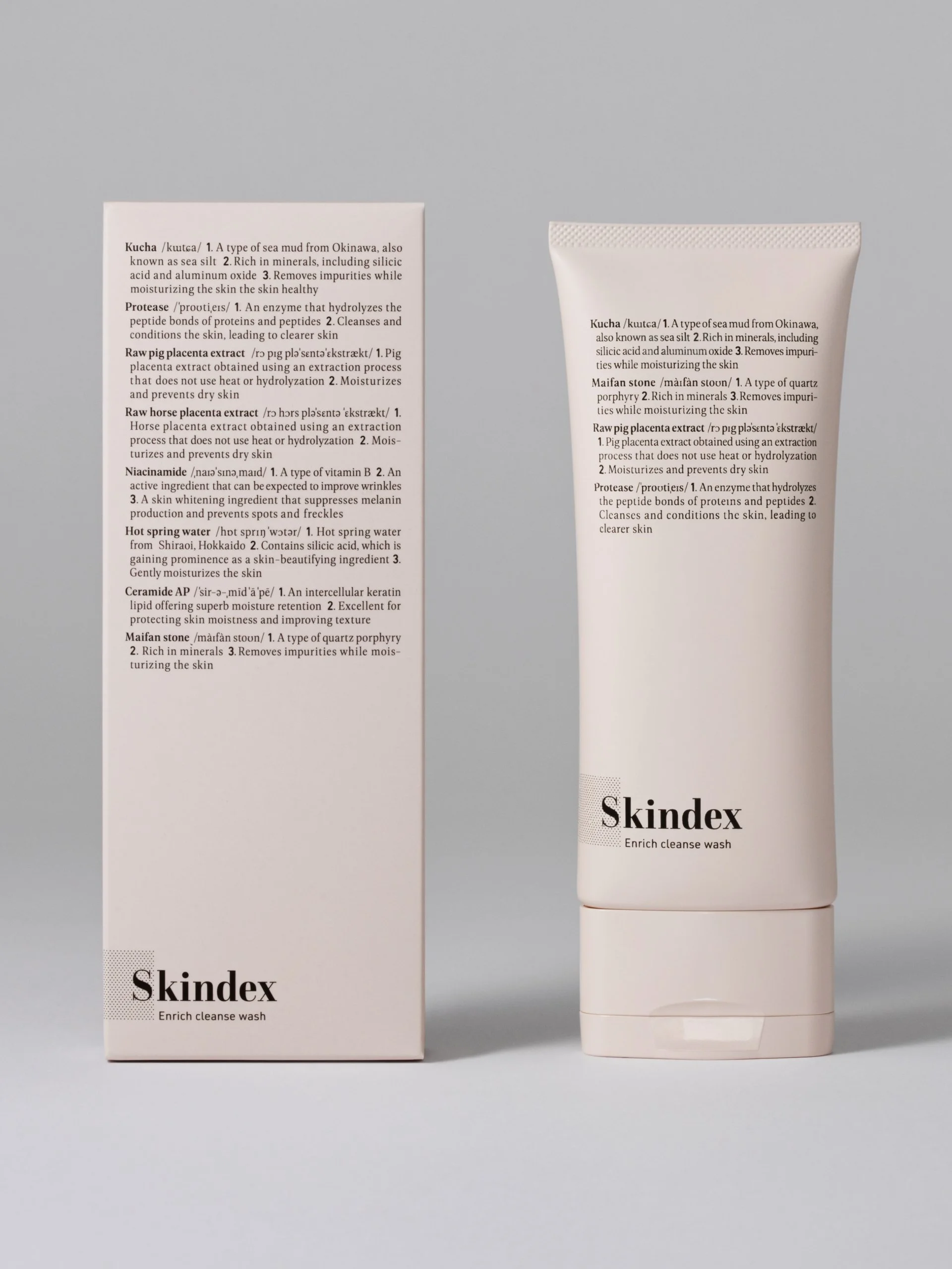
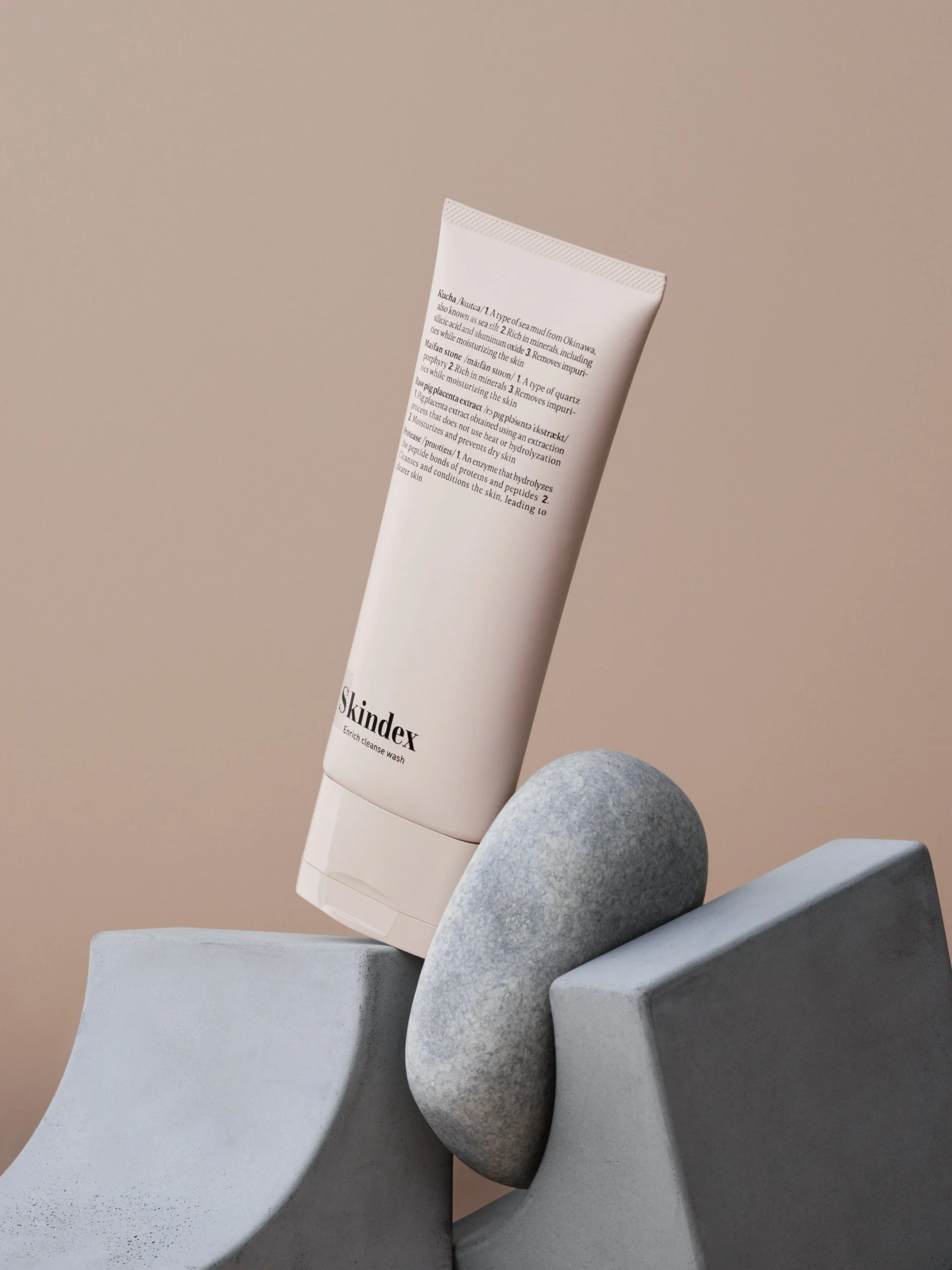
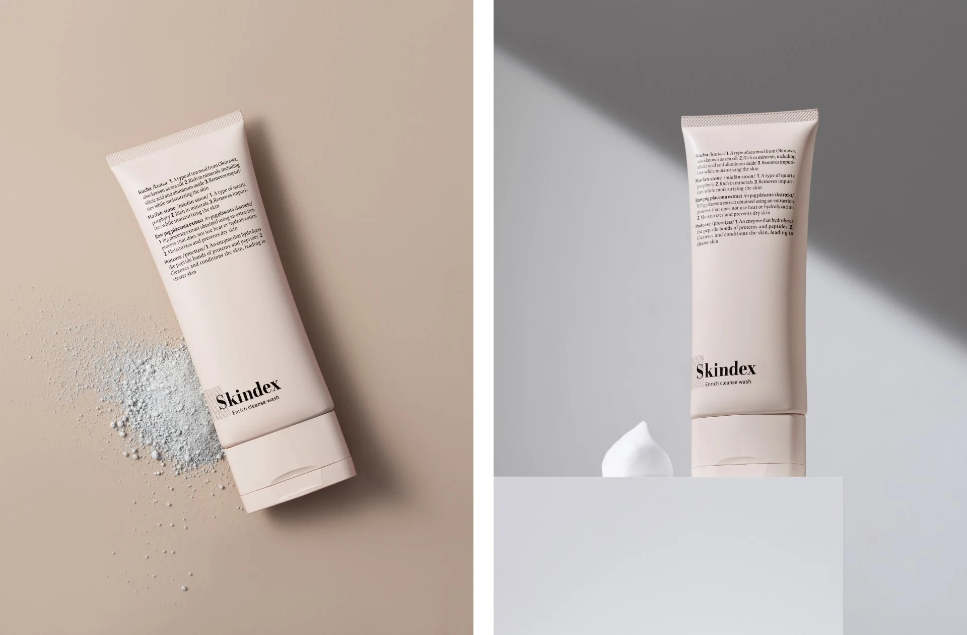
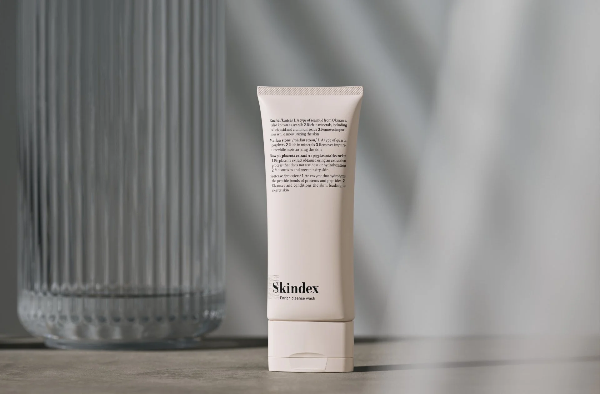
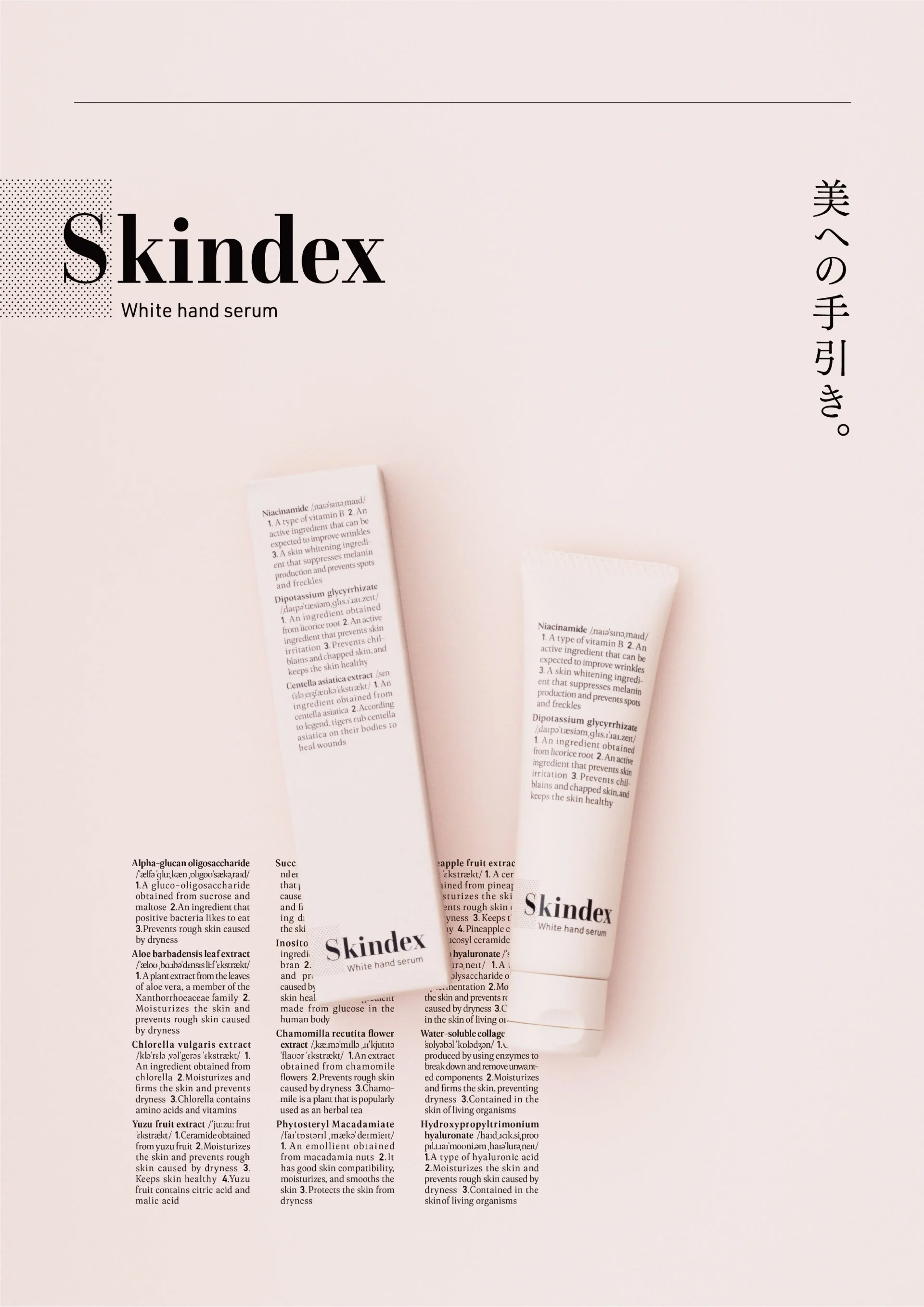
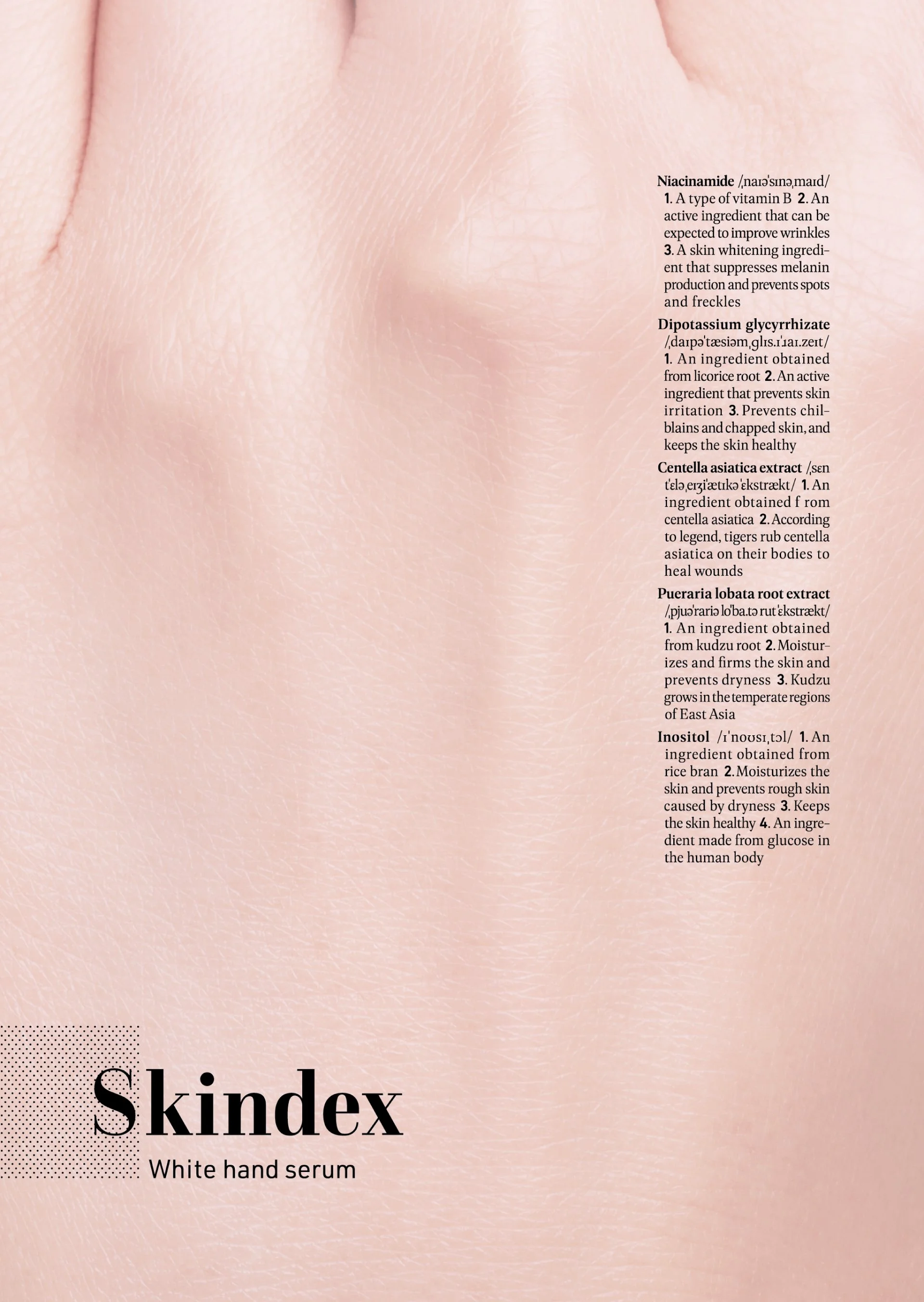
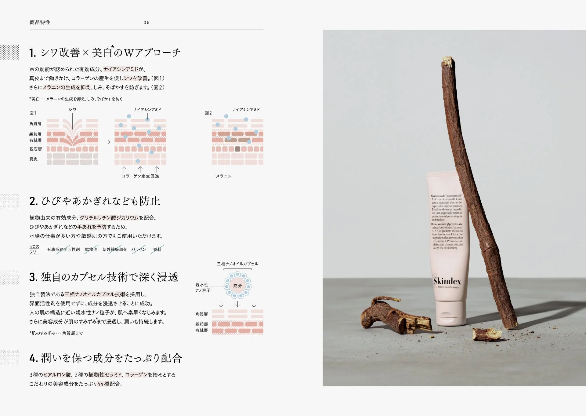
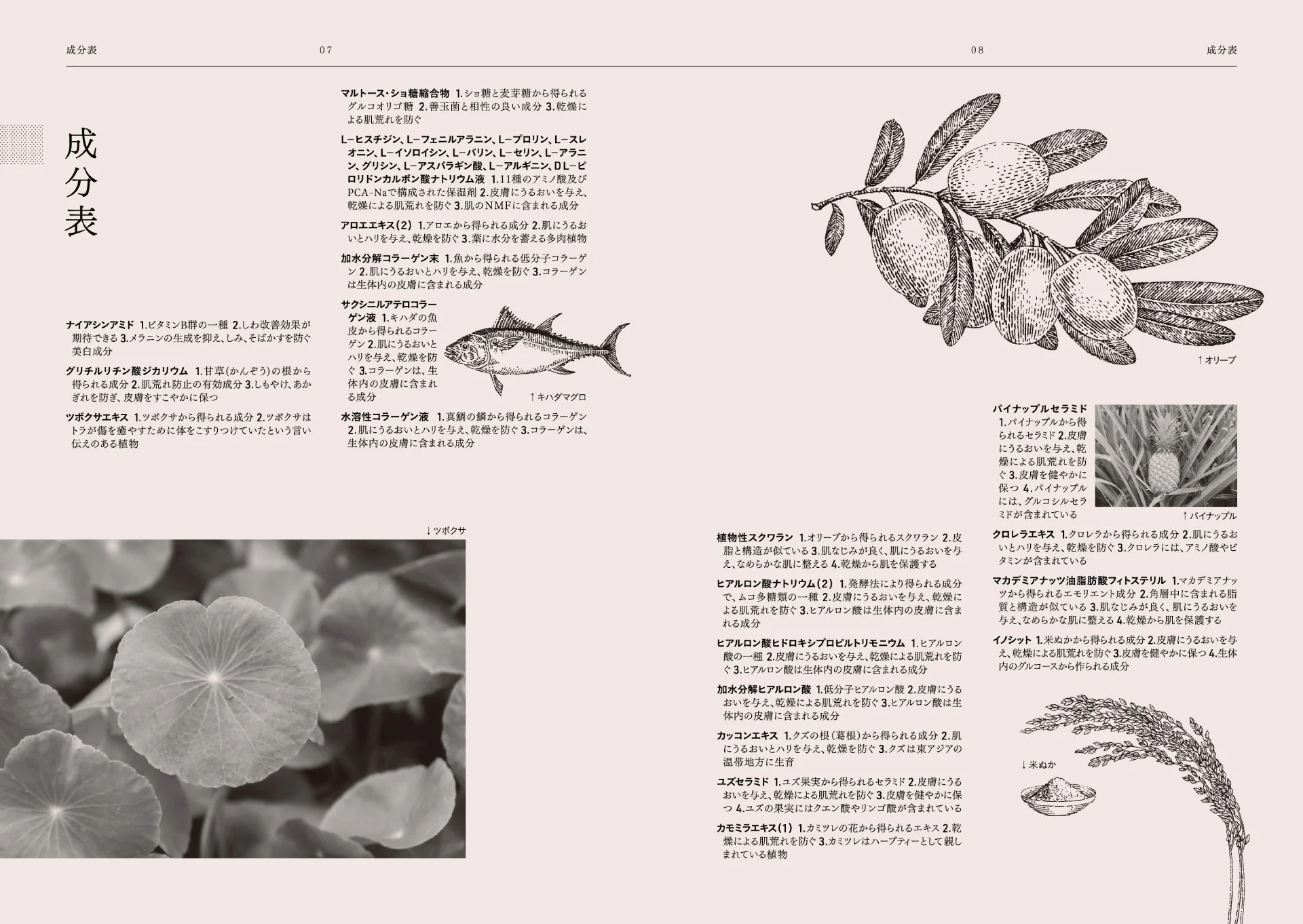
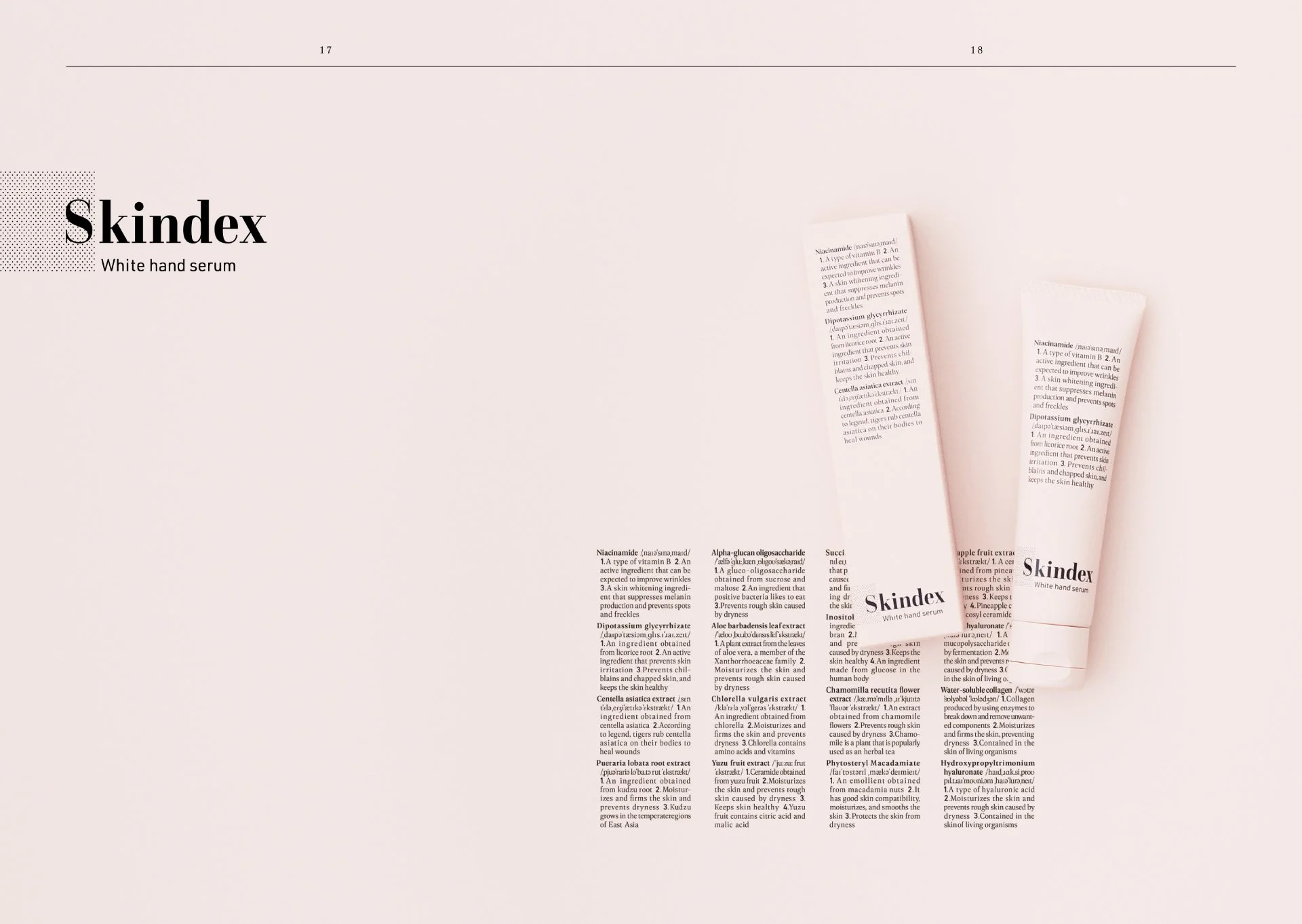
Reflecting a policy of integrating the latest active ingredients, the concept highlighted each element’s unique appeal. The name “Skindex,” a blend of SKIN and INDEX, emphasized both clarity and sophistication. The logo, inspired by dictionary indexes, projected an image of reliability and refinement, positioning the brand as an information-driven presence where knowledge and beauty coexist.
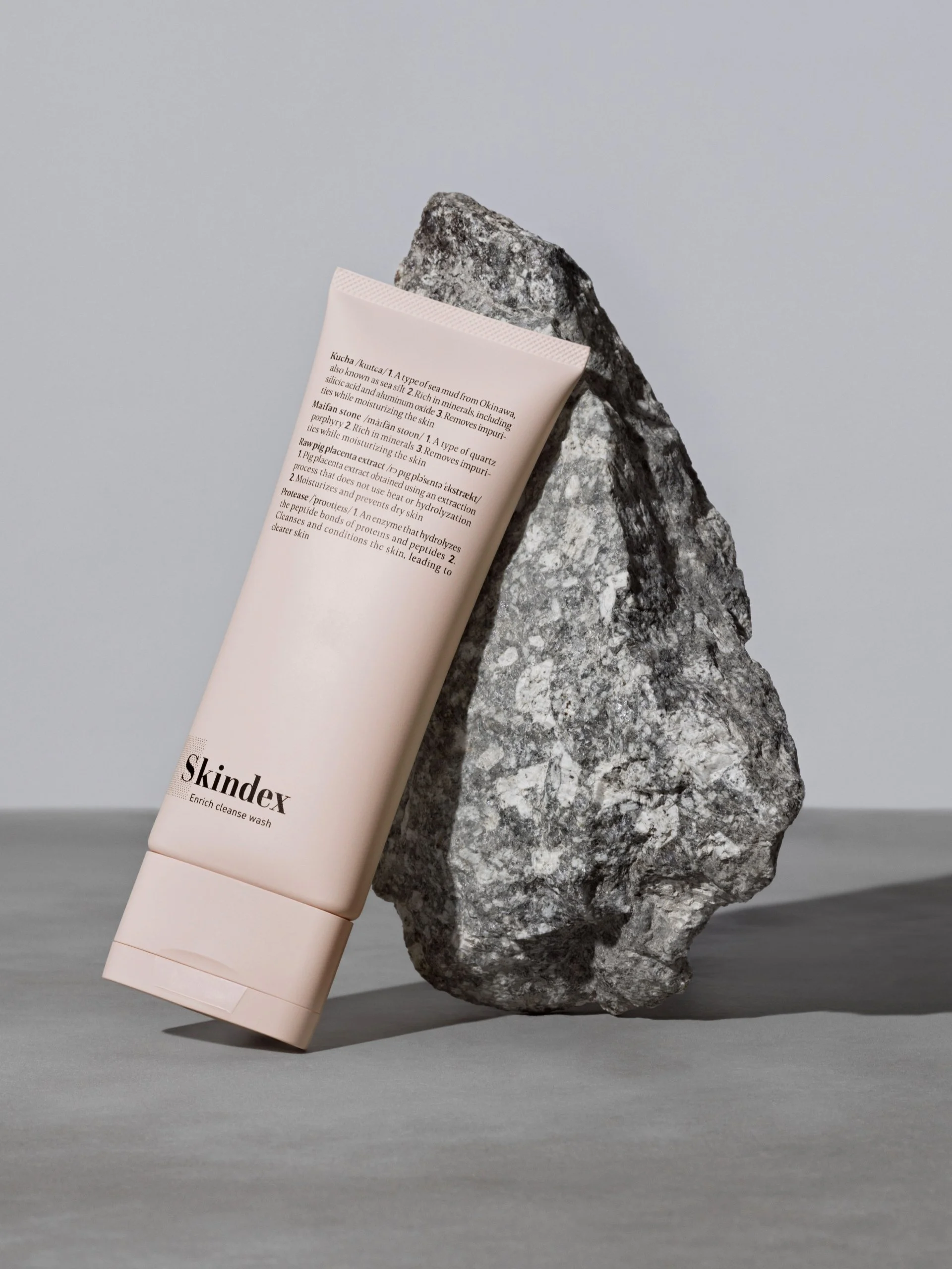
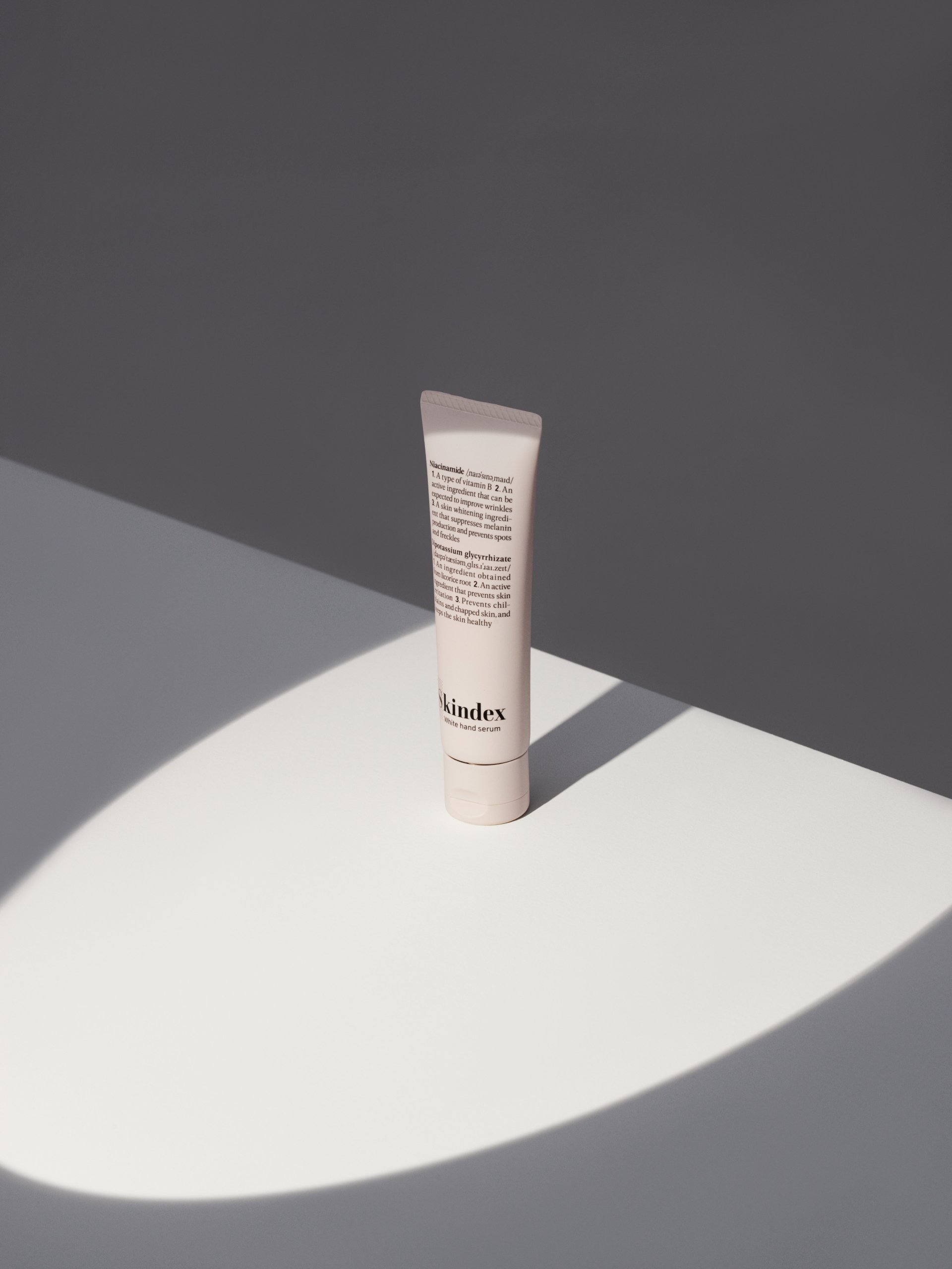
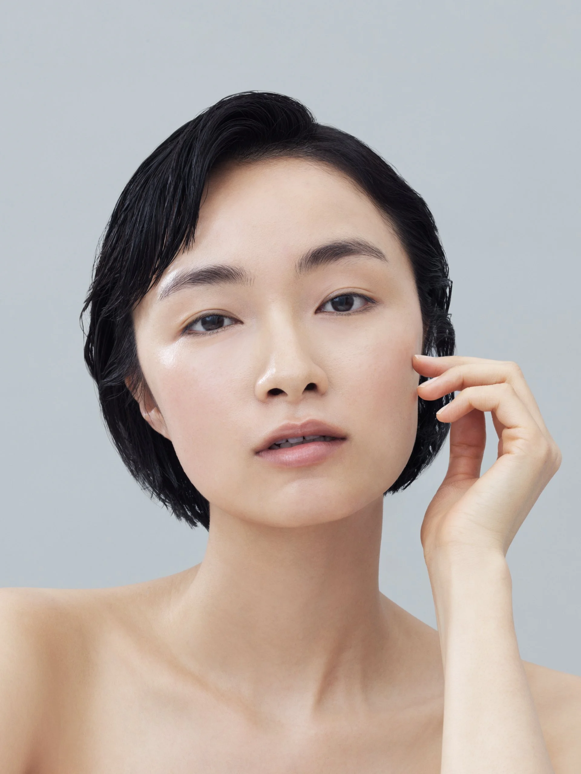
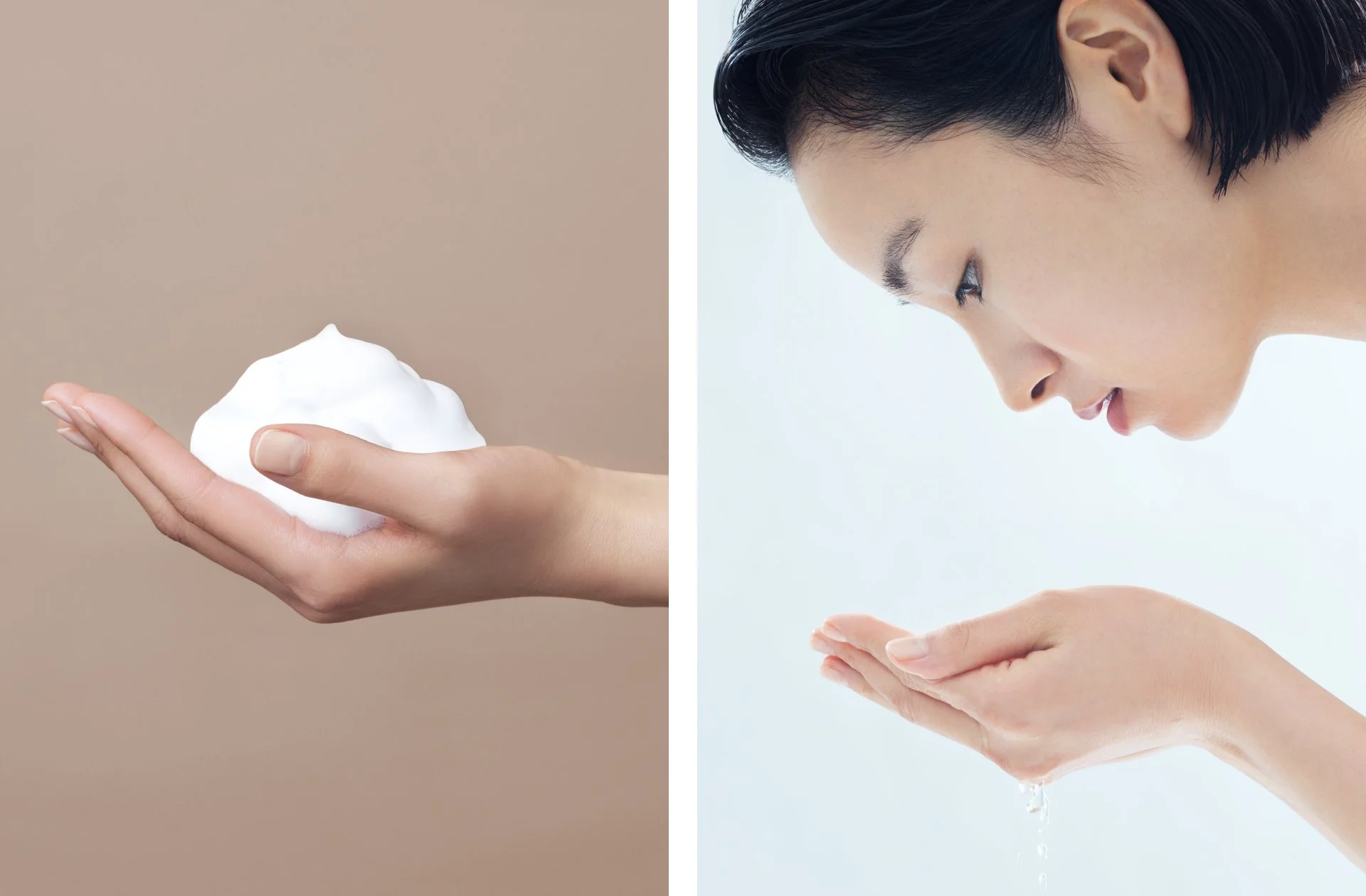
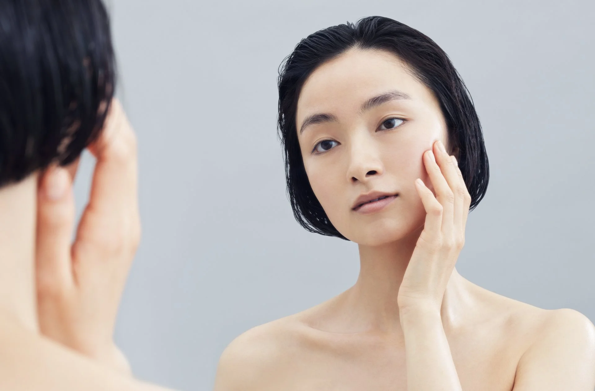
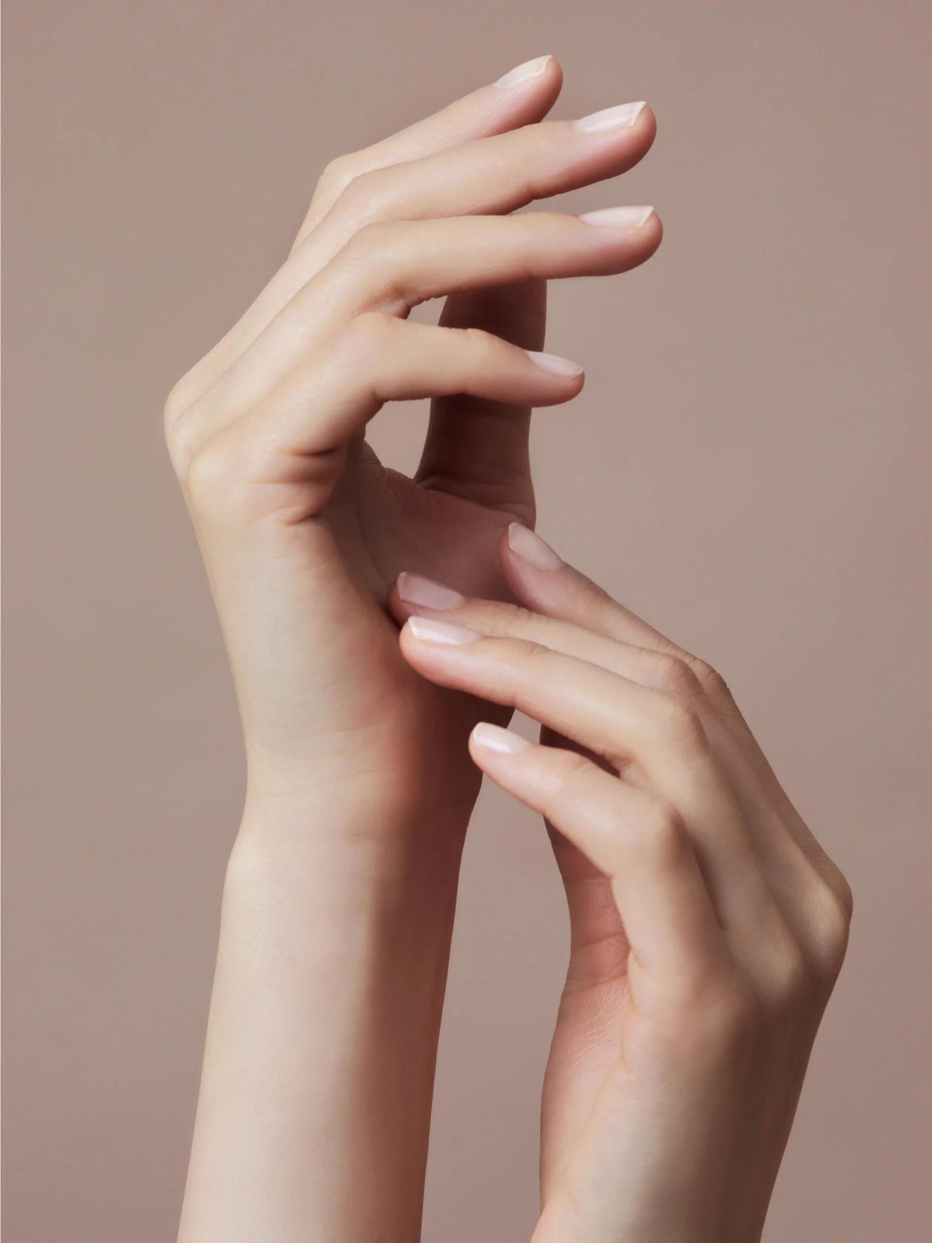
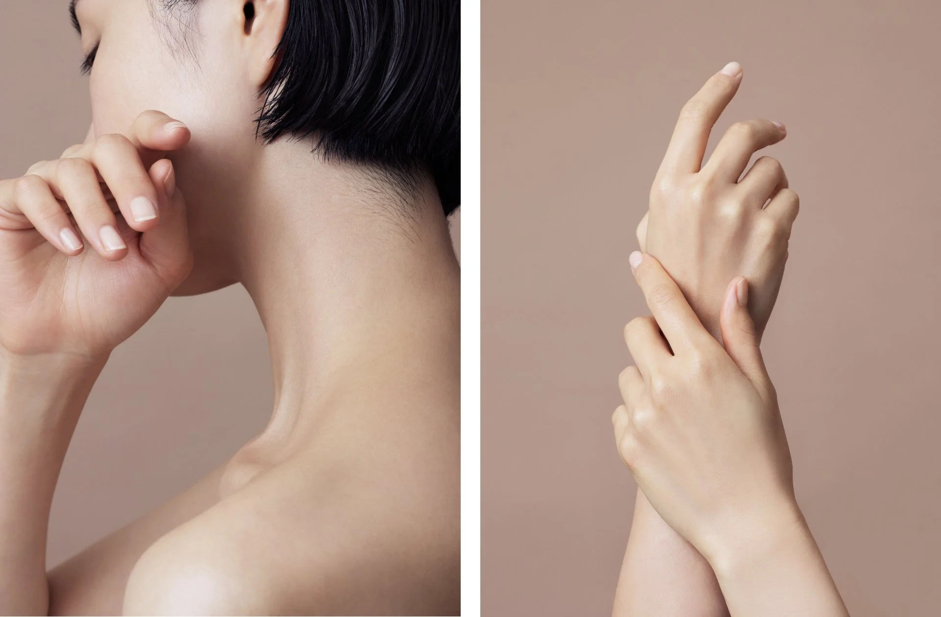
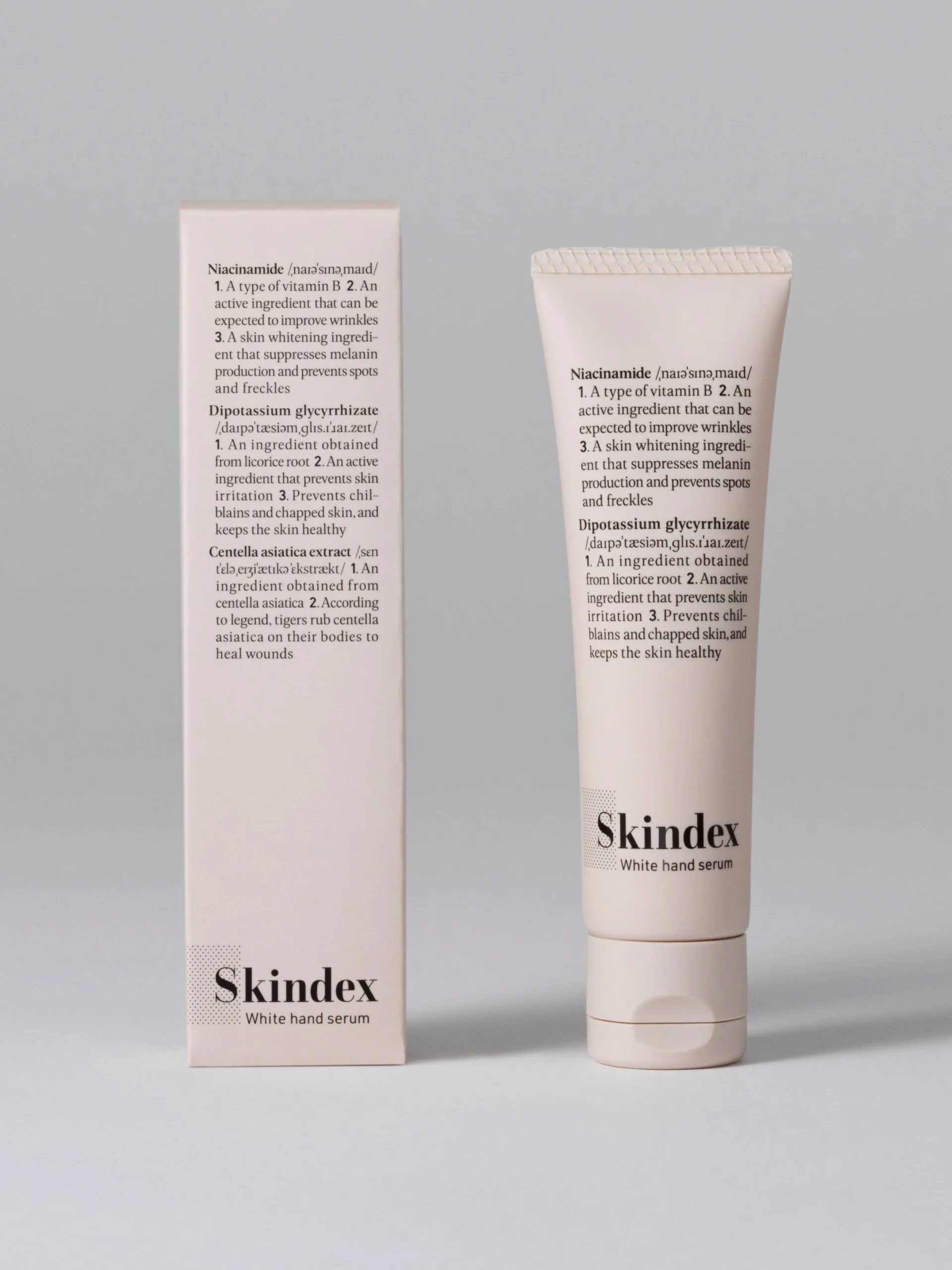
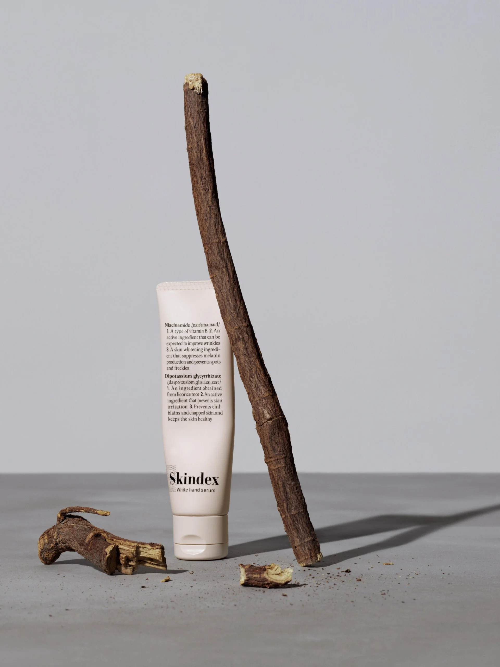
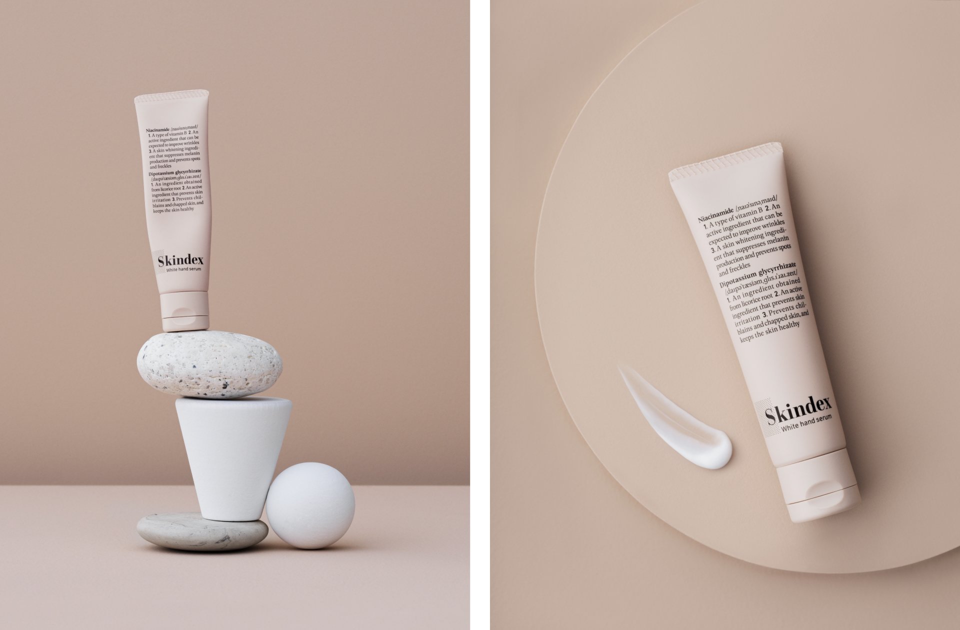
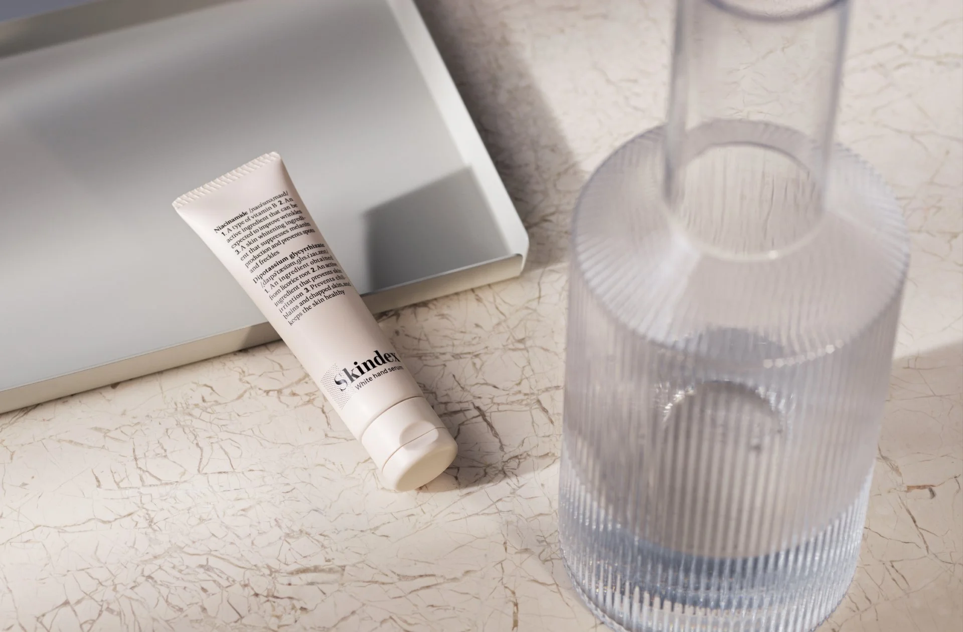
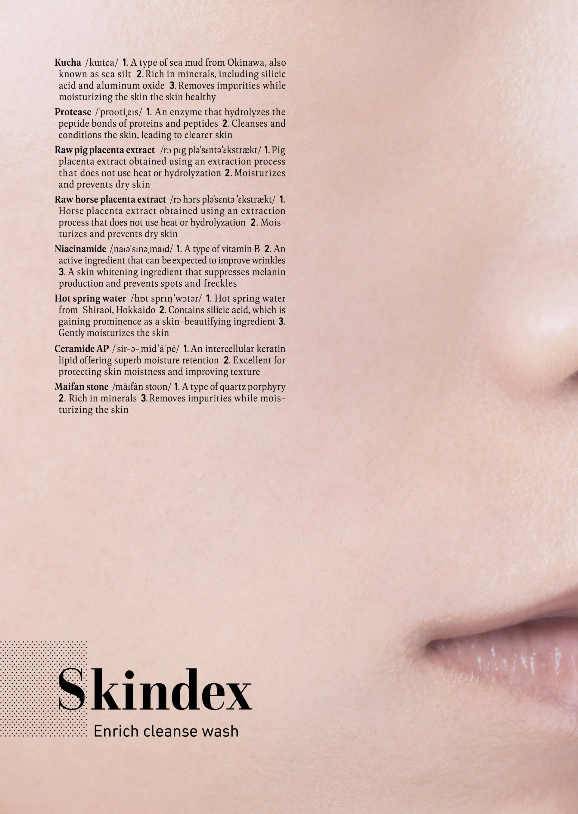
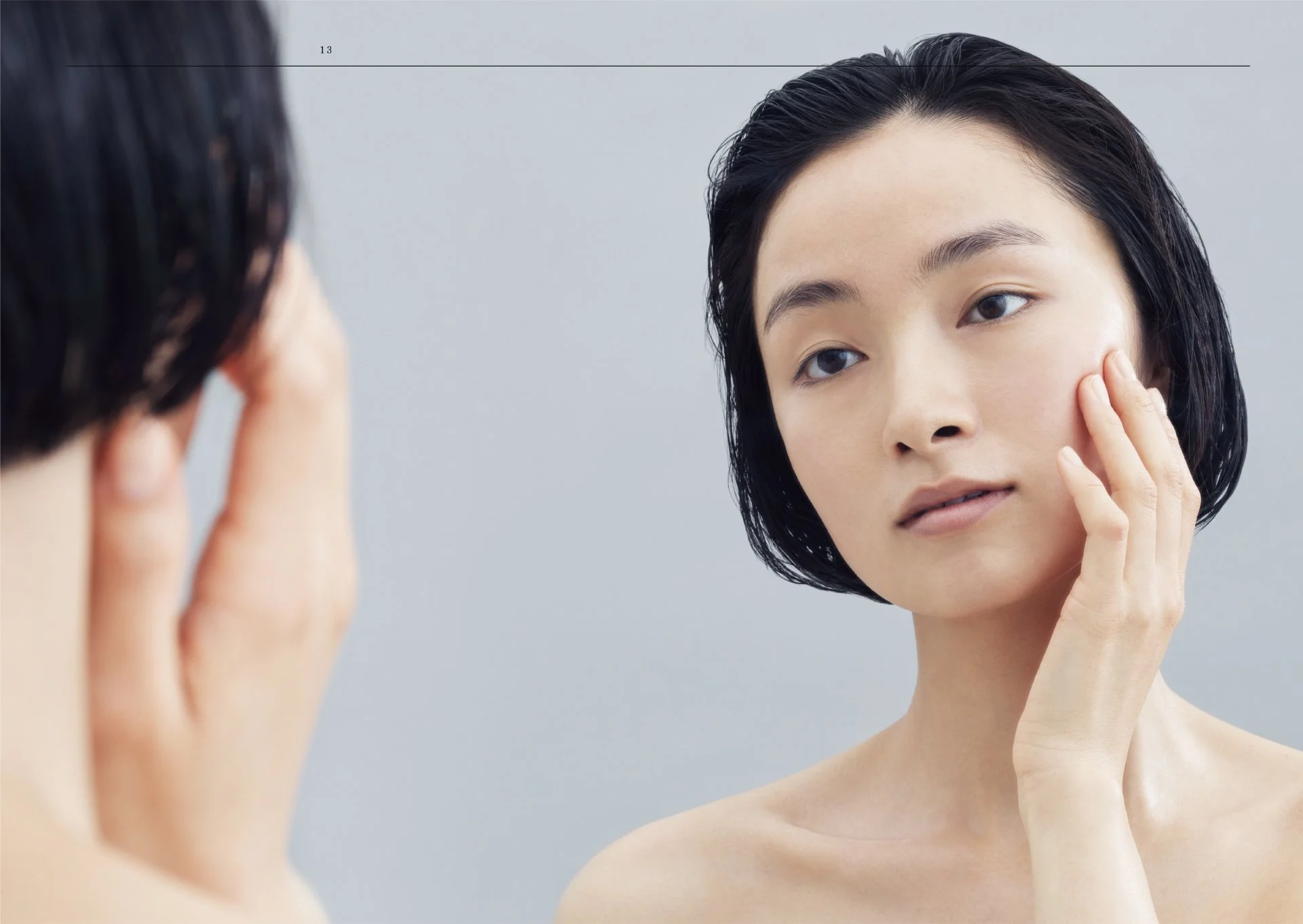
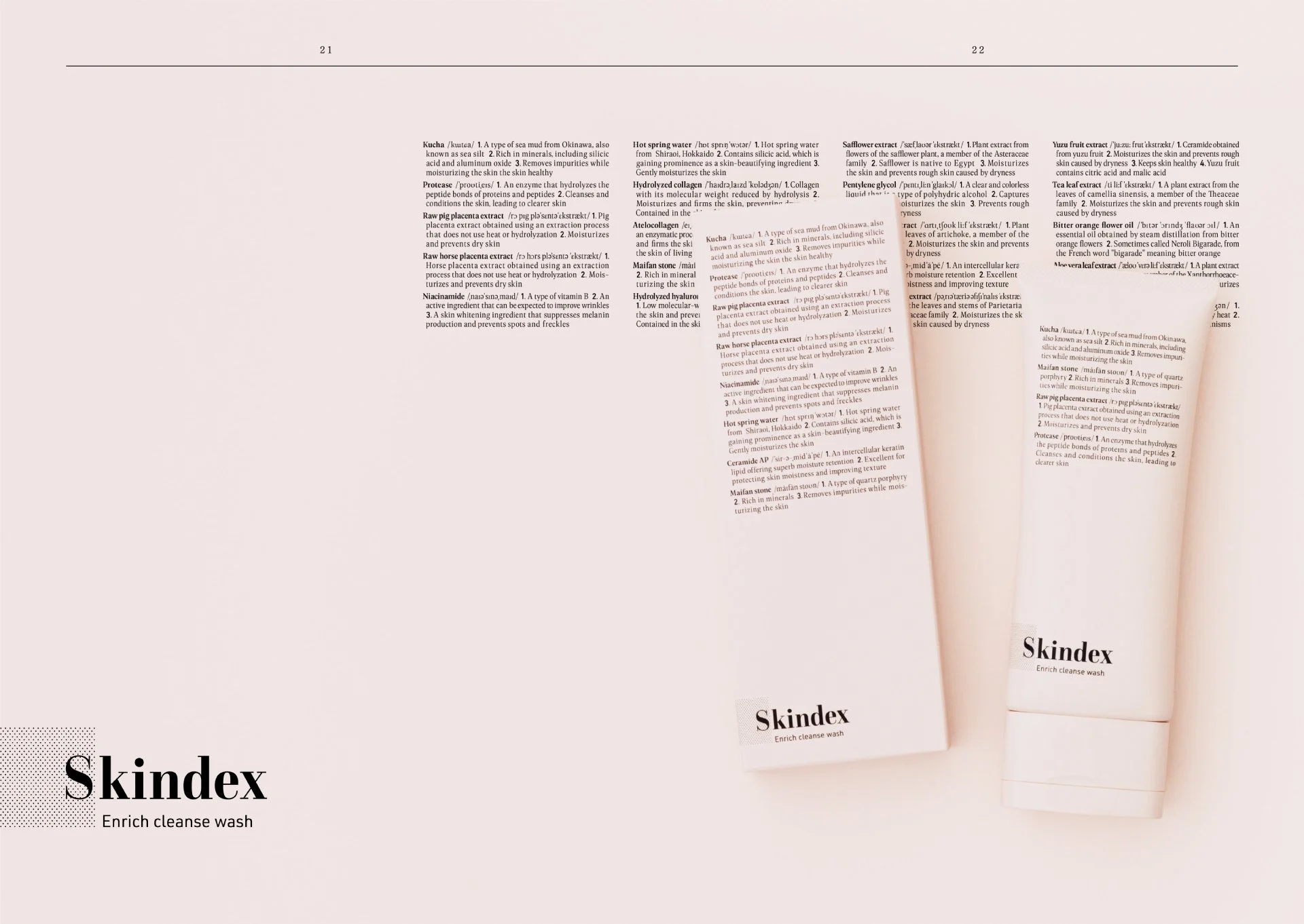
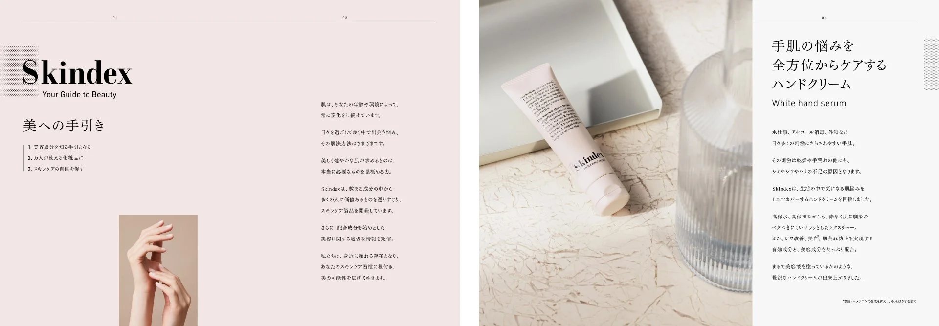
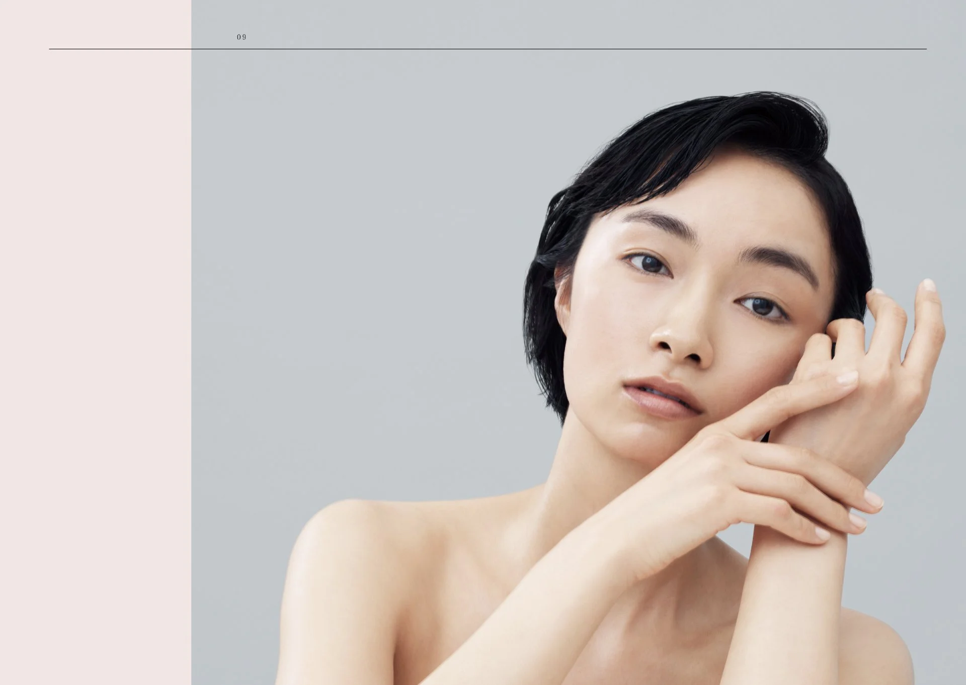
A salmon pink, reminiscent of skin yet stripped of sweetness, was chosen as the brand color, ensuring a gender-neutral tone. Packaging featured ingredient names and benefits so users could encounter them in daily use, while matte textures evoked the softness of skin itself. Every detail embodied the brand’s philosophy of uniting knowledge with beauty.
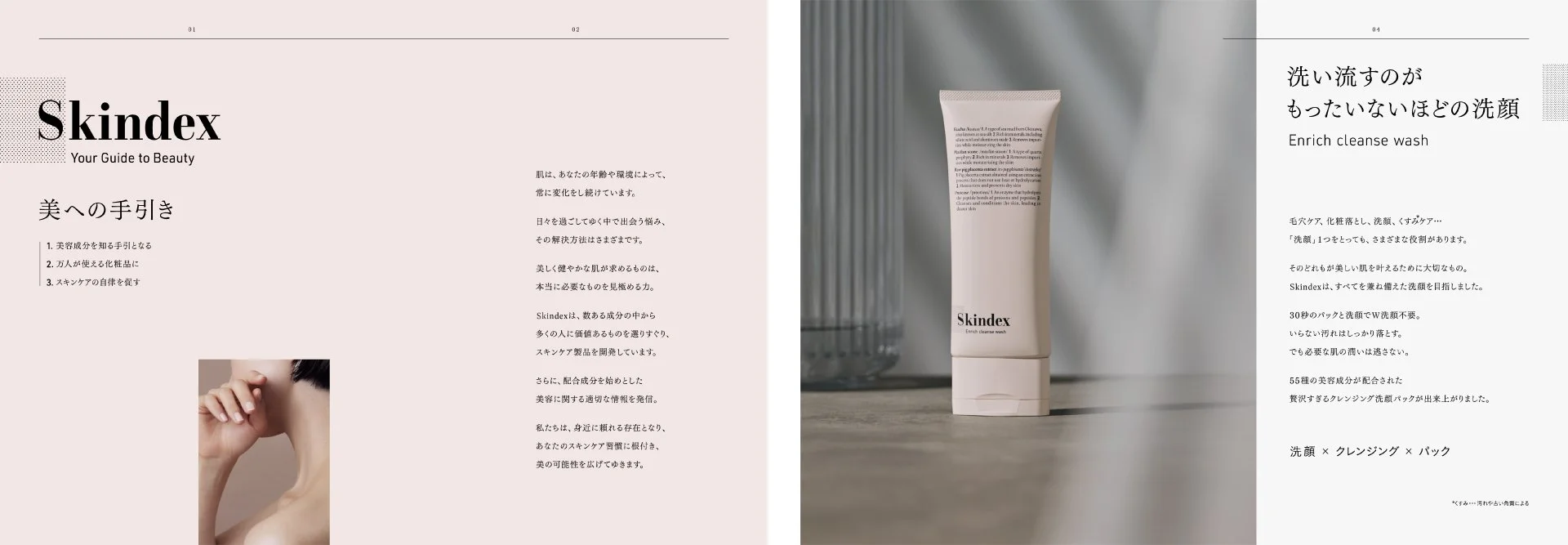
肌と知識が出会う、美への手引き
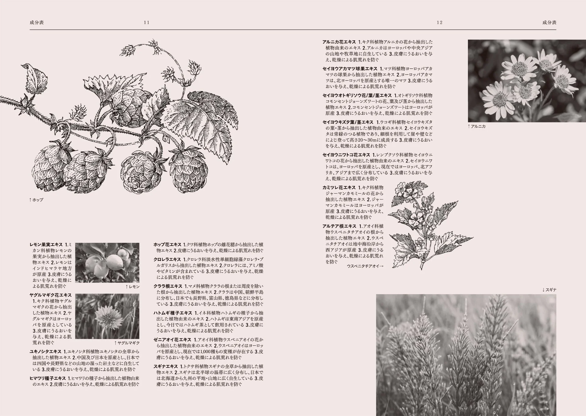
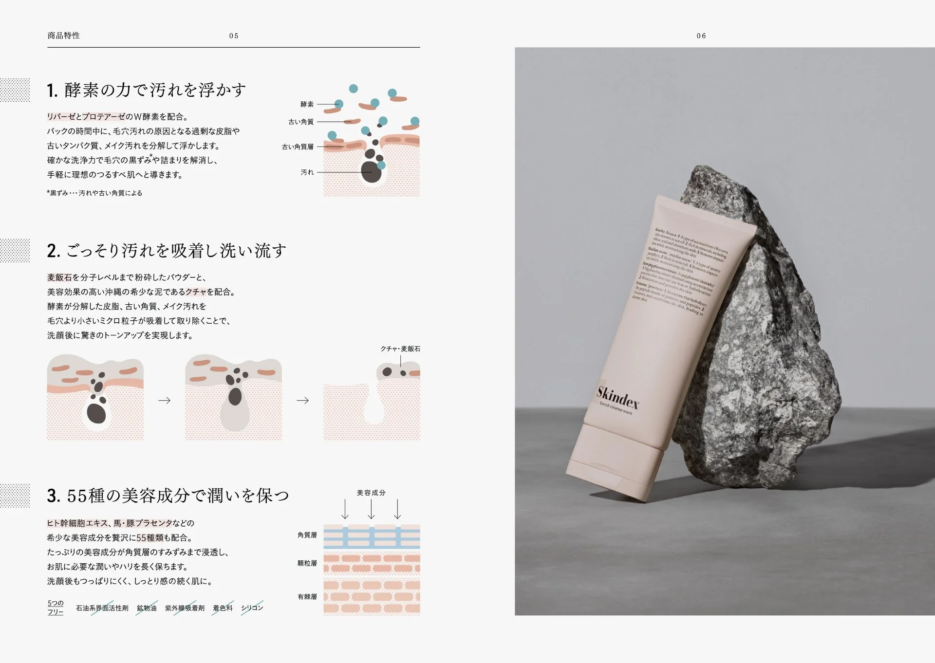
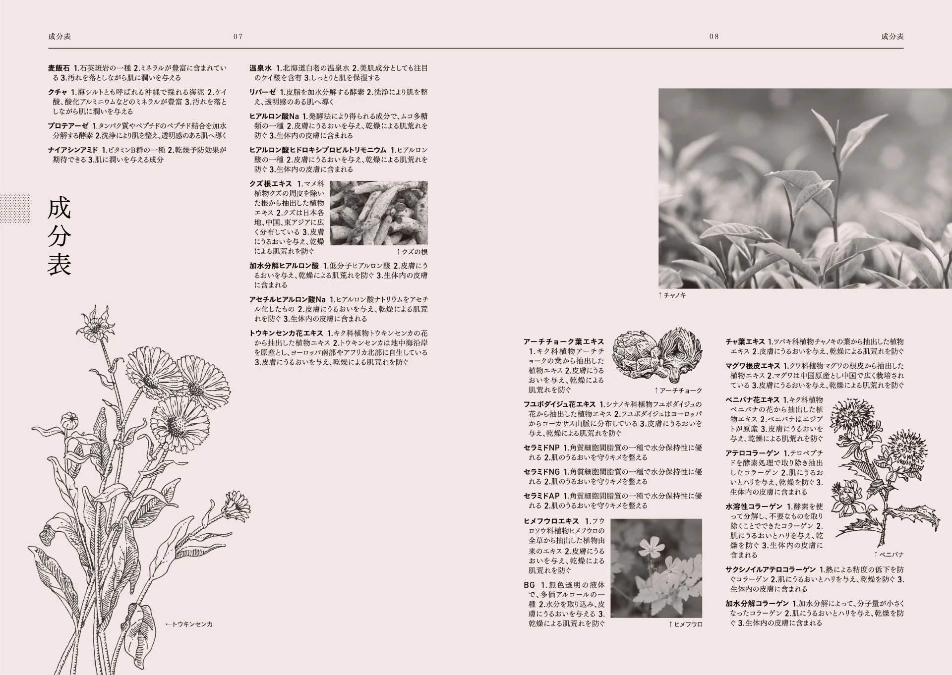
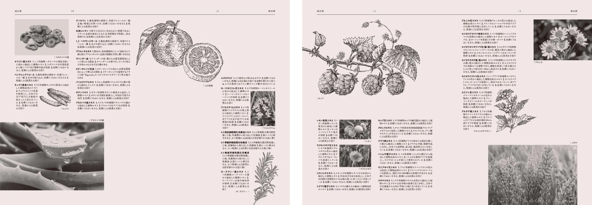
スキンケアシリーズ「Skindex」のブランディング。数ある成分の中から多くの人にとって価値あるものを選び抜き提供することを使命とし、商品開発と並行してブランド構想を形にしました。
最新の有効成分を豊富に取り入れる開発方針を受け、それぞれの成分の魅力を丁寧に伝え導く存在として世界観を設計。SKIN[肌]とINDEX[索引]を組み合わせた造語「Skindex」と名付け、ロゴは辞書の索引を想起させる知的で上質な印象に。信頼性と美しさを兼ね備えた情報発信型のスキンケアブランドを目指しました。
ブランドカラーには肌を思わせながら甘さを抑えたサーモンピンクを採用し、ジェンダーニュートラルな佇まいを意識。外箱や容器には成分名と効能を列挙し、ユーザーが日々その効果を実感できるよう設計しました。仕上げには肌を思わせるしっとりしたマット質感を取り入れ、ブランドの思想を細部まで体現しています。
Client
Aminocells
Creative Team
Creative Director : Yoshinaka Ono (inglewood)
Art Director : Yoshinaka Ono (inglewood)
Designer : Midori Utsumi (inglewood)
Designer : Momoka Atsumi (inglewood)
Designer : Koki Niijima (inglewood)
Photographer : Junpei Kato
Staylist : Takashi Imayoshi (kichi)
Hair Make : Yoshikazu Miyamoto
Retoucher : Hayato Ono
Illustrator : Clemens Metzler
Illustrator : Suzu Saito