The University of Tokyo Hospital
Logo
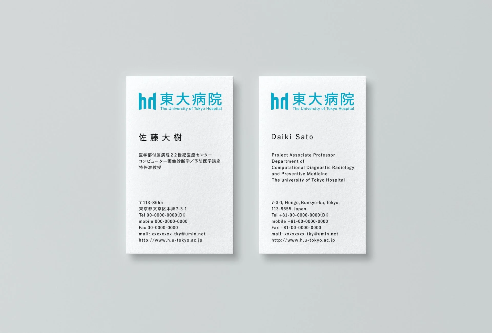
Business Card
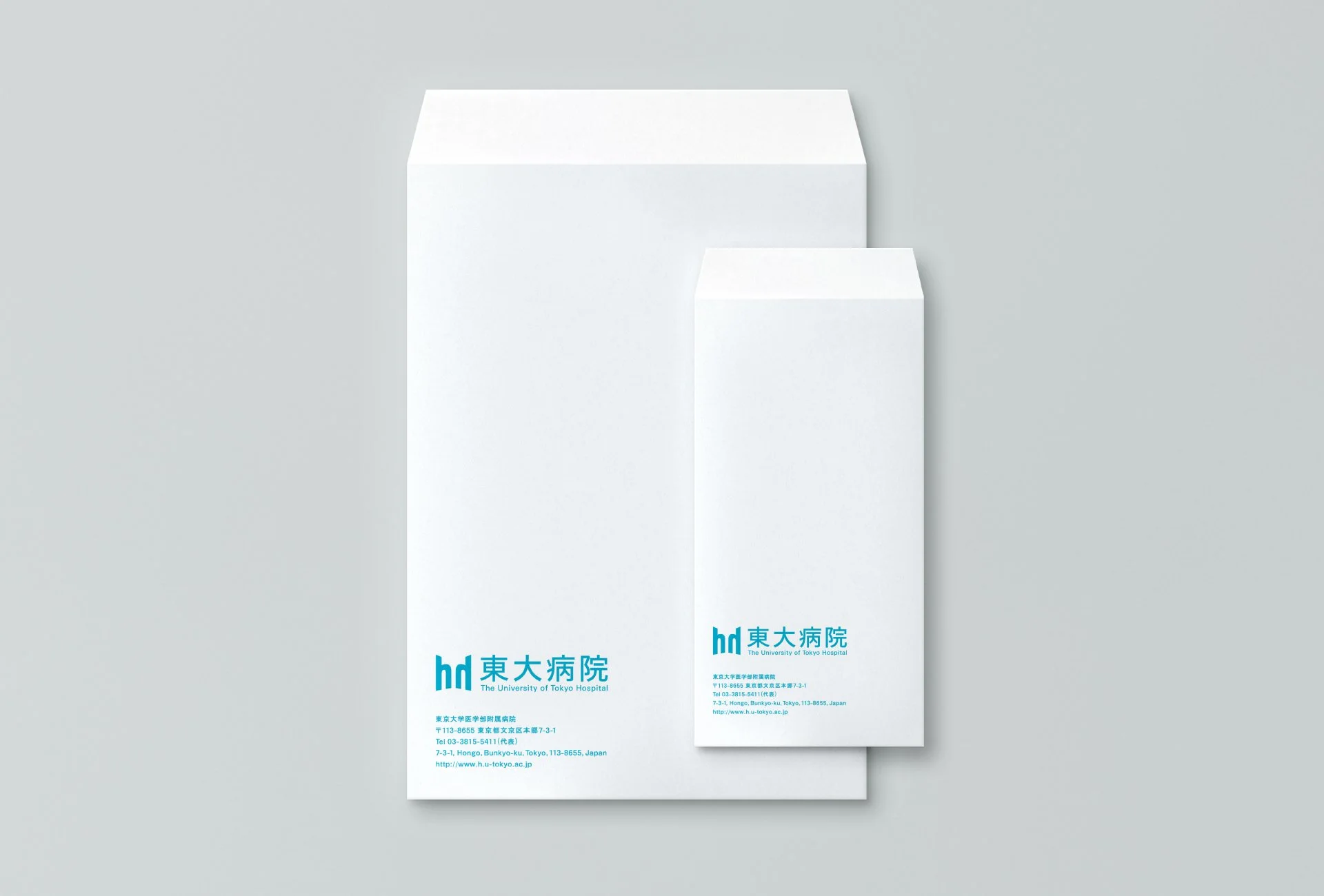
Envelope
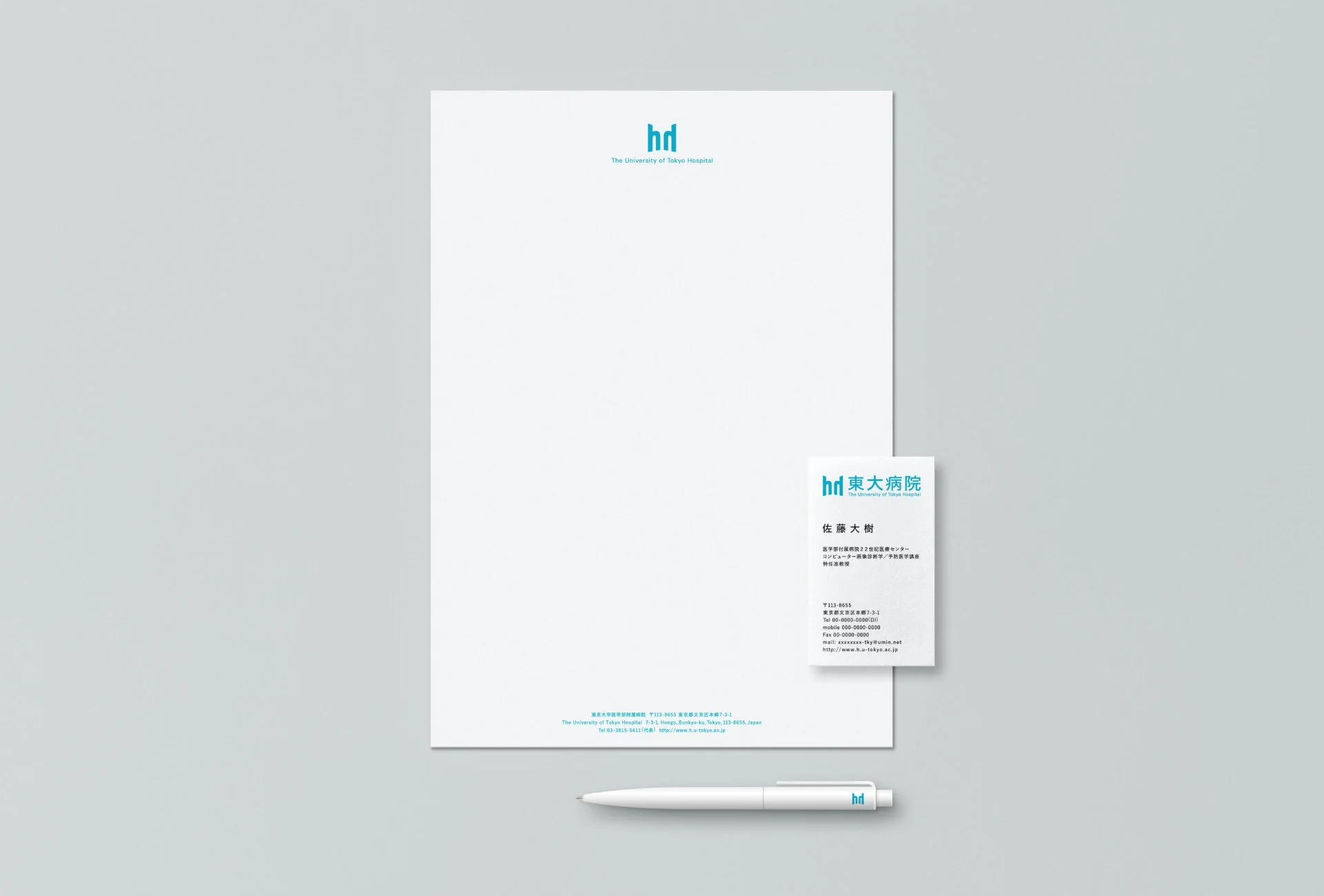
Letter, BusinessCard, Pen
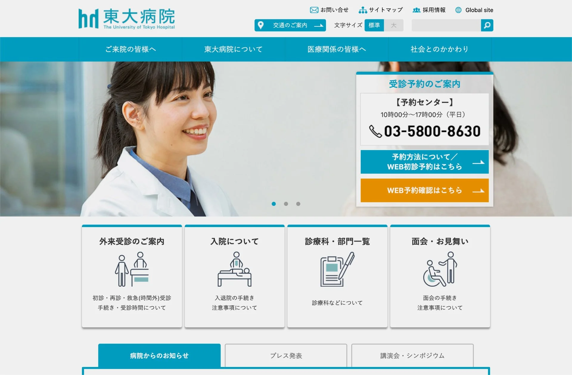
Web
The University of Tokyo Hospital
Human and Hospital, Facing One Another
Logo redesign for “The University of Tokyo Hospital,” one of Japan’s leading medical institutions. The hospital advances clinical medicine, educates future medical professionals, and provides advanced care tailored to each patient.
The mark is built from the letter “h,” standing for both Human and Hospital. Two facing “h” forms suggest people seated in dialogue, while the initial “T” for Tokyo rises at the center. Together, the symbol expresses a sincere, face-to-face relationship between patient and physician, grounded in the academic authority of a university hospital.
Through its clear structure and calm blue tone, the identity balances humanity and reliability. Applied across stationery and digital touchpoints, the logo presents the hospital as an institution where advanced medicine and personal care meet directly.
人と医療が、向き合うかたち
日本を代表する大学病院「東京大学医学部附属病院」のロゴリニューアル。同院は、臨床医学の発展、医療人の育成、そして患者一人ひとりに応じた高度な医療の提供を担う医療機関です。
マークは、Human と Hospital の頭文字である「h」を起点に構成しました。向かい合う二つの「h」は、対話する人の姿を想起させ、その中央には Tokyo の頭文字である「T」が立ち上がります。患者と医師が真摯に向き合う関係性と、大学病院としての学術的な信頼性を一つのシンボルに重ねています。
明快な構造と落ち着いたブルーによって、人間性と信頼性の両立を表現。ステーショナリーやデジタル接点へ展開することで、高度な医療と一人ひとりに寄り添う姿勢が直接出会う病院像を示しました。
Client
The University of Tokyo Hospital
Creative Team
Creative Director : Yuichi Yukawa (Dentsu)
Art Director : Emiko Sato (Dentsu)
Art Director : Yoshinaka Ono (Dentsu)
Designer : Yoshinaka Ono (Dentsu)
Copywriter : Dai Hirose (Dentsu)
Designer : Azuma Saori (J.C.SPARK)
Account Executive : Yoshinori Nakagawa (Dentsu)
Account Executive : Takashi Uozumi (Dentsu)