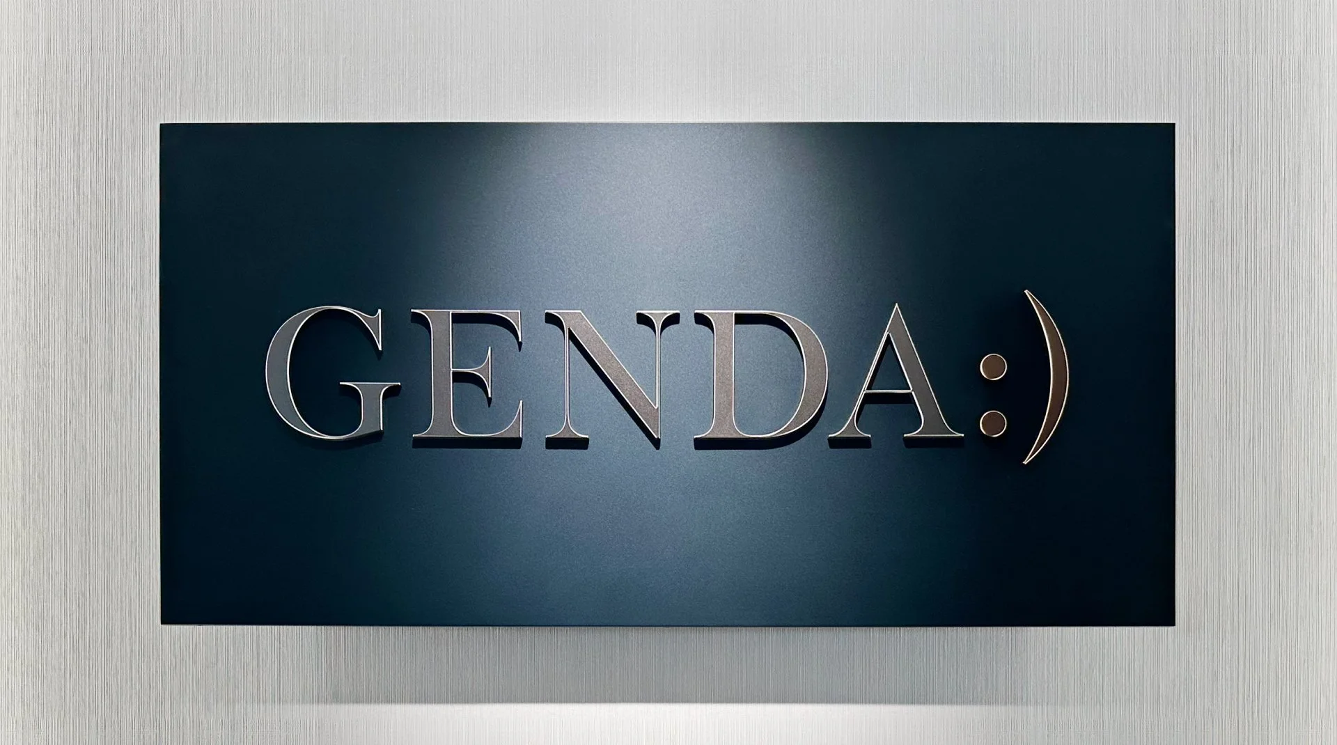
GENDA
Logo : Positive
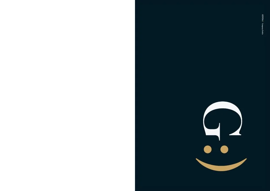
Logo : Negative
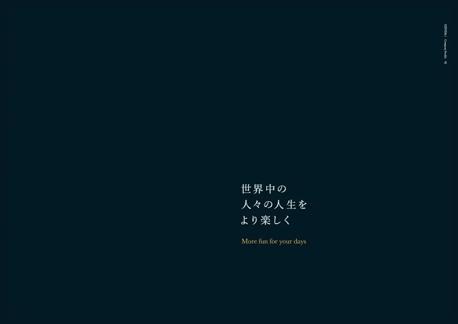
Aspiration
Motion Logo

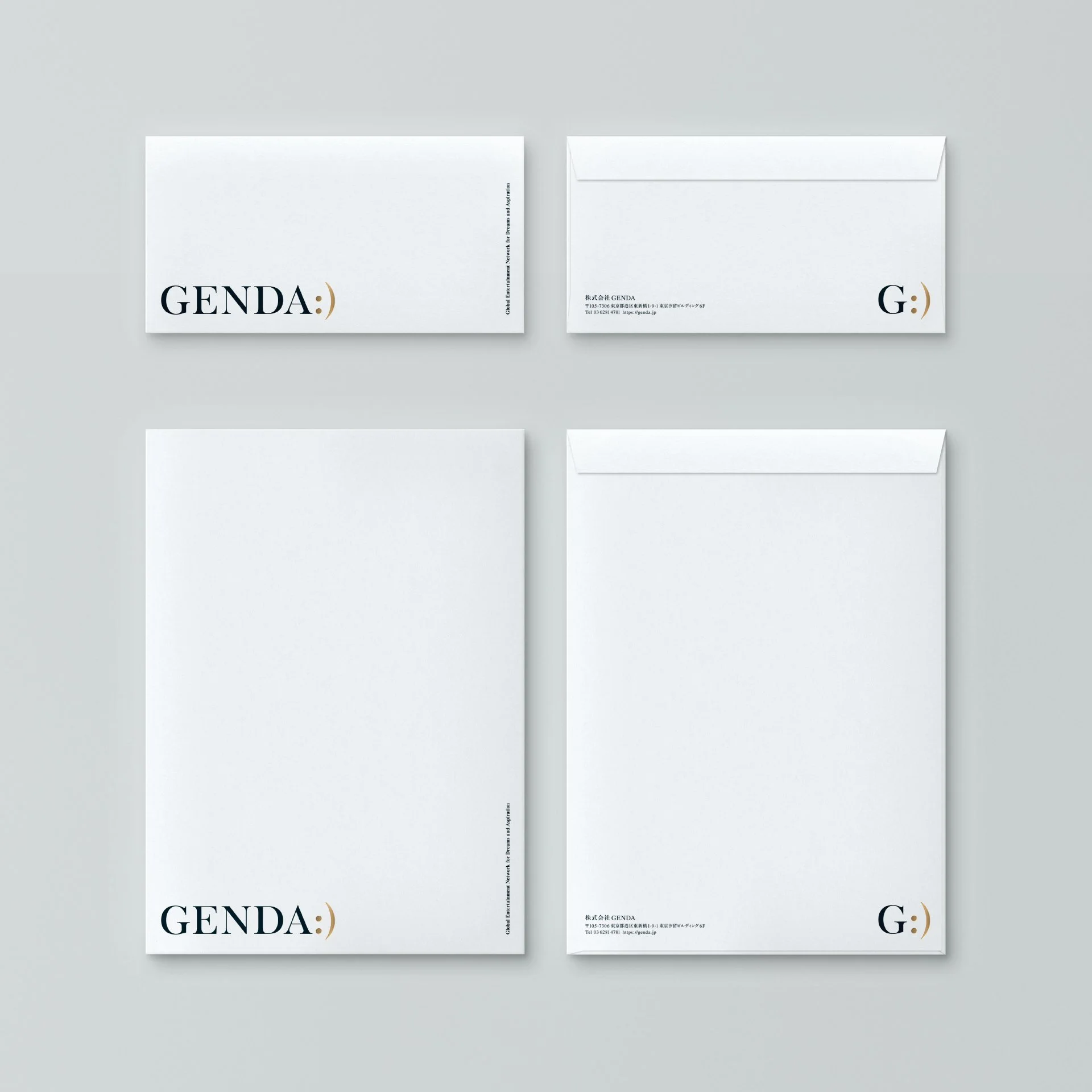
Business Card
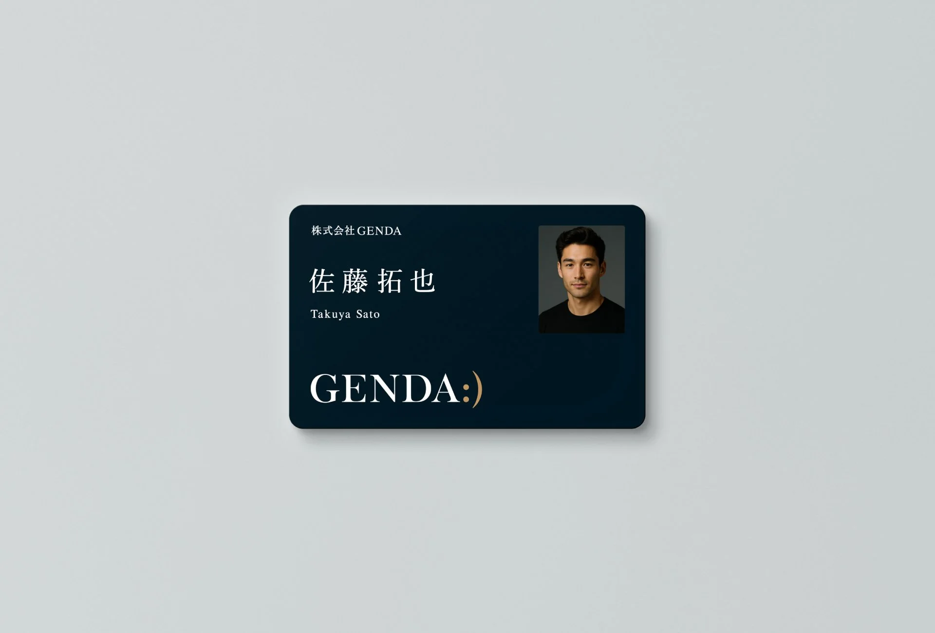
ID Card
Clearfile
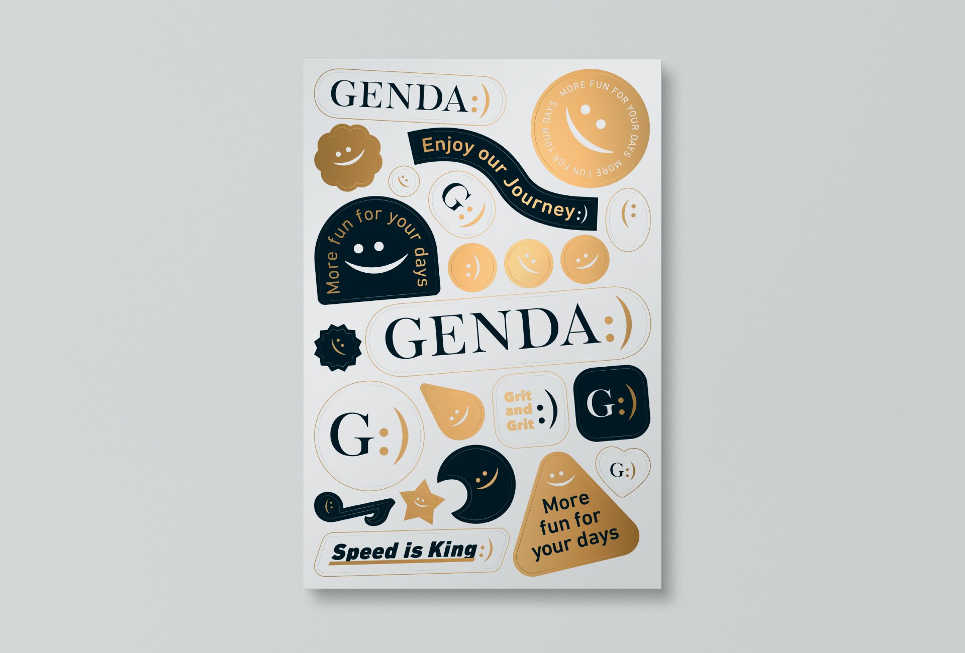
Stecker

New Year Card

T-shirts
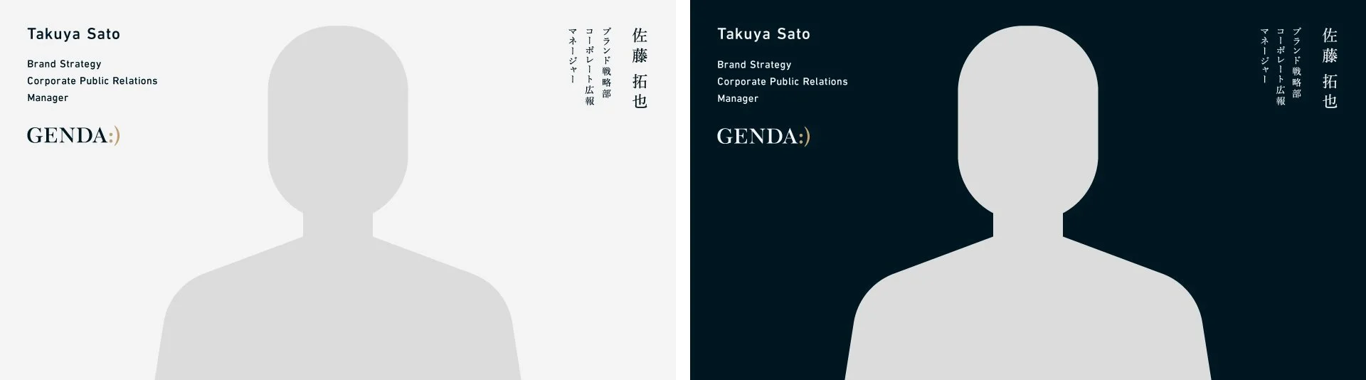
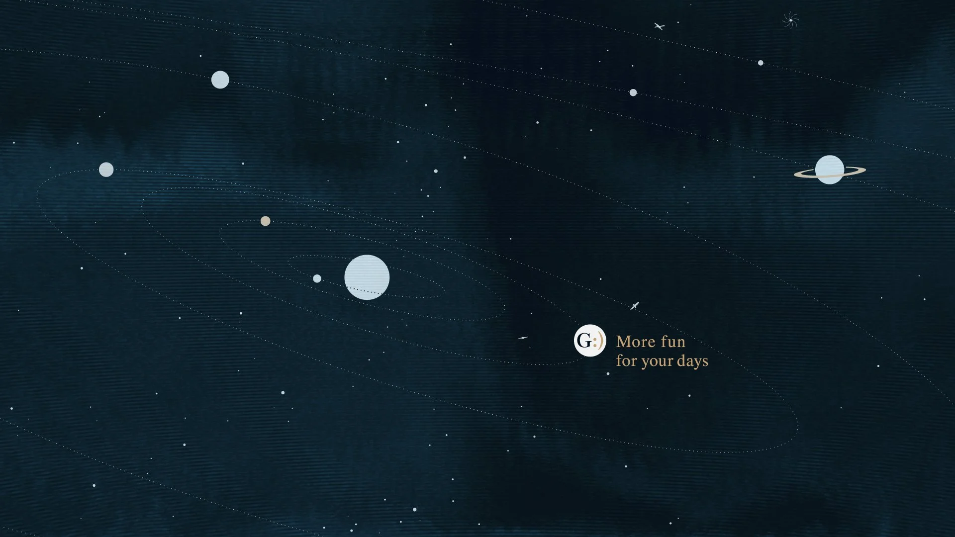
Online Background
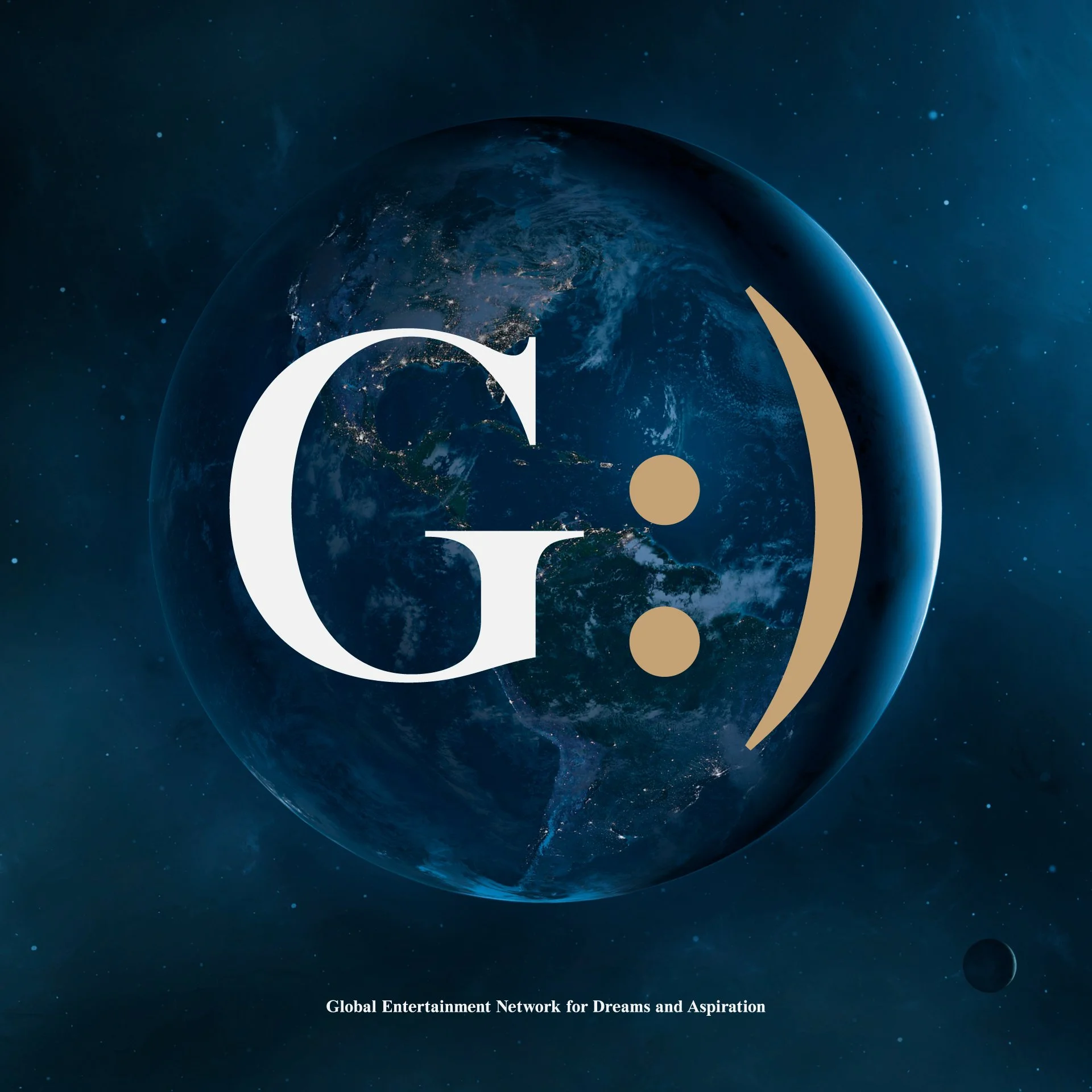
Visual : Global
Visual : Global


Visual : Entertainment
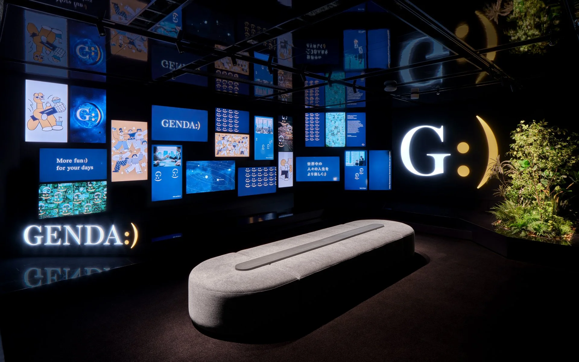


Office Entrance
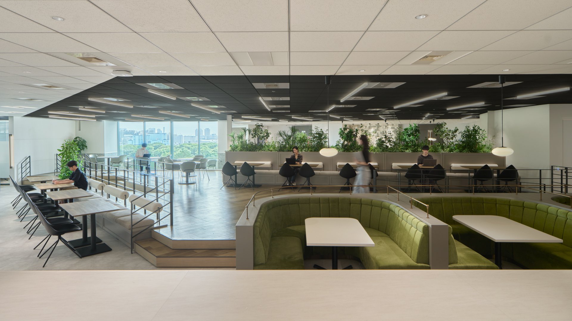
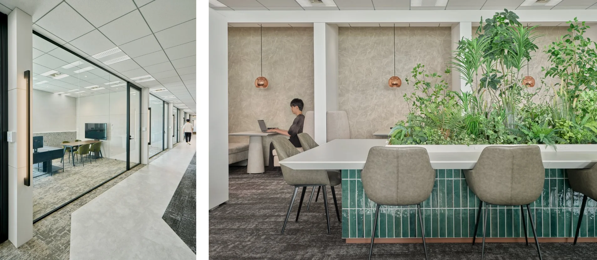
Office Work Space


Pamphlet

General meeting of shareholders
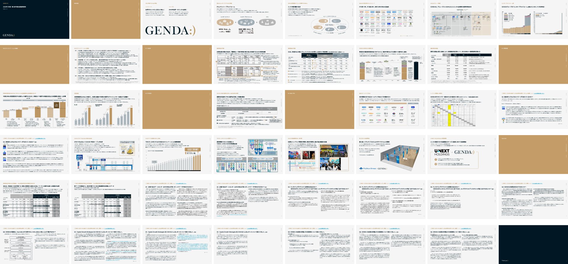
IR Document

Movie

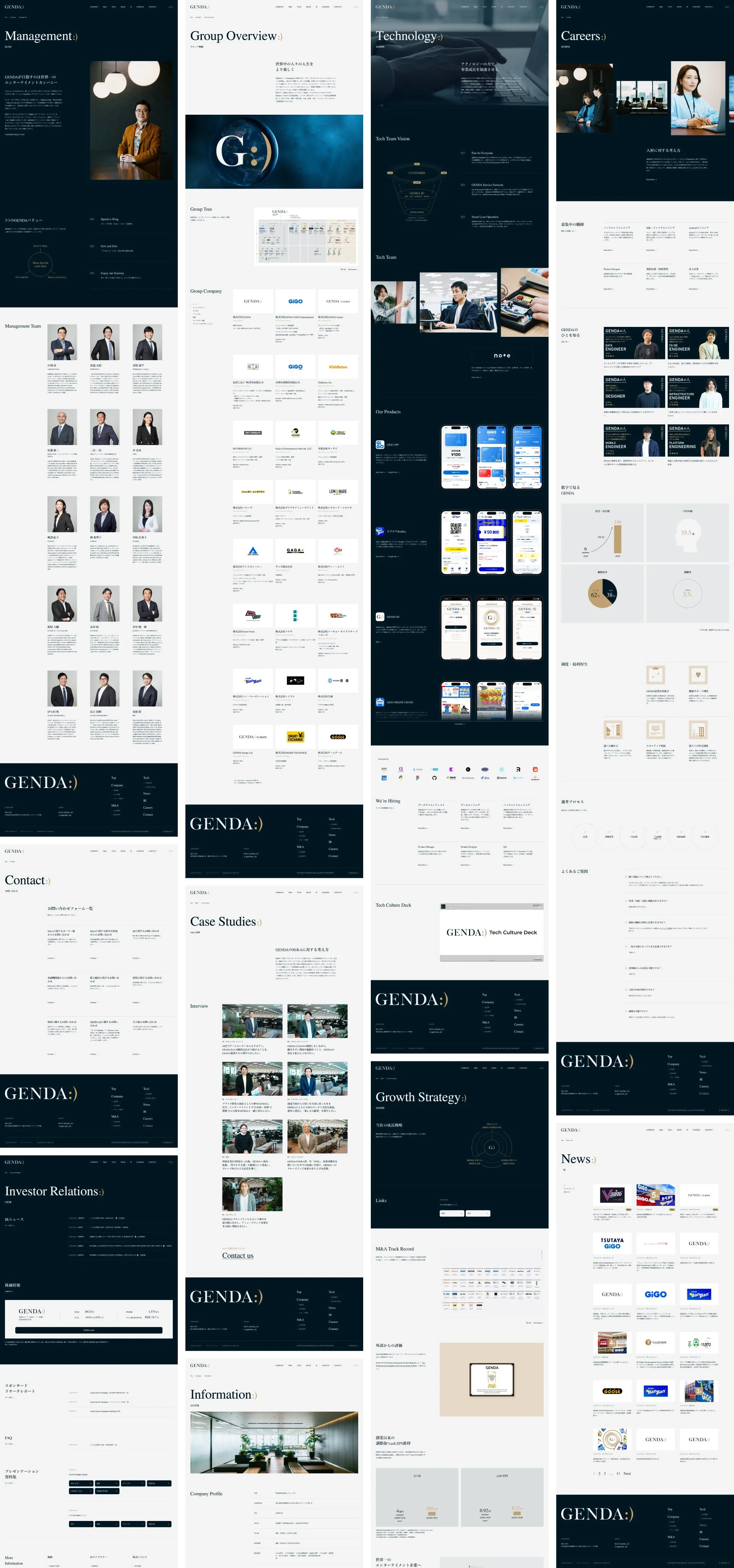
Web
GENDA
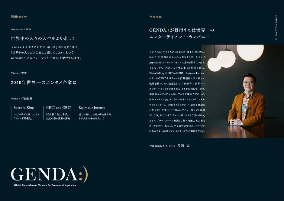
Trust in Capital Markets, Empathy in Popular Culture
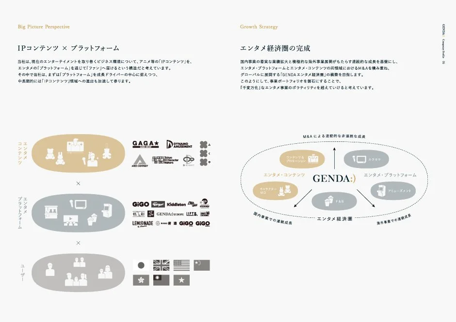
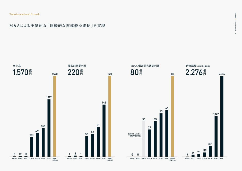
Branding for “GENDA,” a global entertainment company that places M&A at the core of its growth strategy while expanding across amusement, karaoke, cinema, and food & beverage. With stakeholders ranging from investors to everyday consumers, the brand aims to resonate with both capital markets and popular culture.
The logotype conveys dignity through an authentic serif typeface that balances solidity and refinement, while the emblem — “Golden Smile,” inspired by an emoticon — expresses approachability and playfulness. Together they form a distinctive identity unique to GENDA.
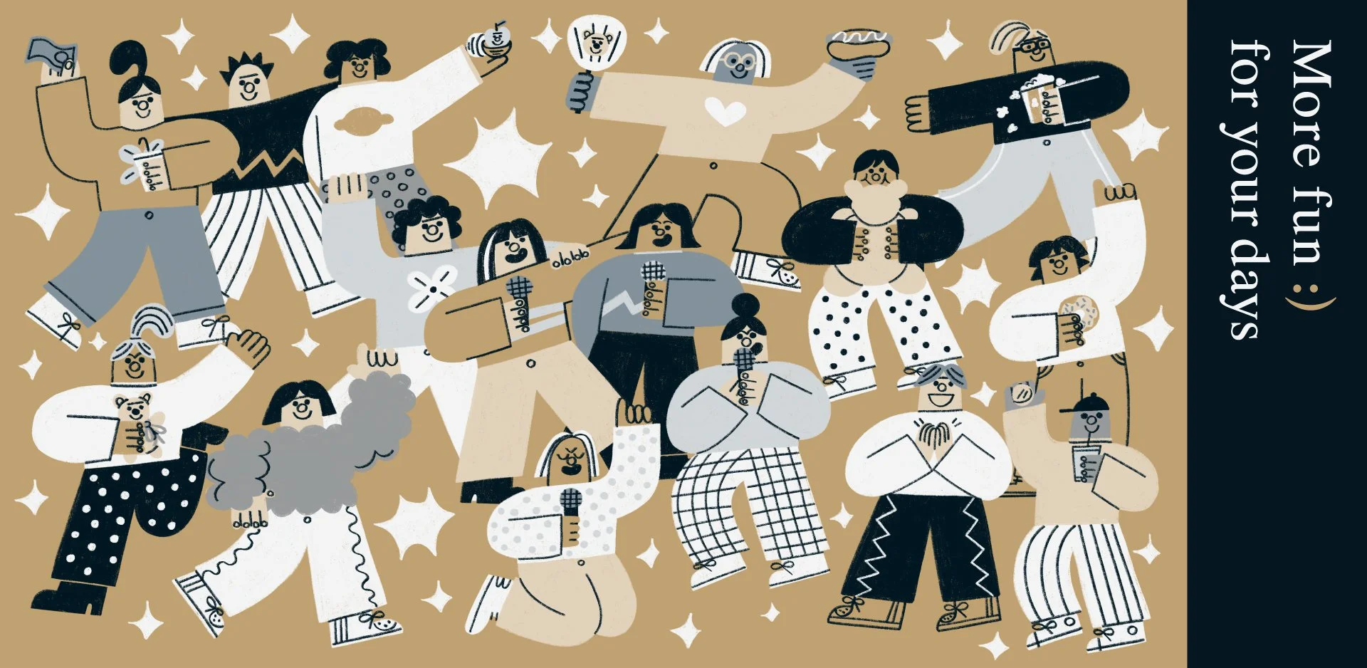
The corporate website adopts a refined, chic tone, complemented by multiple illustration styles that visualize the company’s diverse portfolio. Light motion applied to the logo and headings adds a sense of expansion and dynamism, allowing visitors to experience both financial trustworthiness and the vibrancy of entertainment.
資本市場への信頼と、大衆文化への共感
グローバルにエンターテインメント事業を展開する「GENDA」のブランディング。M&Aを成長戦略の中核に据え、アミューズメント、カラオケ、映画、フード&ビバレッジなど多彩な領域へ拡張。投資家から一般消費者まで幅広いステークホルダーを抱える企業として、双方に響くブランド像を描き出しました。
ロゴタイプは堅実さと洗練を兼ね備えたオーセンティックなセリフ体で格調を示し、シンボルはEmoticonをモチーフとした“Golden Smile”で親しみやすさと遊び心を体現。両者が呼応し合うことで、GENDAならではのアイデンティティを形成しています。
コーポレートサイトは上品でシックなトーンを基調にしつつ、タッチの異なる複数のイラストレーションを採用し、GENDAの幅広く多様な事業を視覚化。さらにロゴや見出しに軽快なモーションを加え、金融的な信頼感とエンターテインメントらしい広がり・ダイナミズムを同時に体験できる構成としました。
Client
GENDA Inc.
Creative Team
Creative Director : Yoshinaka Ono (GENDA)
Art Director : Yoshinaka Ono (GENDA)
Designer : Ryota Sugahara (SORA)
Designer : Kimu Sumi (SORA)
– Photo
Photographer : Dai Yamamoto
Photographer : Keiko Hamada
– Illustration
Illustrator : Tadashi Nishiwaki
Illustrator : TessSmithRoberts
Illustrator : Yuki Takahashi
– Web
Web Producer : Iku Ando (ShiftBrain)
Web Designer : Ryohei Kamada (ShiftBrain)
Front-end Developer : Yusuke Fujiki
Technical Director : Kento Ikeda (GENDA)
Account Manager : Yusuke Arai (GENDA)
– Movie
Film Producer : Yuta Harasawa (FMX)
Film Director : Kenji Aritomo (FMX)
Production Manager : Toranosuke Yamada (FMX)
Music : Satoshi Yoshitake
Editor : Syun Saito
Copy Writer : Takeshi Amata
– Motion Logo
Motion Producer : Yuta Harasawa (FMX)
Motion Director : Suguru Tachikawa
Music : Satoshi Yoshitake