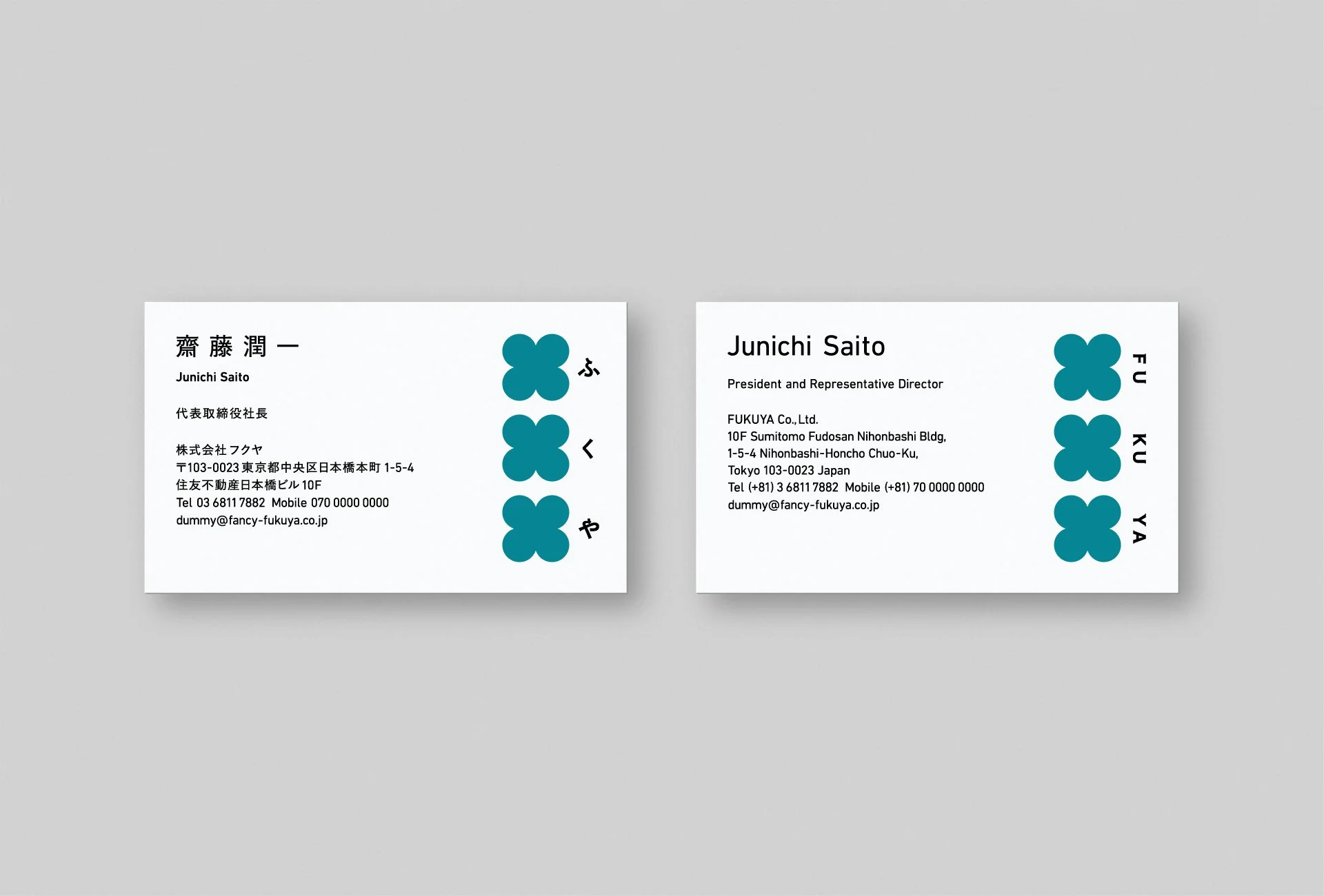
FUKUYA
Logo
Visual
Business Card
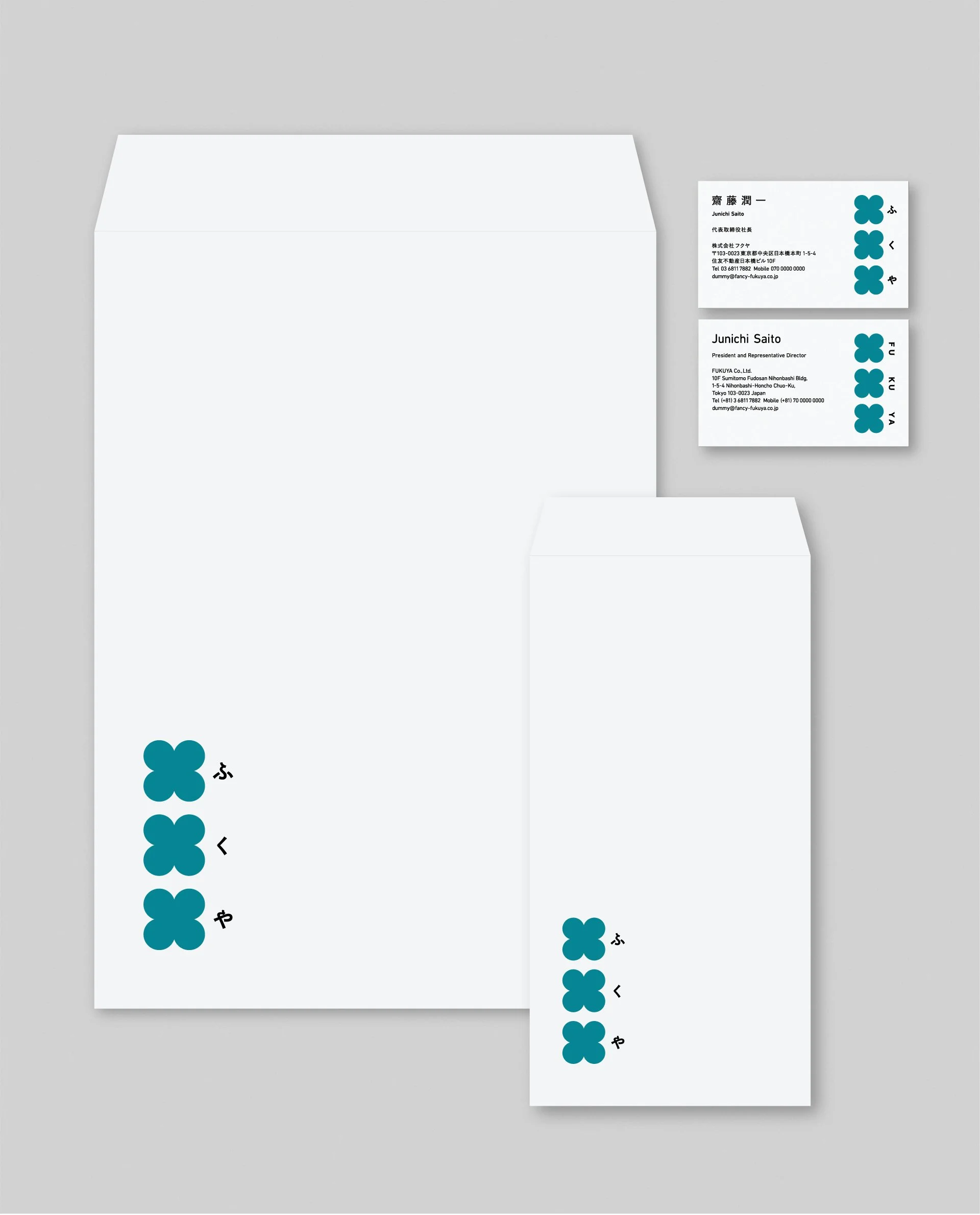
Envelope & BusinessCard
Paper Bag
Entrance
Company Profile
Web
Philosophy
FUKUYA
HAPPY TOGETHER
Spreading Small Joys Around the World
Fukuya Co., Ltd. is a specialized entertainment trading company engaged in the planning and sales of prize items, capsule toys, and lottery-based products through a wide range of distribution channels. Since our founding in 1953, we have upheld the philosophy of "HAPPY TOGETHER – Creating Small Joys Through Craftsmanship," delivering small moments of happiness by connecting people through thoughtfully made products.
To embody this philosophy in a more contemporary way, we undertook a full rebranding—revamping our logo and statement, redefining our mission, vision, and values (MVV), and redesigning our visual tone across both verbal and visual expressions.
Our new logo features three four-leaf clovers, a symbol of good luck, arranged side by side to express moments of connection and empathy. This trio reflects the three syllables of “Fu-Ku-Ya,” making the design easy to remember, while also evoking the lucky feeling of lining up symbols on a slot machine. The vertical layout expresses our heritage as a company with over 70 years of history and subtly conveys the elegance and pride of a Japanese brand. In our key visual—the “Clover Field,” which represents our expanding reach—we’ve added a ladybug, another symbol of good fortune, as a playful accent.
In terms of tone and color, we considered our employee demographics—predominantly female—and the challenge of attracting more male hires. The design balances geometric simplicity and modernity with soft, friendly forms to create a gender-inclusive appeal. The calm yet vivid blue-green base color symbolizes harmony, growth, and diversity—core values of the Fukuya brand.
In redefining our MVV, we retained “HAPPY TOGETHER” as our central philosophy while developing a more concrete tagline: “Crafting with our own love for what we do, to bring joy to what our customers love.” The previously scattered nine values were reorganized into six core values, restructured from the perspectives of the individual, the company, and society. These now serve as practical and inspiring behavioral guidelines for our team, as well as a renewed promise to the world.
Through these refined visual and verbal expressions, we aim to strengthen the resonance and reach of the Fukuya brand, connecting with more people across cultures and generations.
HAPPY TOGETHER
世界に小さな幸せを
株式会社フクヤは、プライズ、カプセルトイ、くじの企画・販売を軸に、多様なチャネルでエンターテインメントを届ける専門商社です。1953年の創業以来、「HAPPY TOGETHER ― プチハッピーを創造するモノづくり ―」を企業理念に掲げ、モノを通じて人と人をつなぎ、小さな喜びを届け続けてきました。
この理念をより現代的に体現すべく、ロゴとステートメントの刷新に加え、企業理念やMVVの再定義、ビジュアルトーンの再設計など、視覚と言語の両面からブランド再構築に取り組みました。
新たなロゴは、幸運の象徴である四葉のクローバーを3つ並べ、出会いや共感の瞬間を表現。「ふくや」の3音と呼応する構造にすることで記憶に残りやすく、スロットマシンの絵柄が揃うようなラッキー感も添えています。縦書きのレイアウトは、創業70年を超える老舗企業としてのヘリテージや、日本ブランドとしての誇りと風格をにじませています。また、ブランドの広がりを描いた「クローバー畑」のキービジュアルには、もう一つの幸運の象徴であるてんとう虫をアクセントとして添えました。
トーン&カラーにおいては、社員の多くを女性が占める一方、男性の採用が課題であった背景をふまえ、ユニセックスに開かれたバランスを重視。幾何学的なシンプルモダンさと、丸みのある親しみやすいフォルムを組み合わせることで、性別を問わず受け入れられるデザインに仕上げました。穏やかさとほどよい鮮やかさを併せ持つブルーグリーンは、調和・成長・多様性といったフクヤの価値観を象徴しています。
MVVの再定義では、「HAPPY TOGETHER」という理念を核に据えつつ、“自分たちの「好き」を込めたモノづくりで、お客様の「好き」を楽しむ気持ちに応え続ける”という、より具体的なタグラインを開発。ばらばらに存在していた9つのバリューは、「個人・会社・世界」という3つの視点から再整理され、6つのコアバリューへと集約されました。これは、社会への約束であると同時に、社員の行動を支える実践的な指針として機能します。
こうして生まれ変わったビジュアルと言語表現を通じて、フクヤというブランドの個性と価値が、より多くの人々と共鳴し、つながっていくことを目指しています。
Client
Fukuya Co., Ltd.
Team
Creative Director : Yoshinaka Ono
Art Director : Yoshinaka Ono
Designer : Ryota Sugahara (SORA)
Copywriter : Takeshi Amata