Gokkan Buri
Logo

Brand Card


Box

Package

Sake Fukutsukasa
Sake Goshikinokumo
Gokkan Buri
Exquisite Winter Yellowtail, Nurtured by Extreme Cold
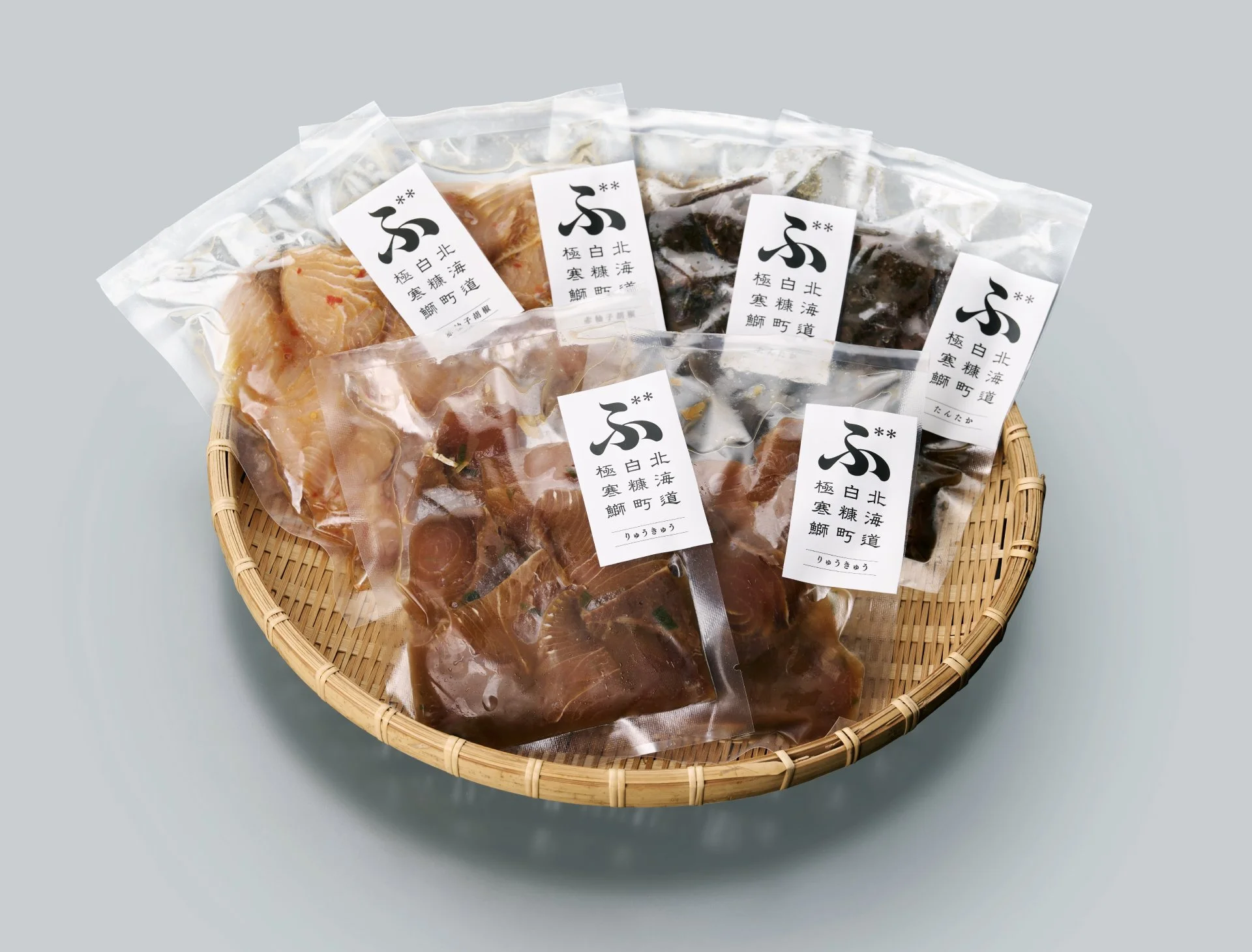
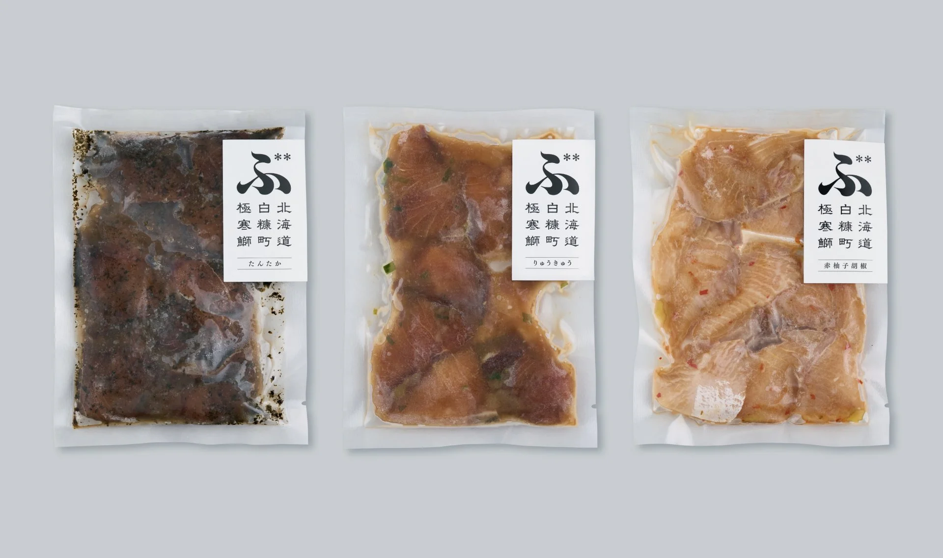
Branding for “Gokkan Buri,” premium winter yellowtail from Shiranuka, Hokkaido. Swimming through waters where warm and cold currents meet, feeding on abundant natural prey, and enduring the severe climate of eastern Hokkaido, the fish develops firm flesh balanced with rich marbling.
The name succinctly conveys its singular presence, forged in extreme cold. At the center of the logo is the bold black character “ぶ” (bu), for buri. Its diacritical marks resemble snowflakes while doubling as annotation marks that guide the eye toward the tagline. Rendered in solid black, the form embodies the fish’s tightened texture and resilient vitality.
The outer package employed matte white, evoking the frigid Hokkaido landscape, with the “ぶ” logo standing prominently. Opening the box reveals copy along the side and a translucent sheet resembling ice placed above the product, reinforcing the impression of extreme cold and heightening anticipation for the delicacy within.
極限の寒さが育んだ、白糠の極上寒ぶり
北海道白糠町発の寒ぶり「極寒ぶり」のブランディング。寒流と暖流が交わる漁場を泳ぎ抜き、豊富な天然餌を食べて丸々と肥え、さらに道東の厳しい寒さによって身が引き締まった極寒ぶりは、脂のりと身質の調和に優れています。
ネーミングは、極寒の地で鍛えられた唯一無二の存在感を端的に表現。ロゴの主役は黒の「ぶ」の一文字。ブリの「ぶ」であり、濁点は雪の結晶をかたどると同時に注釈マーク「**」としても機能し、キャッチコピーへの視線を導きます。黒一色の造形は、身の締まりと極寒を生き抜いた魚の力強さを象徴しました。
パッケージ外箱は、道東の極寒の大地を想起させるマットホワイトを背景に、「ぶ」のロゴを際立たせた構成。箱を開くと側面にコピーが現れ、商品の上には氷を模した半透明の間紙を添えることで、極寒の印象と食への期待感を高めています。
Client
immue Co., Ltd.
Creative Team
Creative Director : Yoshinaka Ono (ORBIT)
Art Director : Yoshinaka Ono (ORBIT)
Designer : Ryota Sugahara (SORA)
Planner : Yuka Nakamura