yomica
Logo

Shop Card


Poster
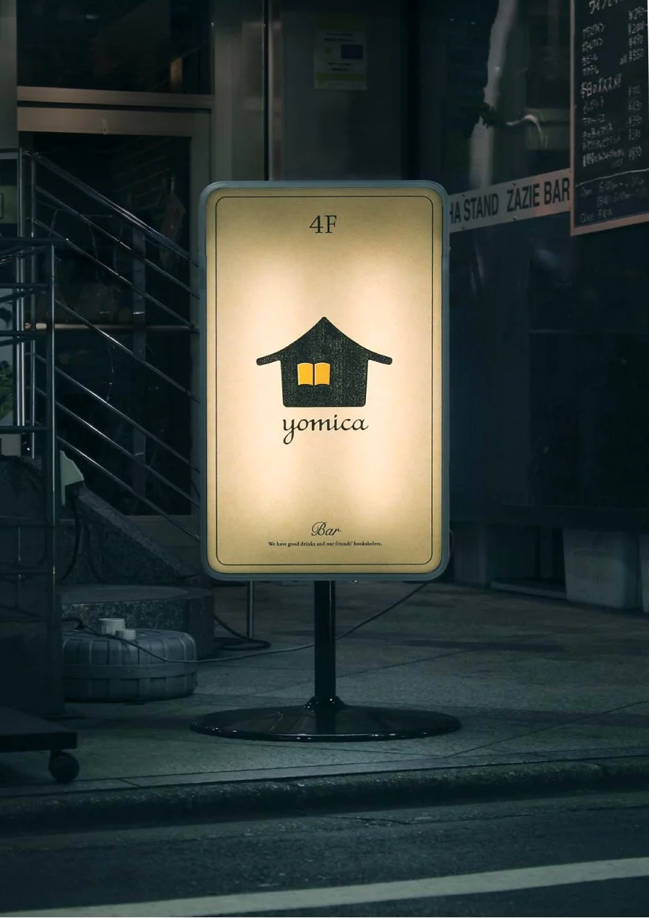
Sign


Space

Web
yomica
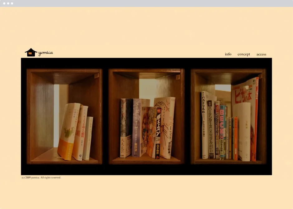
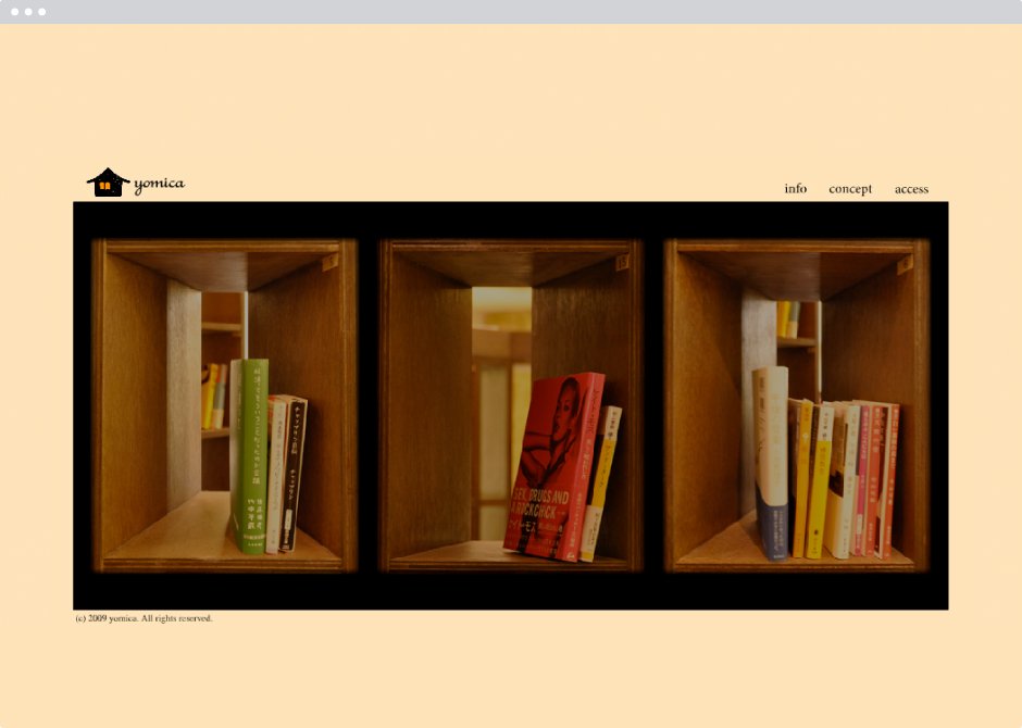
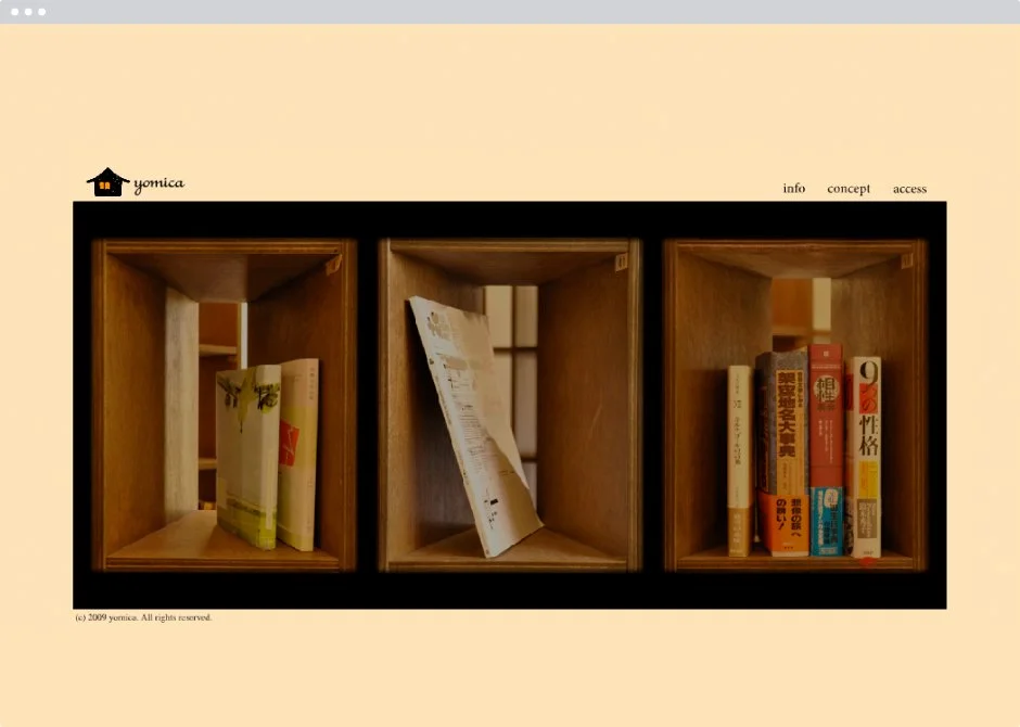
A Bar Where You Meet Everyone’s Bookshelf
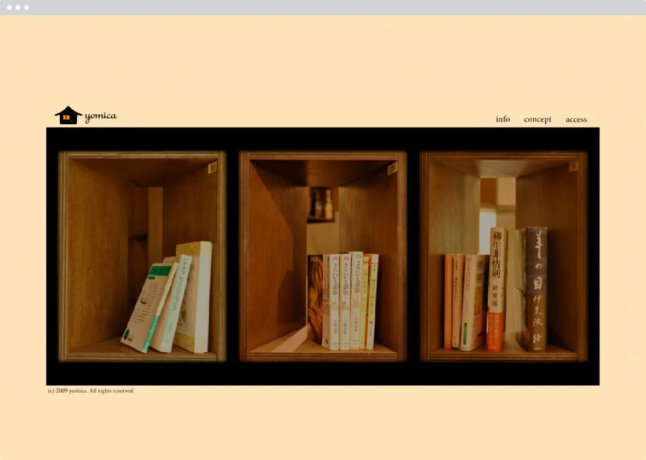
Branding for “yomica,” a book bar in Sangenjaya. Each guest is assigned a personal shelf, holding a book that has resonated deeply in their life—turning the space into a quiet archive of people and stories. The name comes from yomika (“reading house”), suggesting a study-like place where connections form through books.
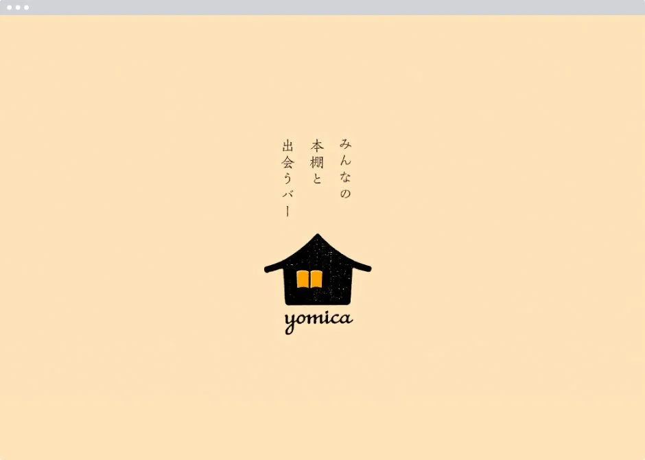
The logo portrays a house at dusk, with a window shaped like an open book. The orange light spilling out represents both a warm welcome and a gateway to new narratives.
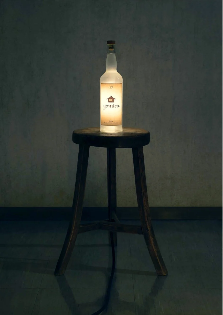
On the website, visitors can browse “everyone’s bookshelf,” inviting serendipitous encounters through shared titles. At the storefront, a softly glowing whisky-bottle light sign serves as a symbolic fixture—embodying the time where books, drinks, and people come together.
みんなの本棚と出会うバー
三軒茶屋のブックバー「yomica」のブランディング。店内には一人ひとりに棚が与えられ、それぞれの人生に響いた一冊が並びます。「読家」に由来するネーミングは、本を媒介に人と人が静かに結び合う、温もりある書斎のような空間を象徴しています。
ロゴは、宵闇に浮かぶ家のシルエットに、一冊の本をかたどった窓を重ねたデザイン。こぼれる橙色の光は、訪れる人を迎え入れる温もりであると同時に、新しい物語への入口を示しています。
ホームページでは「みんなの本棚」を一覧でき、偶然の出会いを可視化する仕掛けを導入。店頭にはやわらかく発光するウィスキーボトルの照明サインを設置し、本と酒と人が交わる時間を象徴的に演出しました。
Client
yomica
Creative Team
Art Director : Yoshinaka Ono (ORBIT)
Designer : Yoshinaka Ono (ORBIT)
Copywriter : Takuro Hashimoto
Photographer : Shigeru Bando
Web Engineer : Hideki Yoshimoto